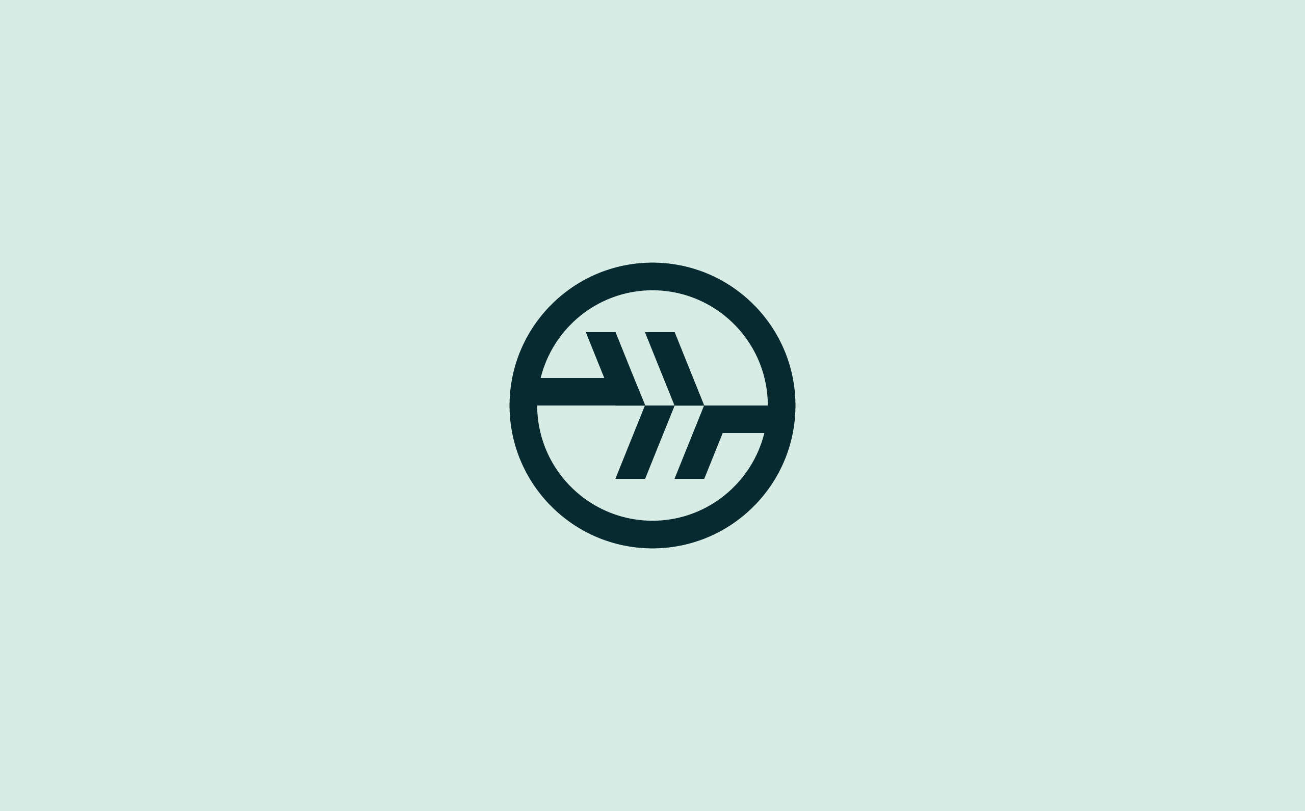
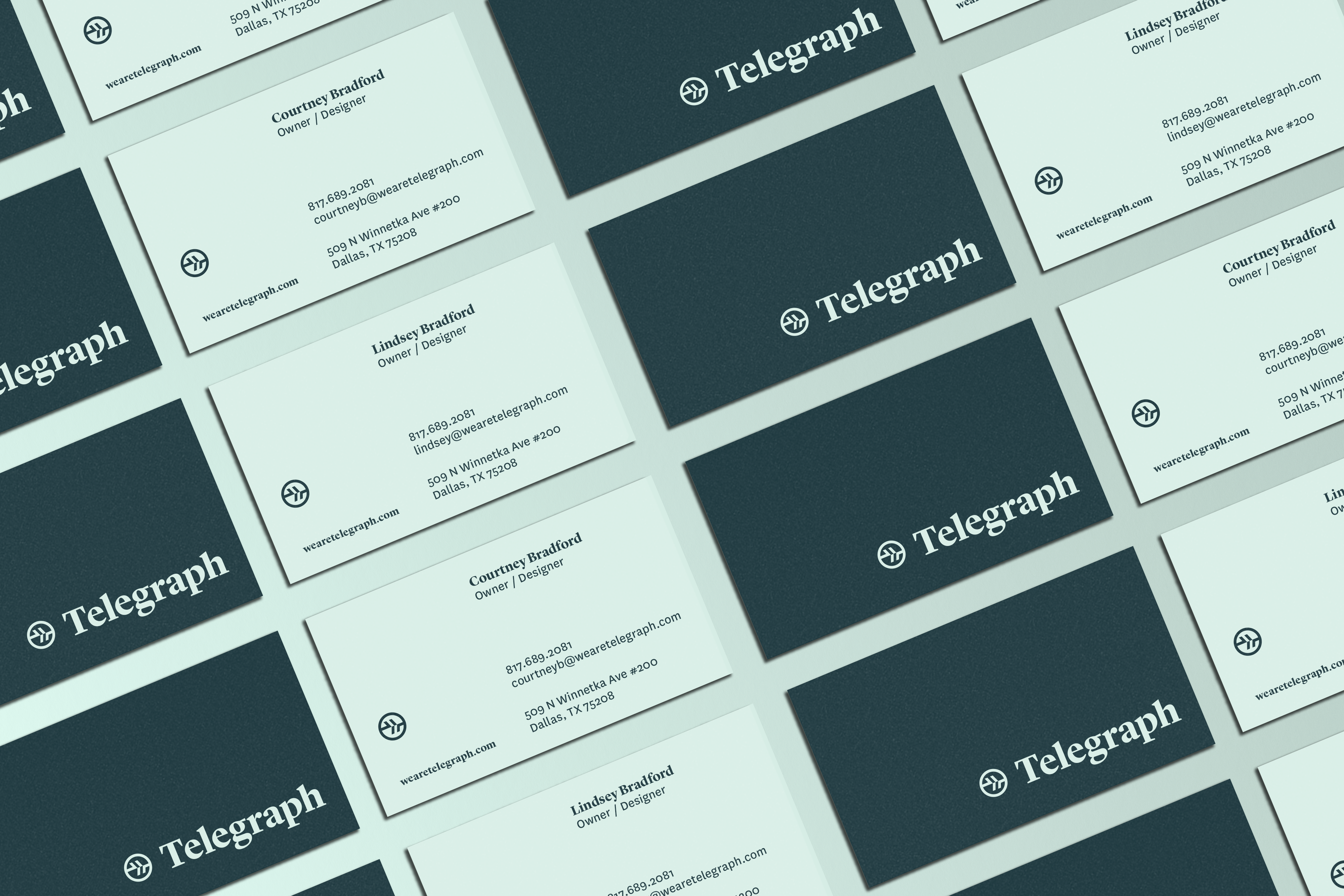
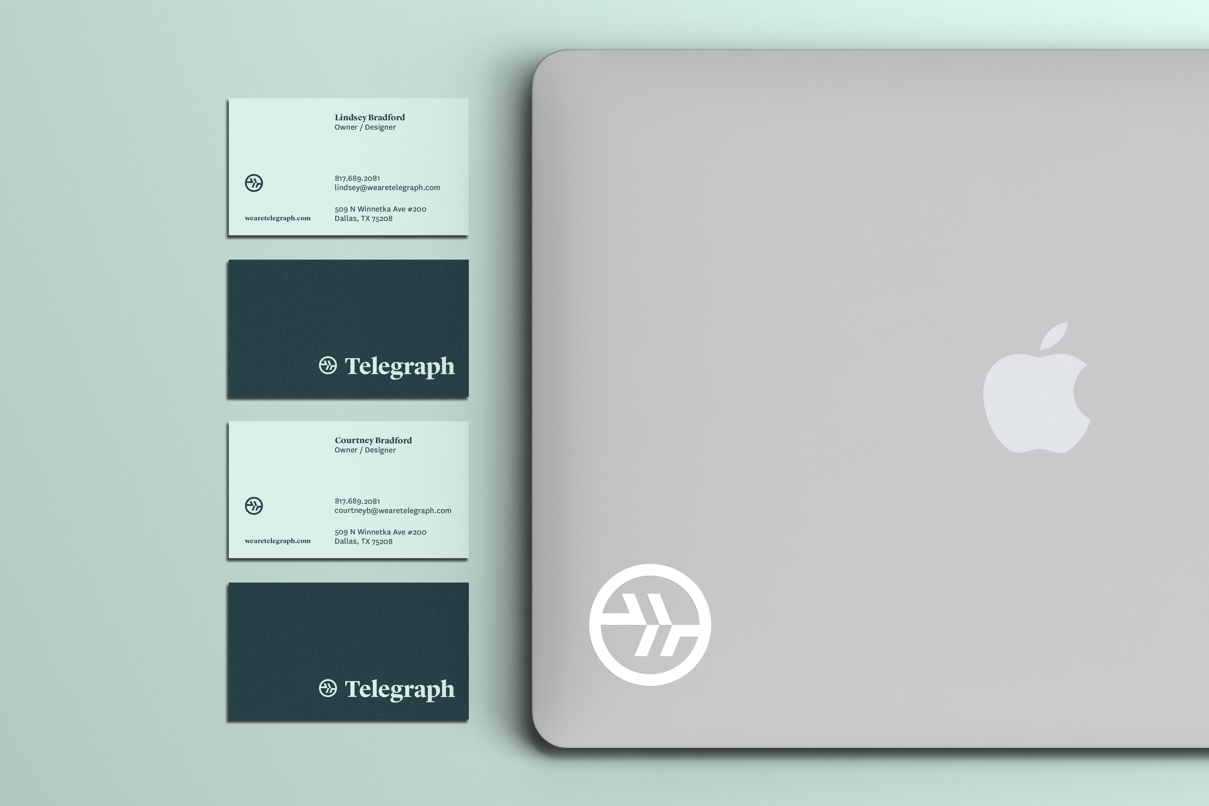
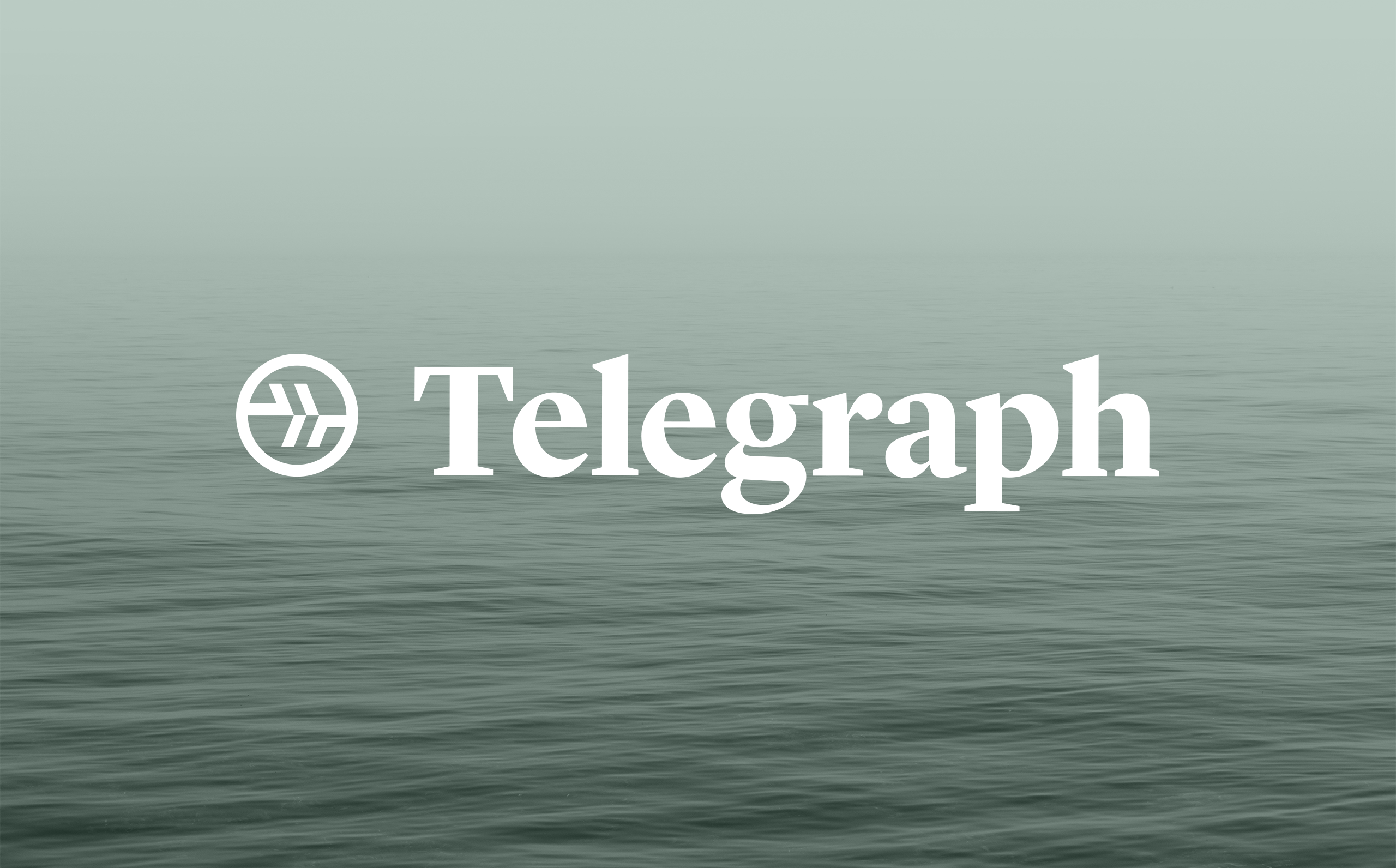
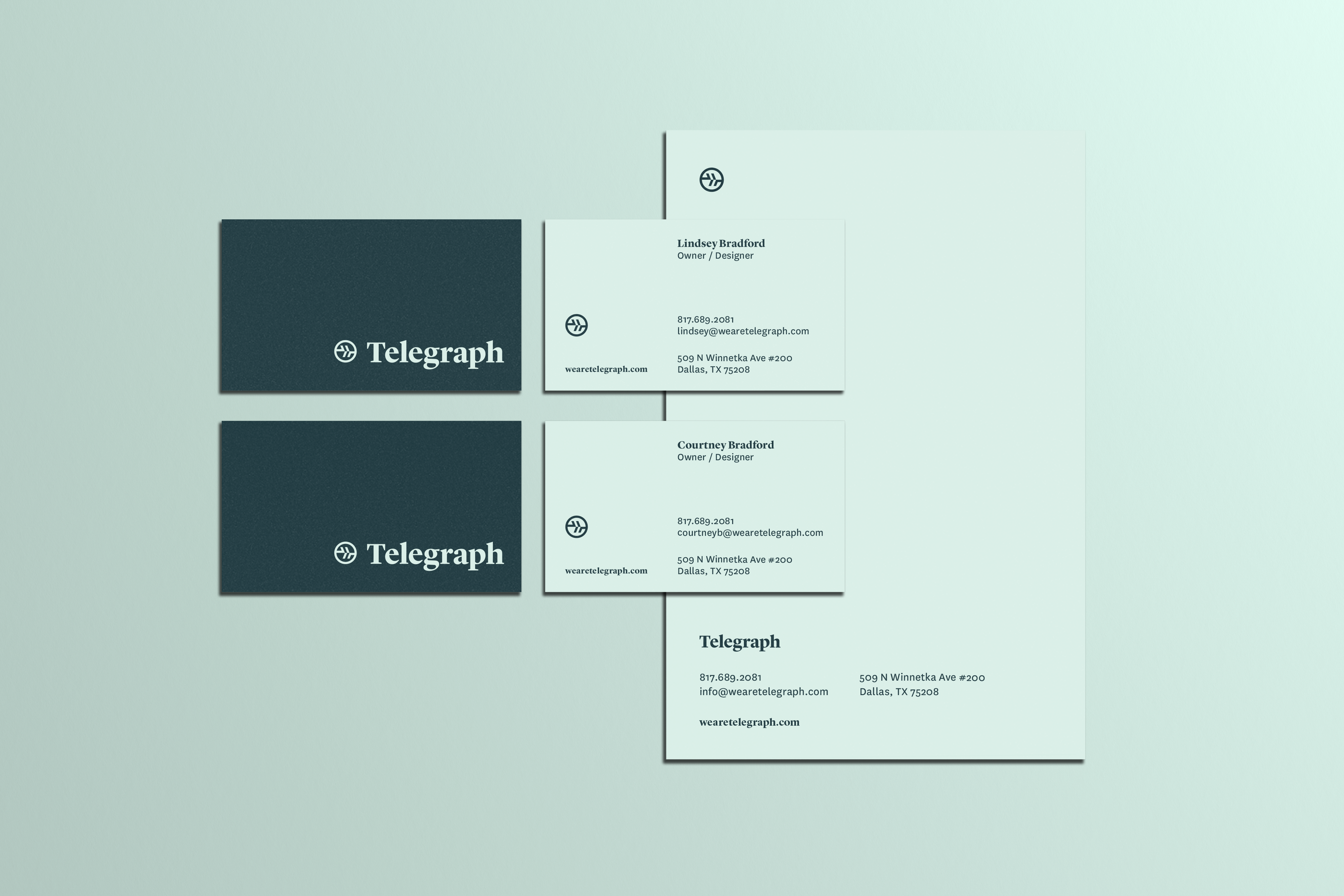
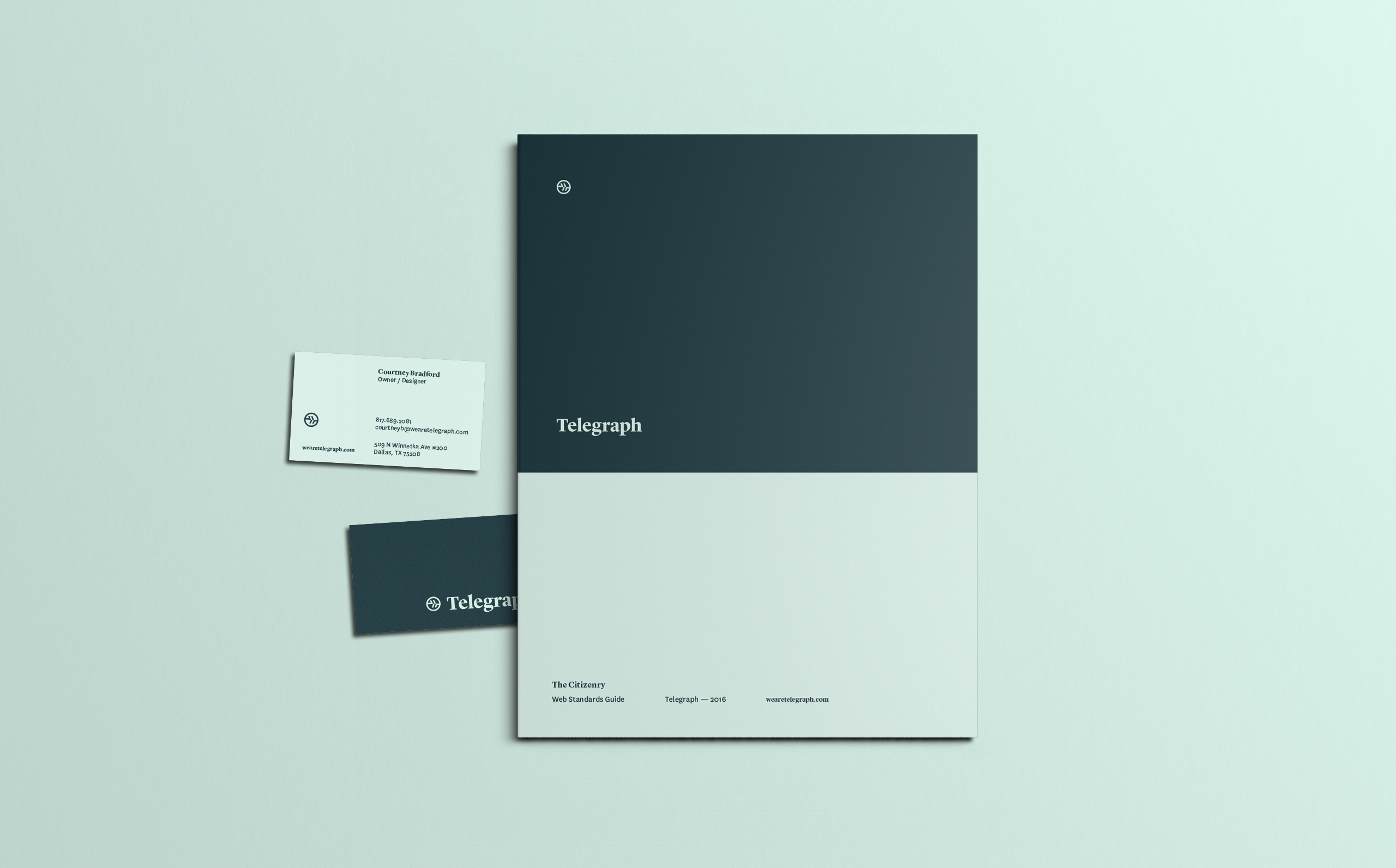
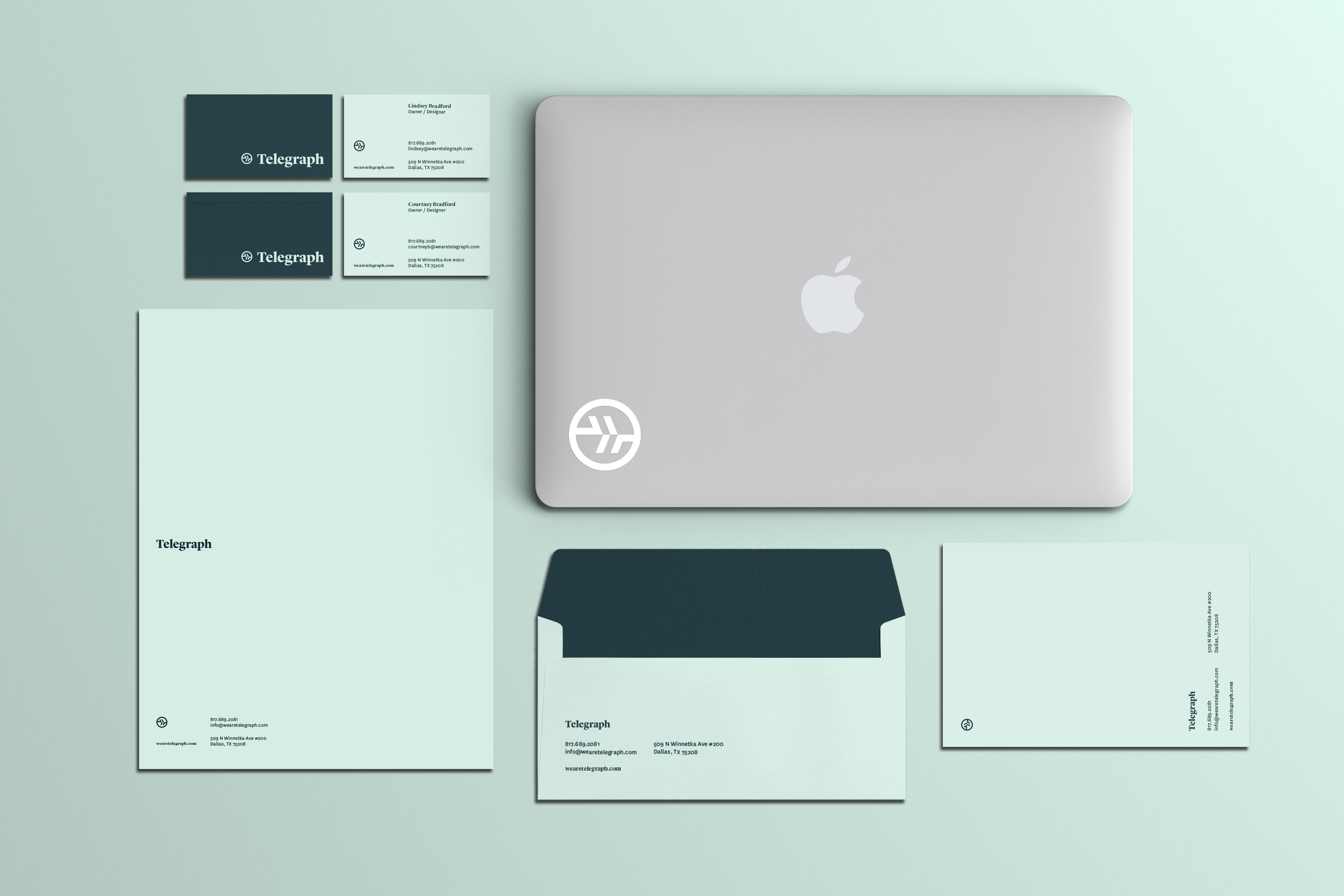
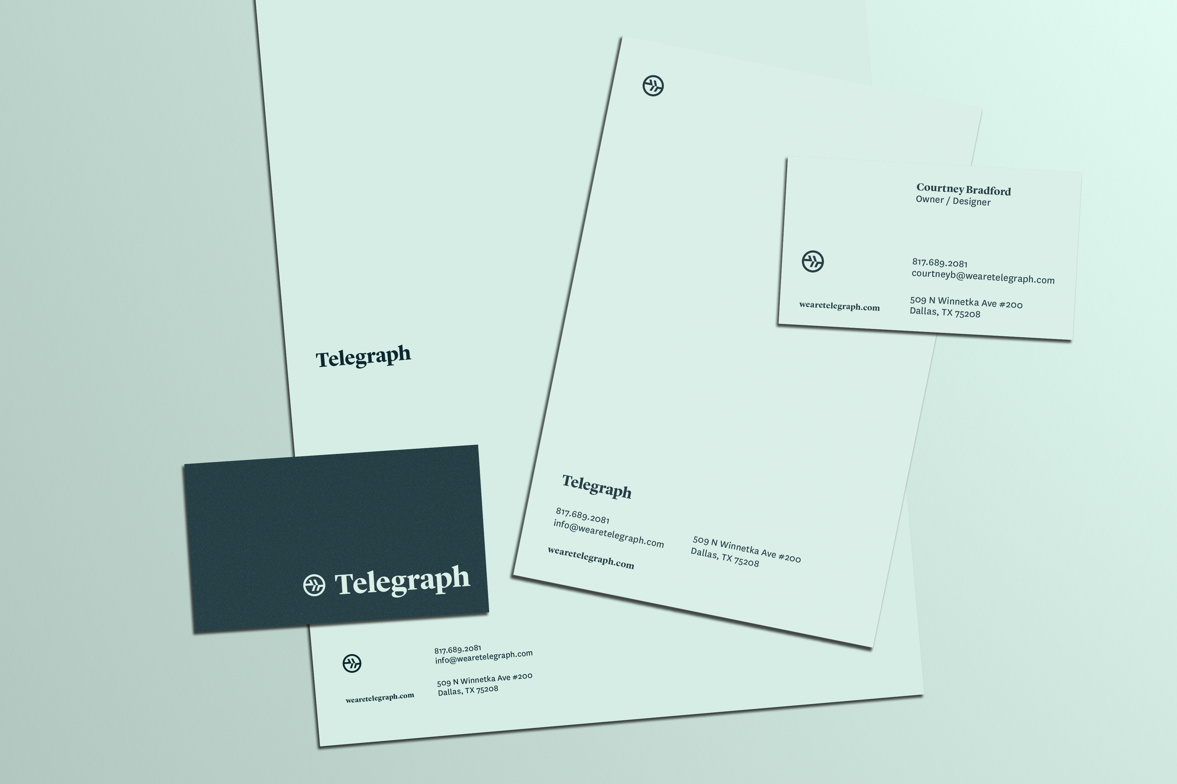
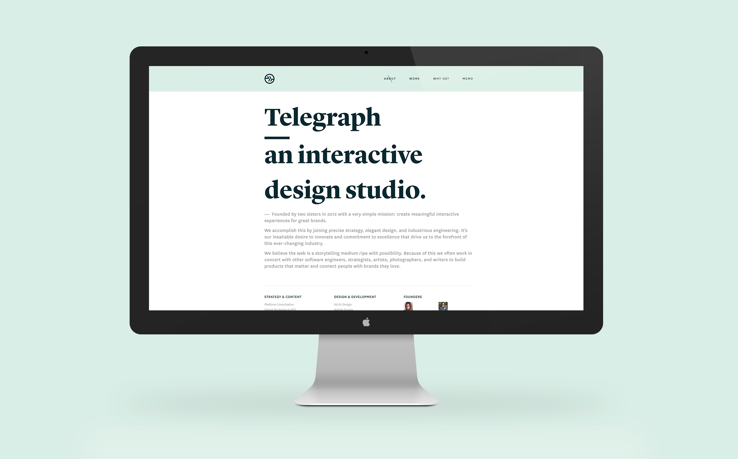
When it comes to their work, Telegraph seeks to combine technical expertise and vision to produce a superior product for their clients. As an interactive design studio, their insatiable desire to learn keep them at the forefront of the industry. It was important to the owners that the brand reflected these values.


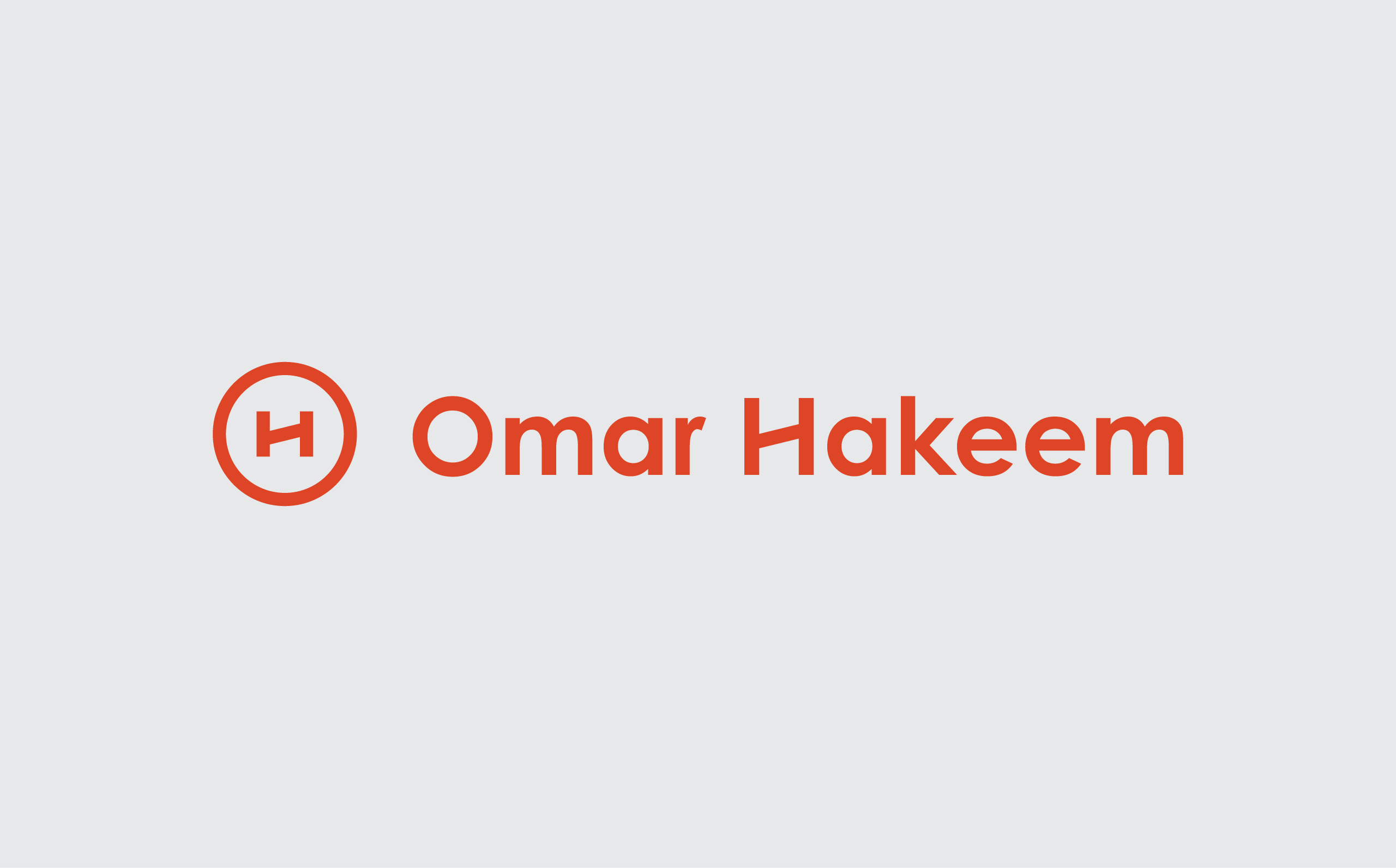
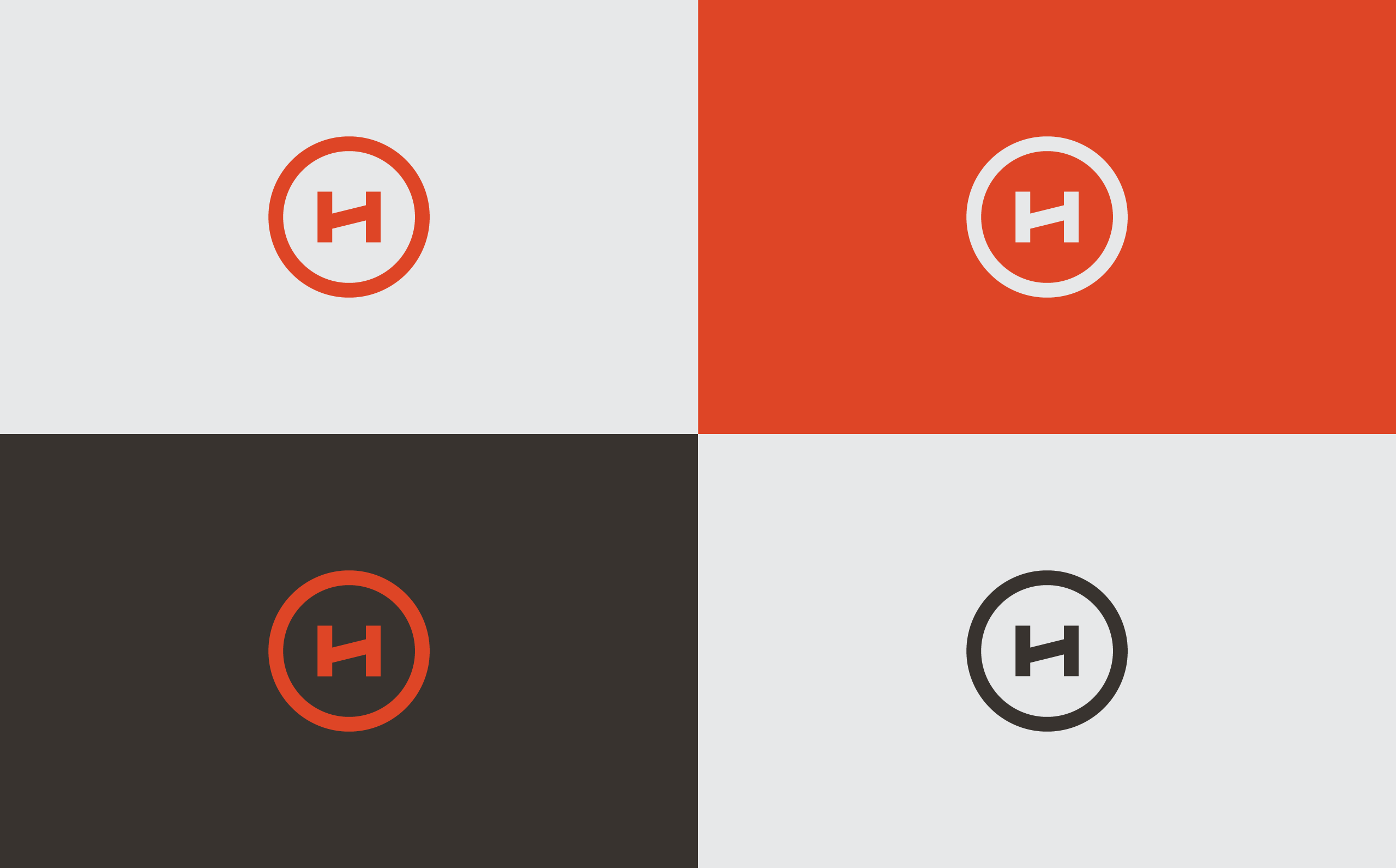
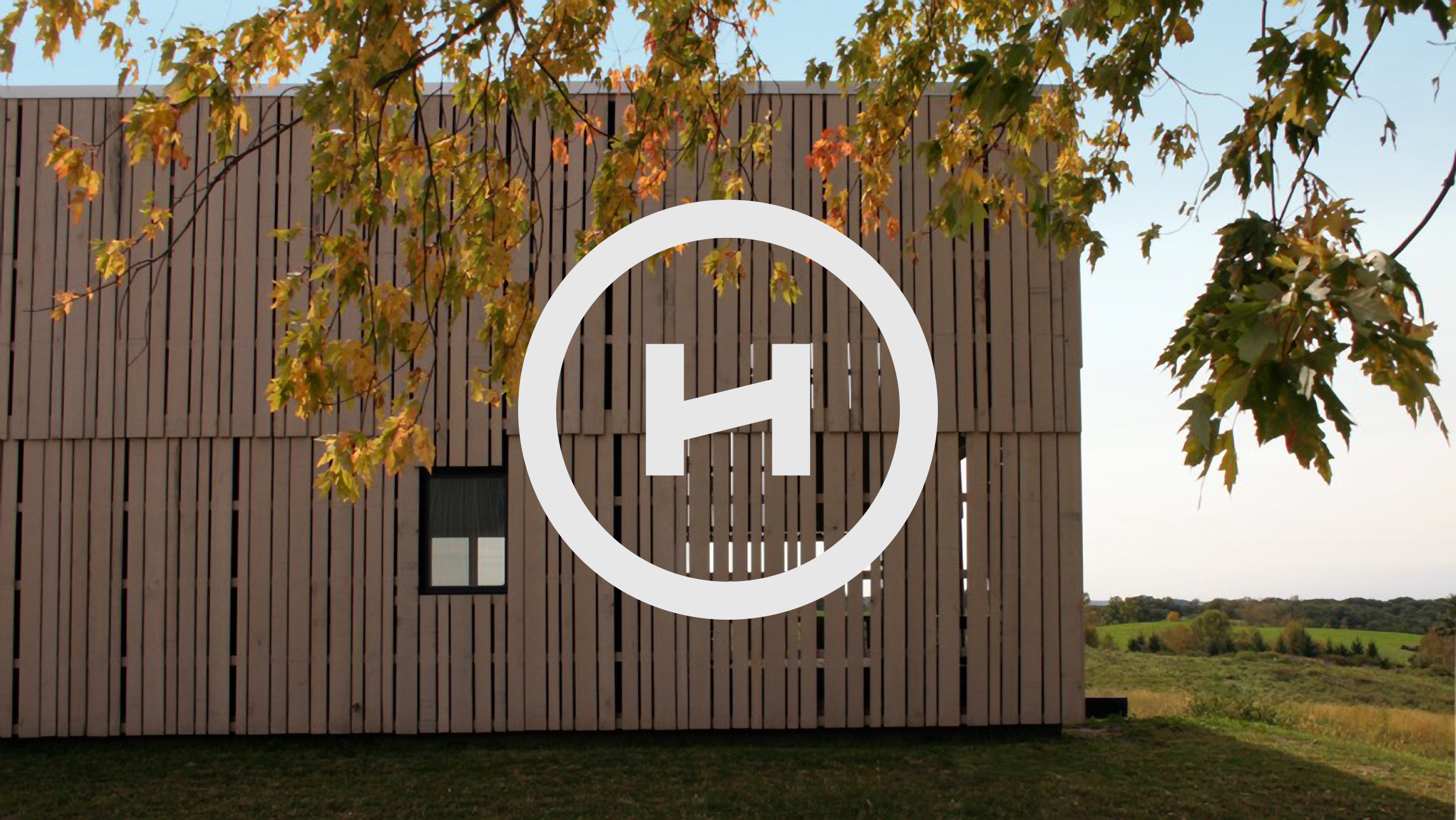
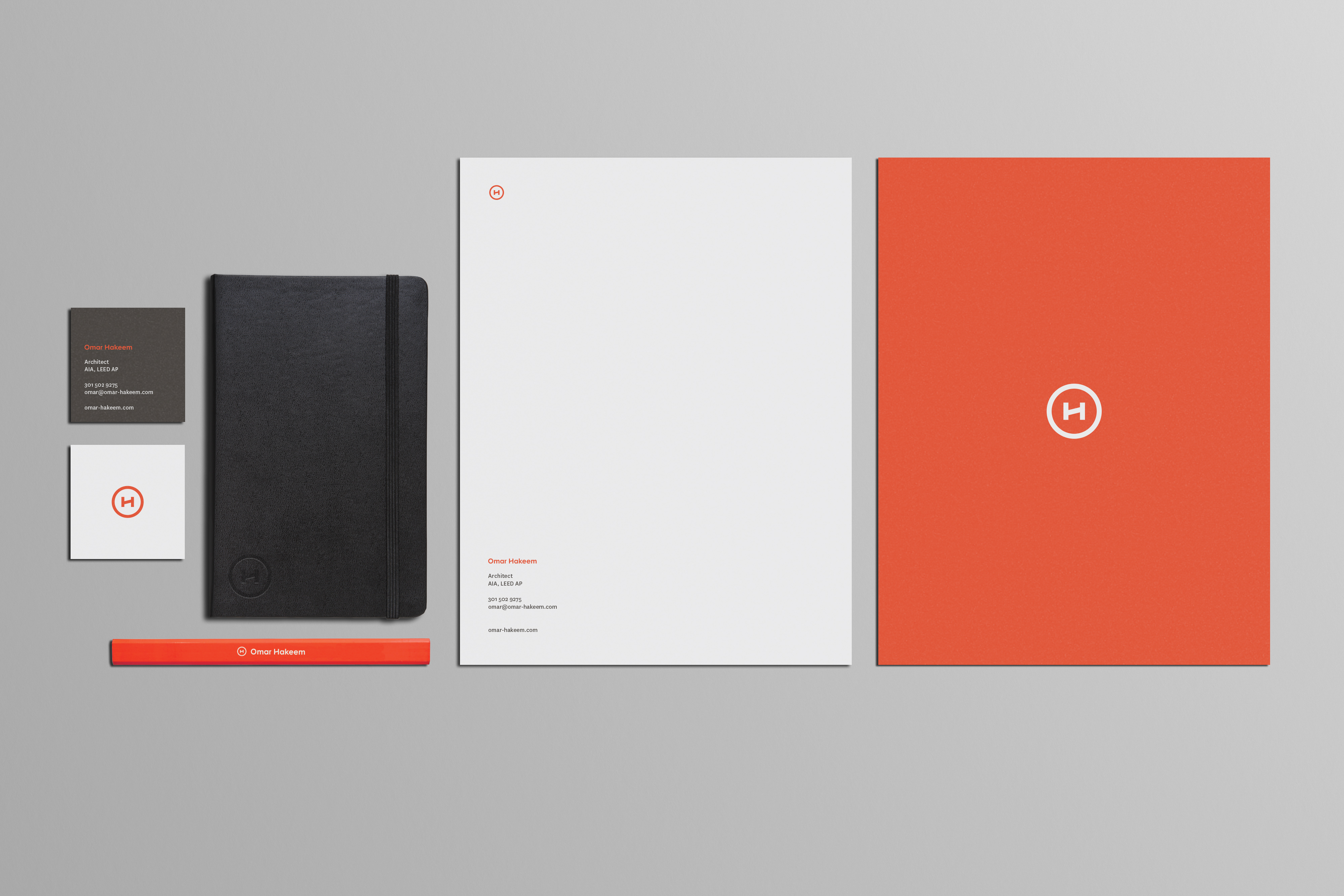
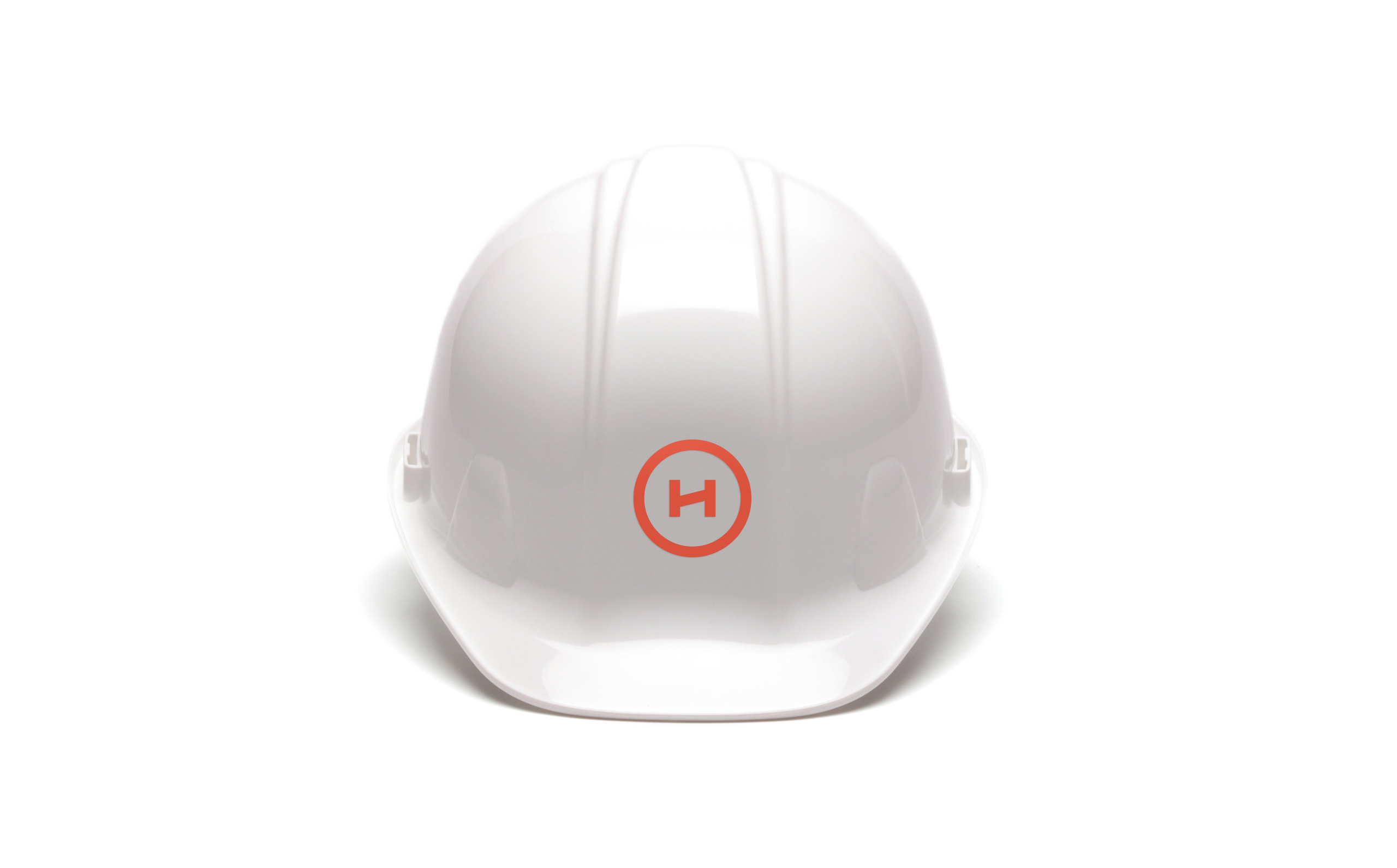
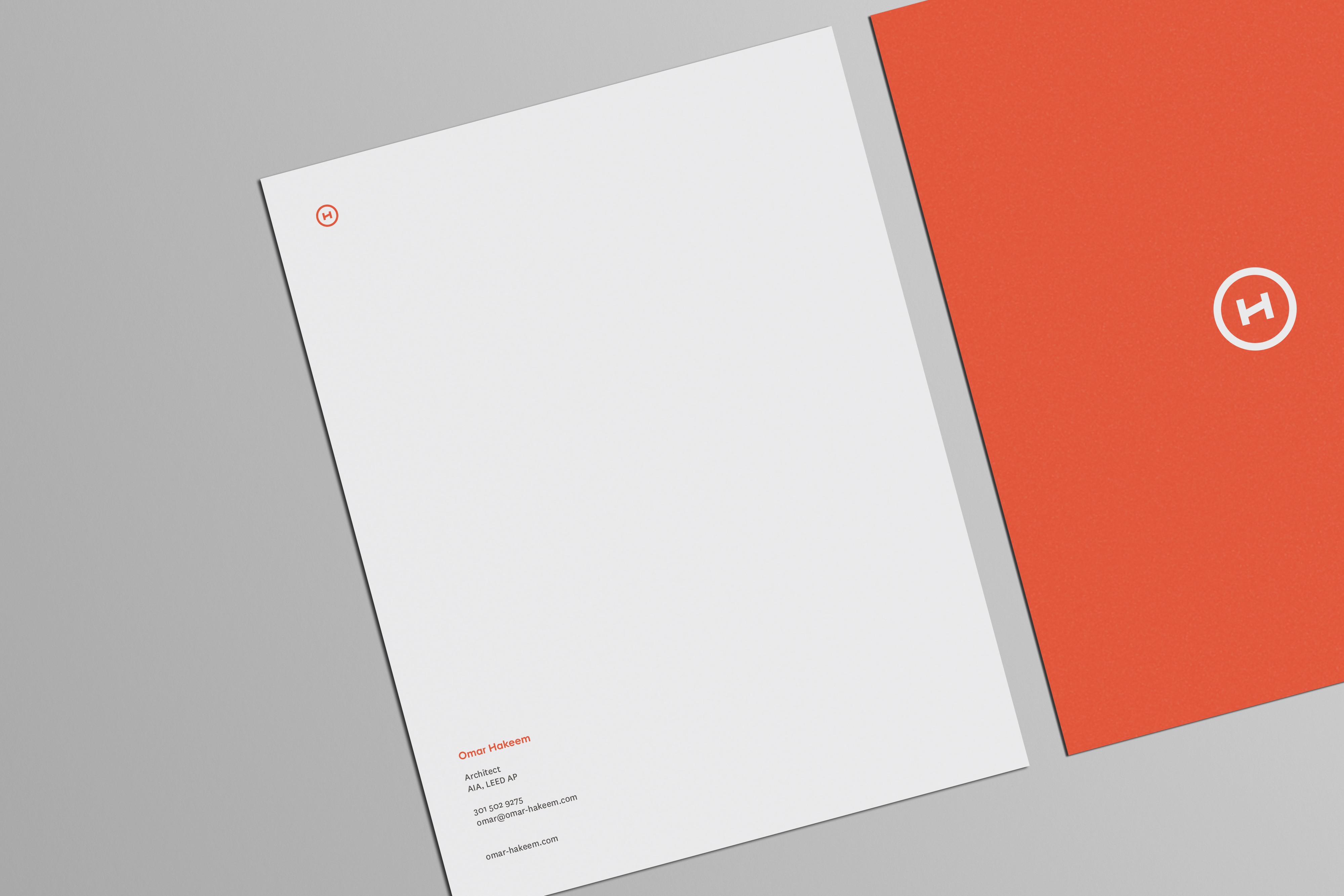
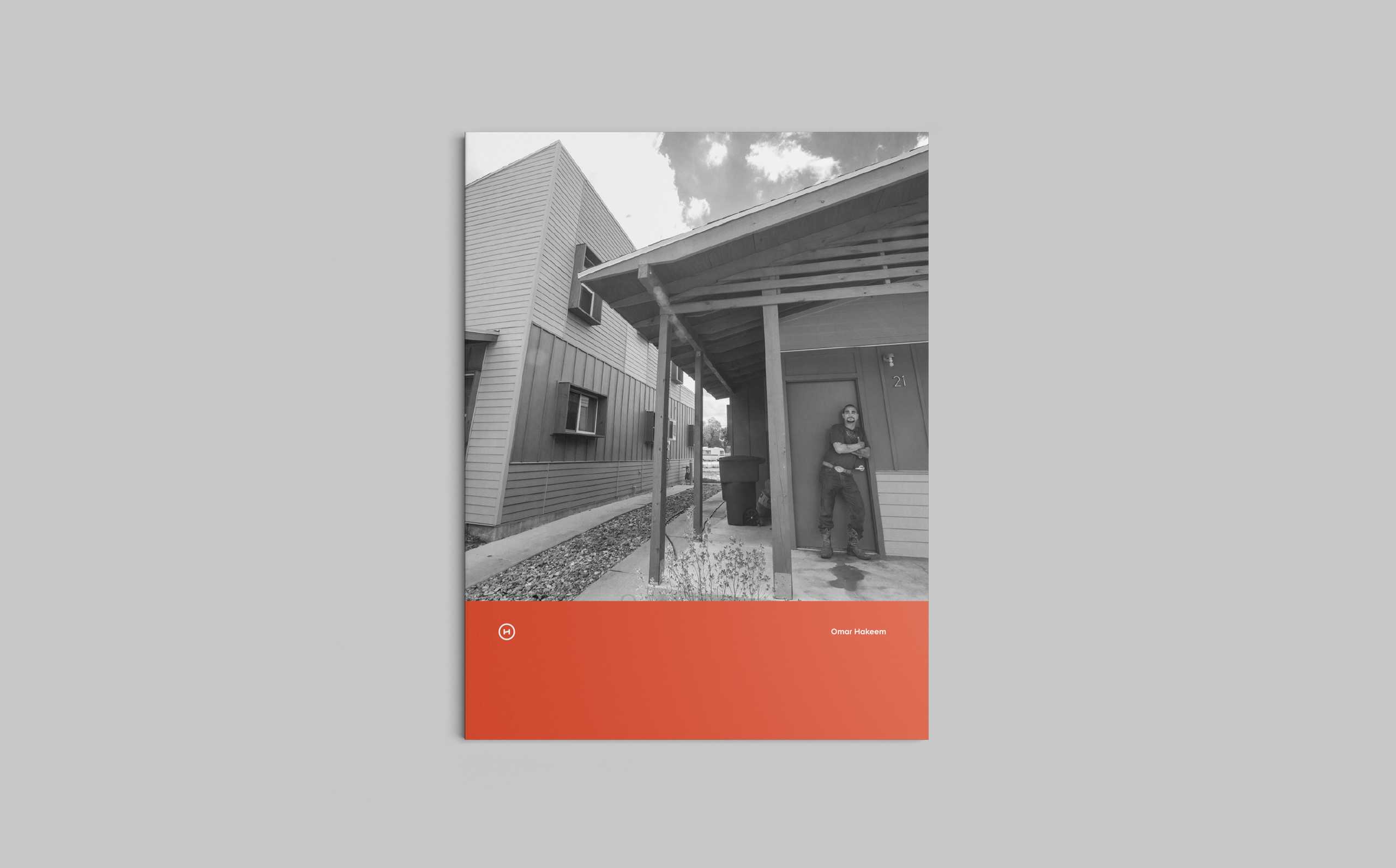
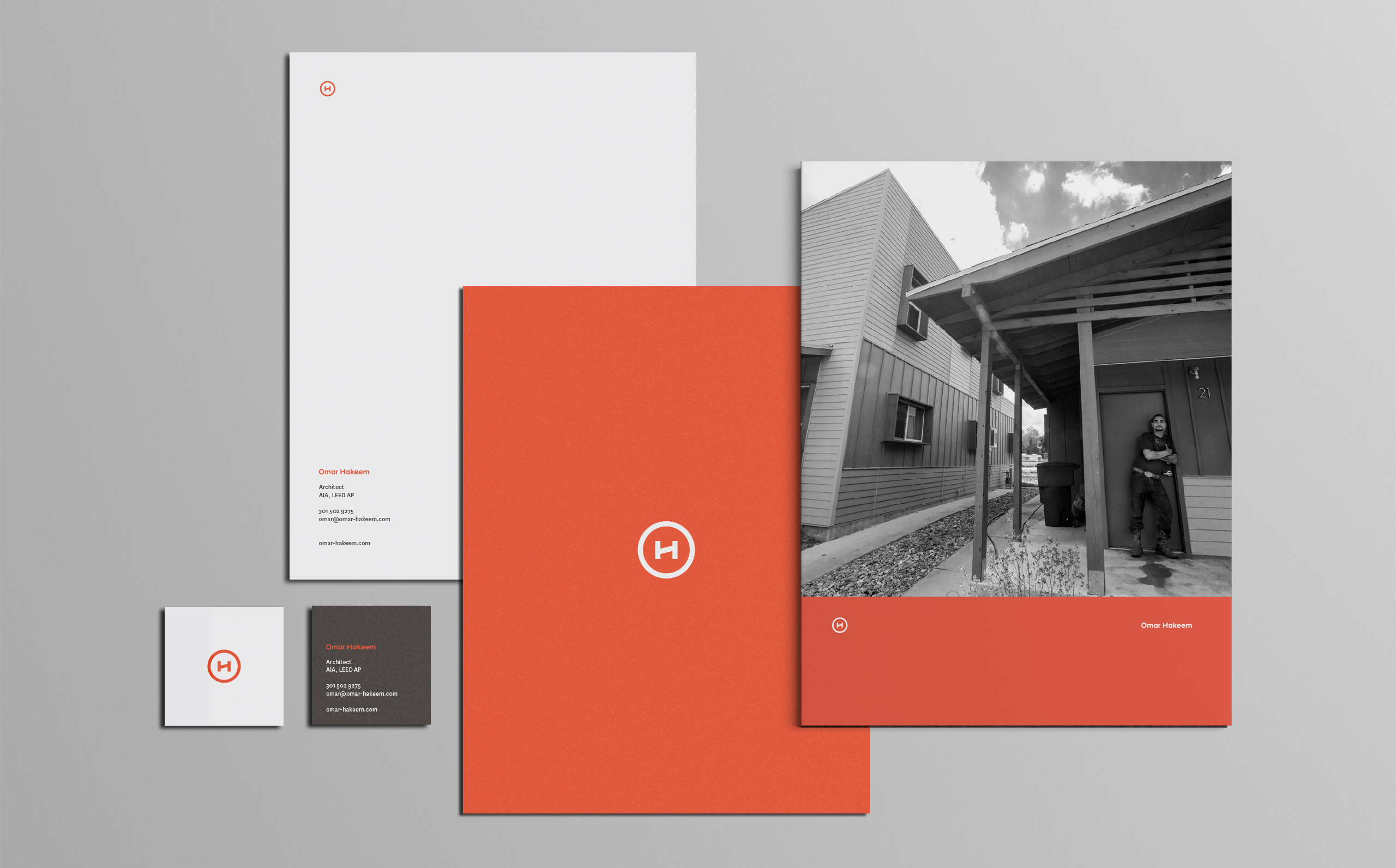
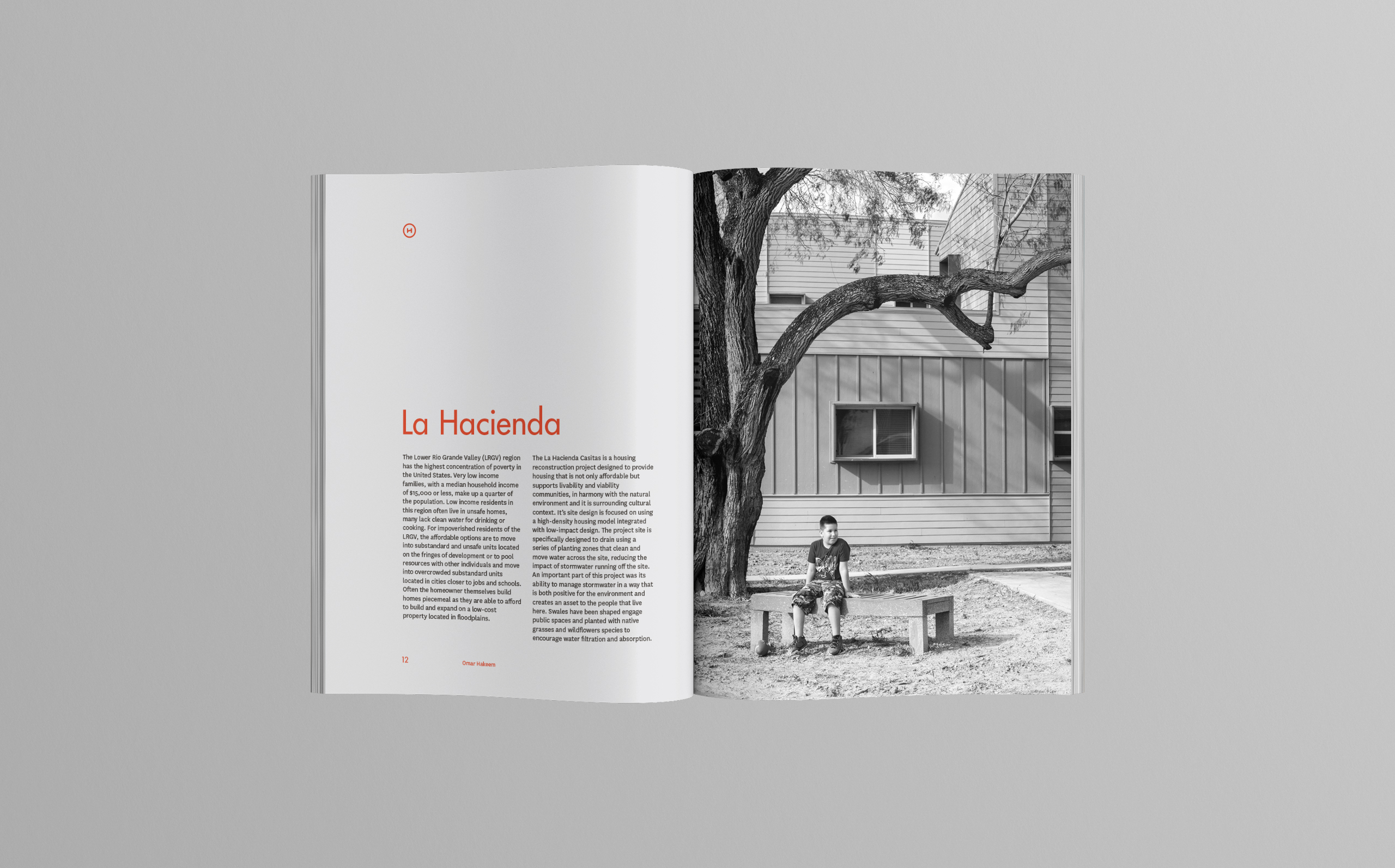
Omar Hakeem is a D.C. based architect, specializing in social and environmental equality through thoughtful design and planning. He has completed award winning affordable housing projects, rapid response disaster housing prototypes, urban bike and pedestrian infrastructure, regional drainage improvements, and community based rural planning initiatives. Omar’s passion for design has taken him from the cloud forests of Costa Rica to the ravaged communities of the Gulf Coast and many places in between. His professional practice has also included supporting large arts & cultural projects and prefabricated modular buildings. With such a diverse portfolio and skill set, it was important for the brand to not stand in the way of the work. A modern brand based on sharp lines and perfect circles mimics Omar’s standard principles of design.
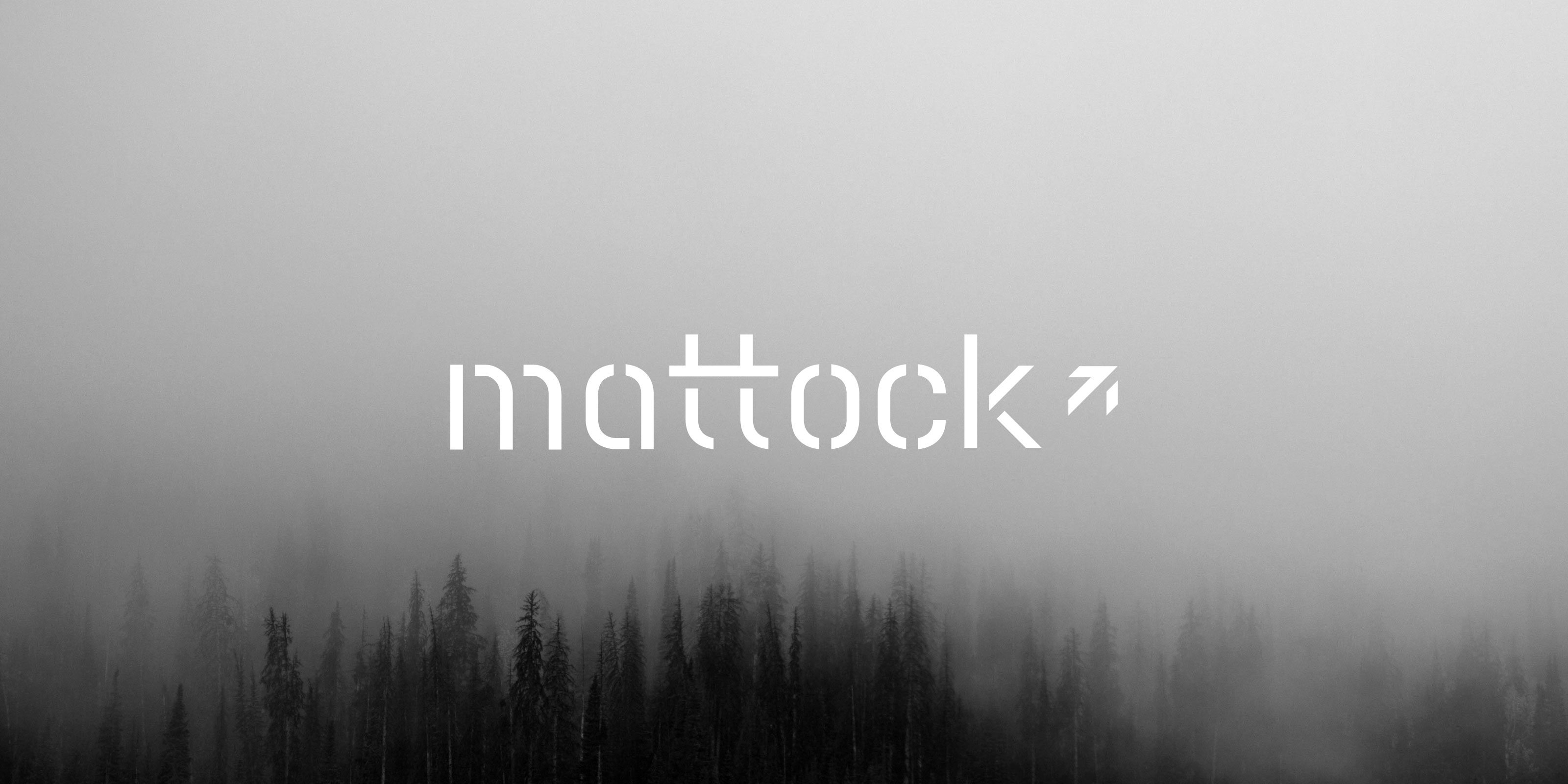
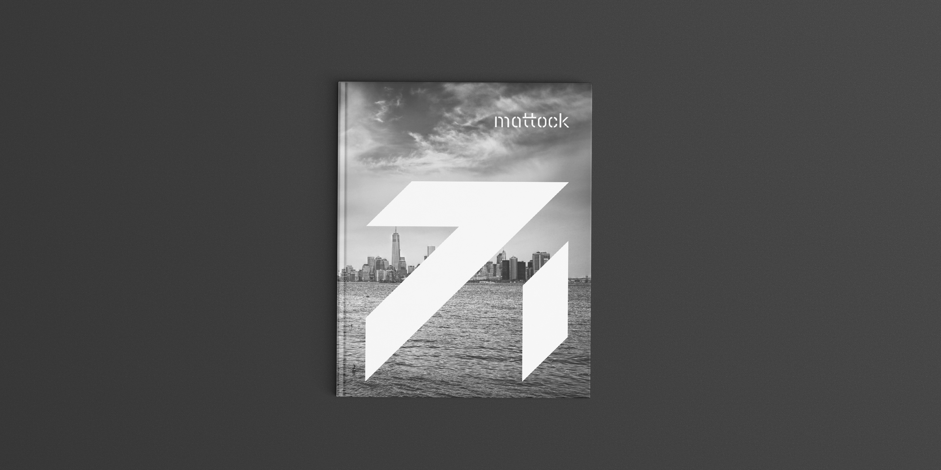
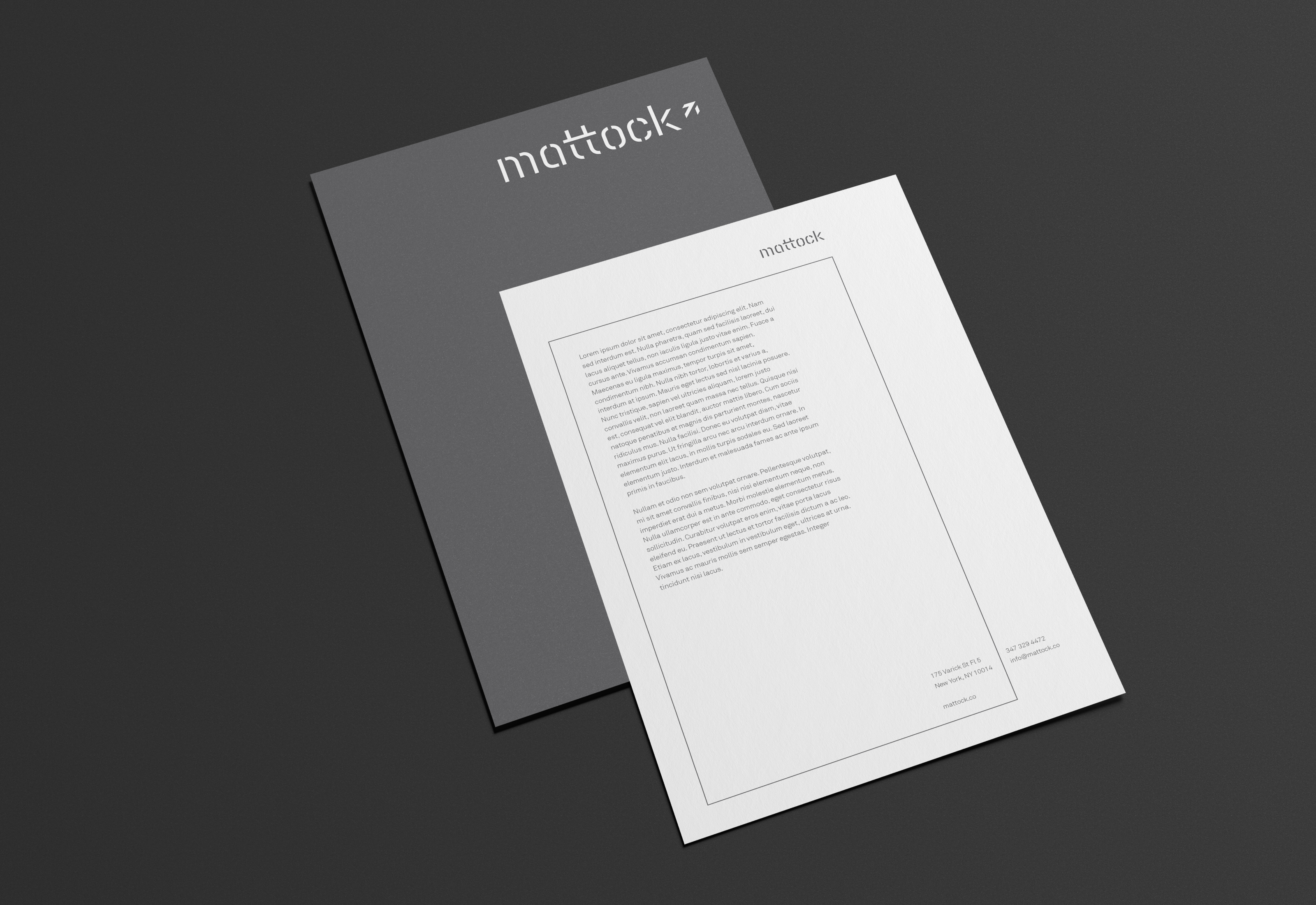
Upward & Onward. A mattock is a versatile tool that is actually two tools in one. The two founders of Mattock felt it was the perfect name to represent their new partnership. After years of experience in the high-end agency production industry, they set out to write their own story by combining their talents with a new venture. Done in collaboration with Scott Hill for Studio Mast.

Cutting Through the Clutter.
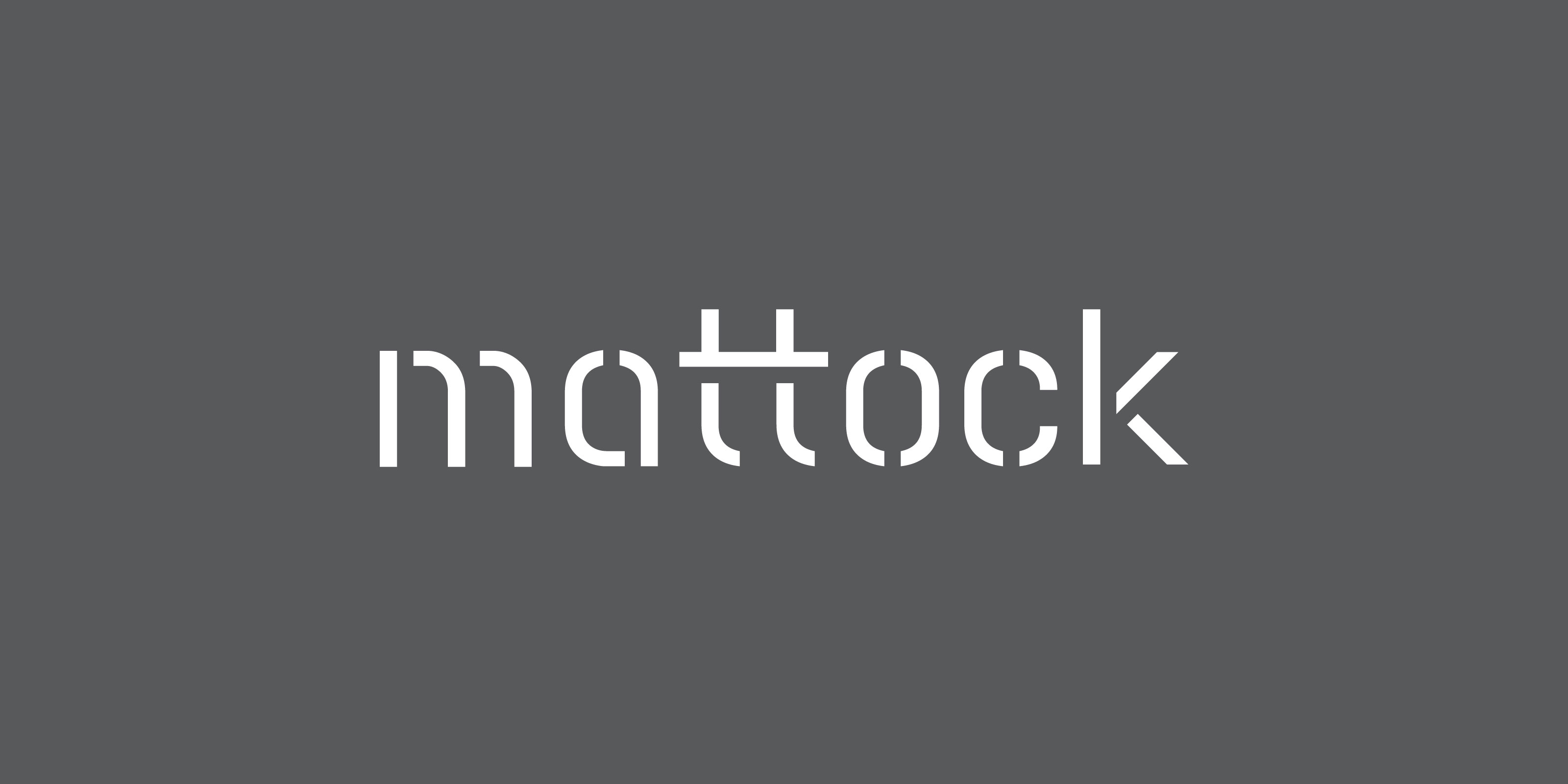
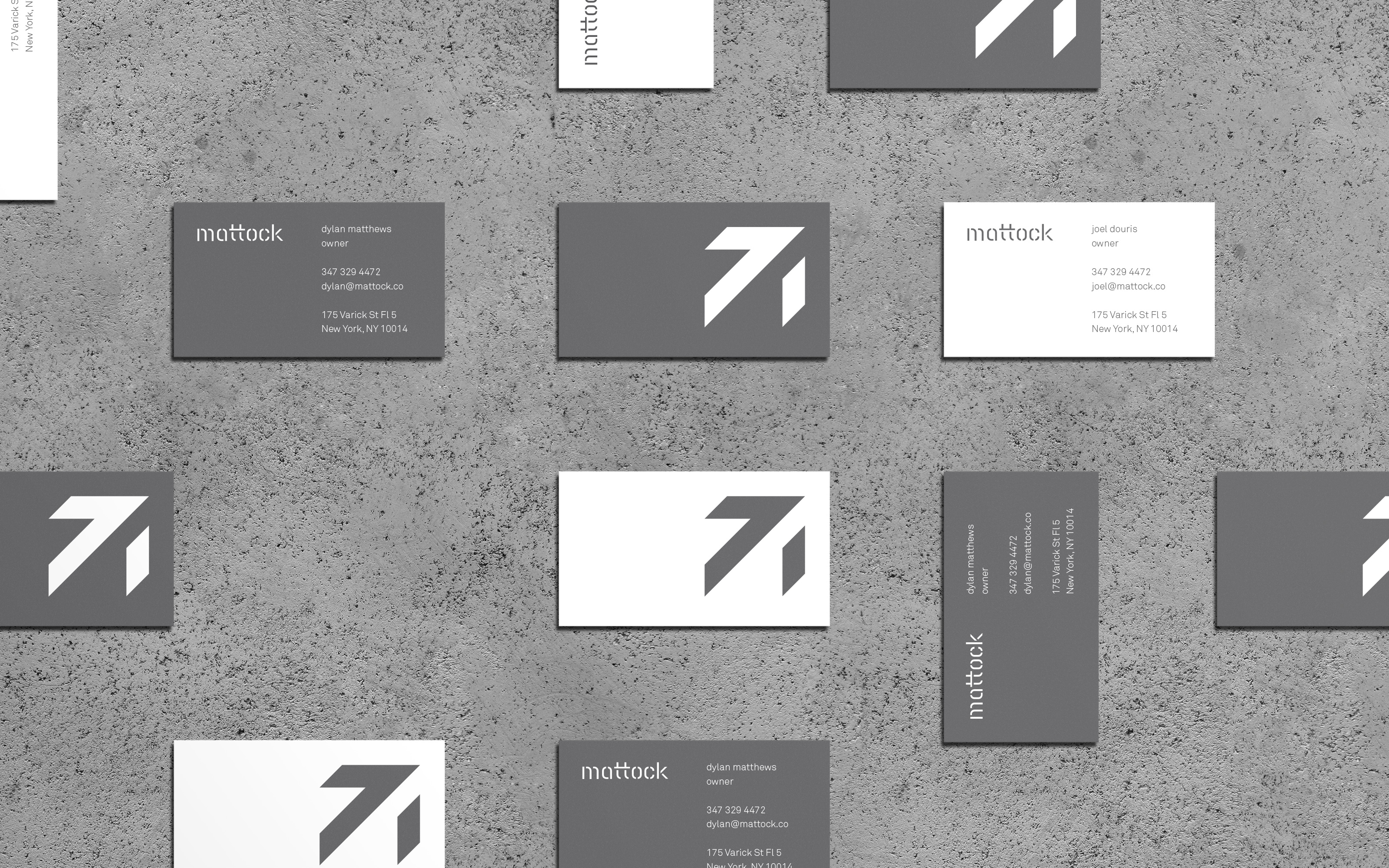
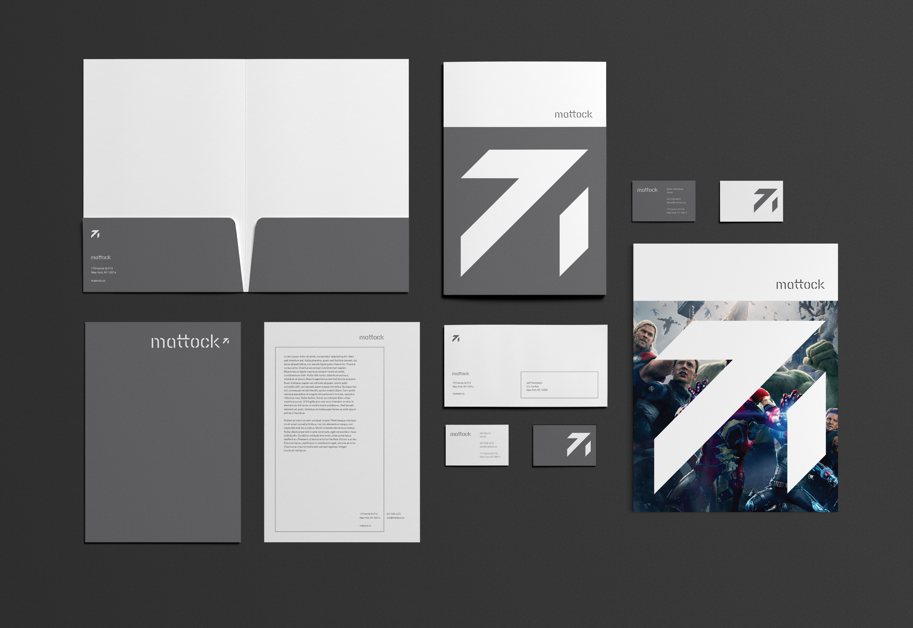
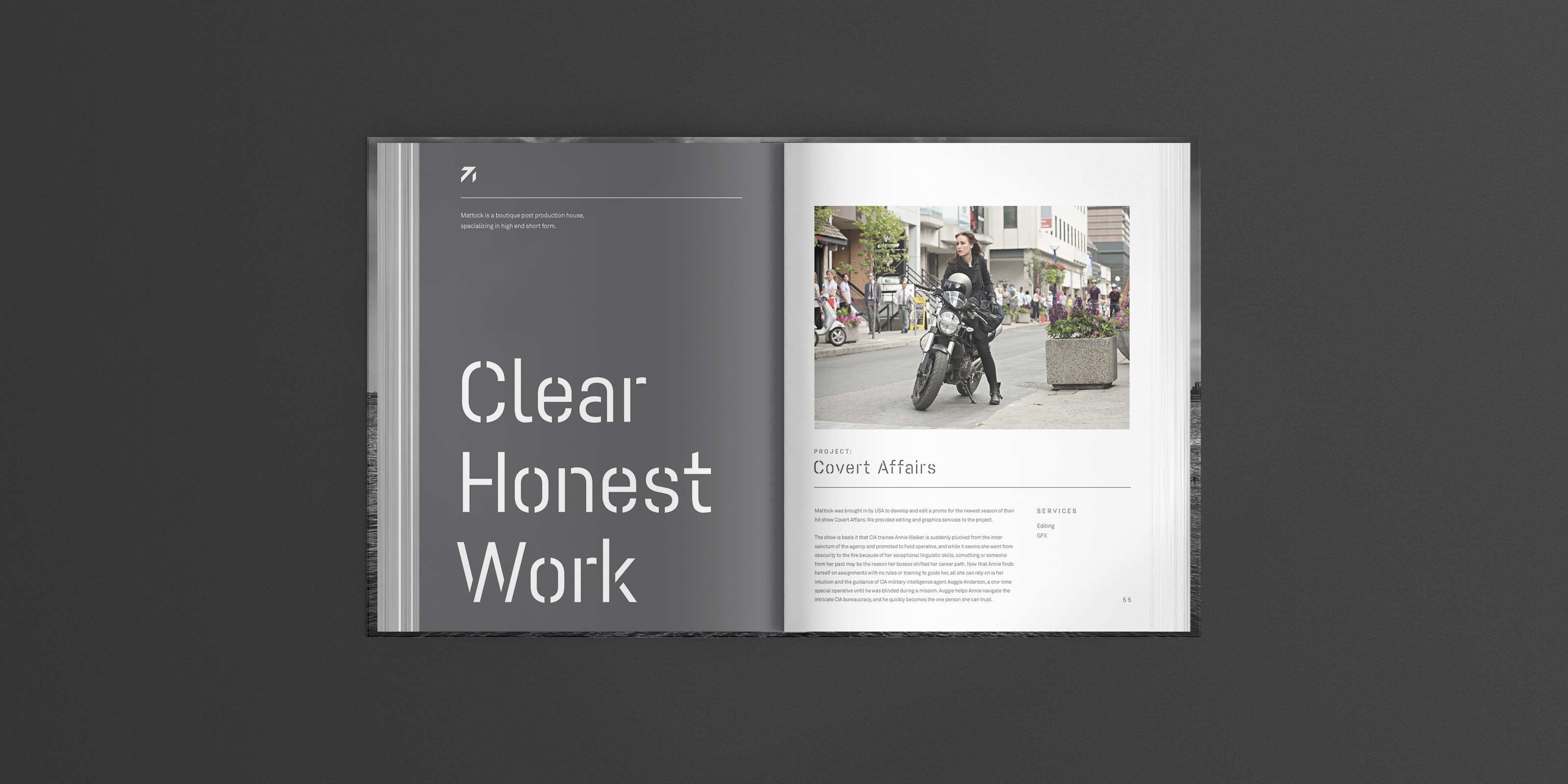
It was important to Mattock to make sure the brand didn’t overshadow the high caliber work they present. The logotype and logomark both utilize a stenciled approach, leaving only what is necessary to present the mark. The brand behavior throughout all materials utilizes a similar approach rooted in simplicity.
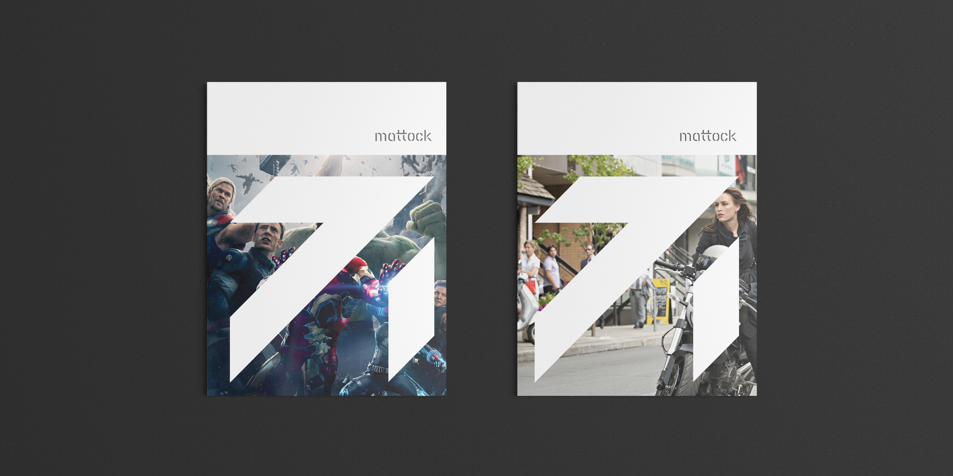
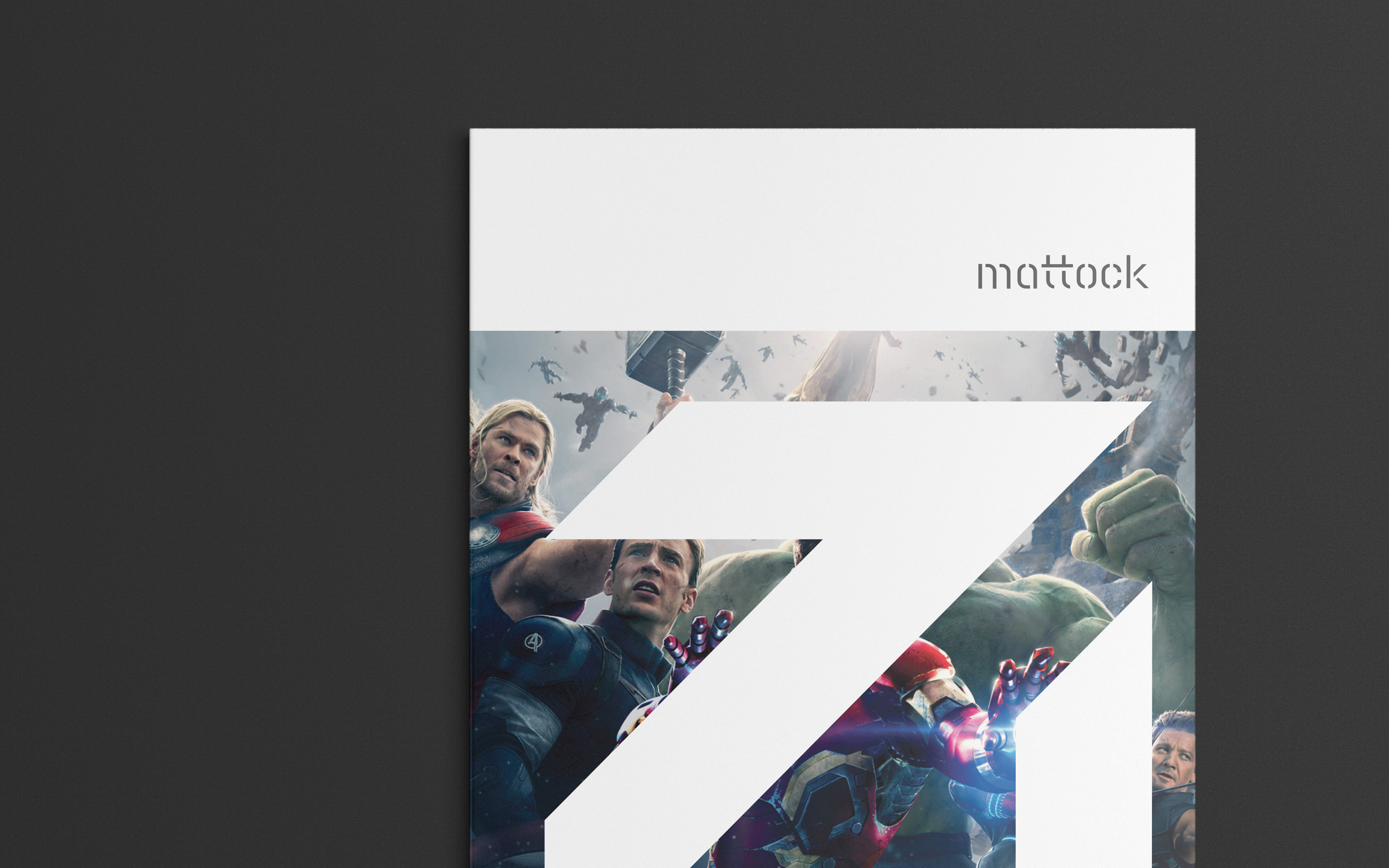
With clients like Discovery Channel, National Geographic, and NBC, Mattock has a wealth of powerful imagery to promote their brand. The brand materials feature snippets of the work front and center to let it speak for itself.

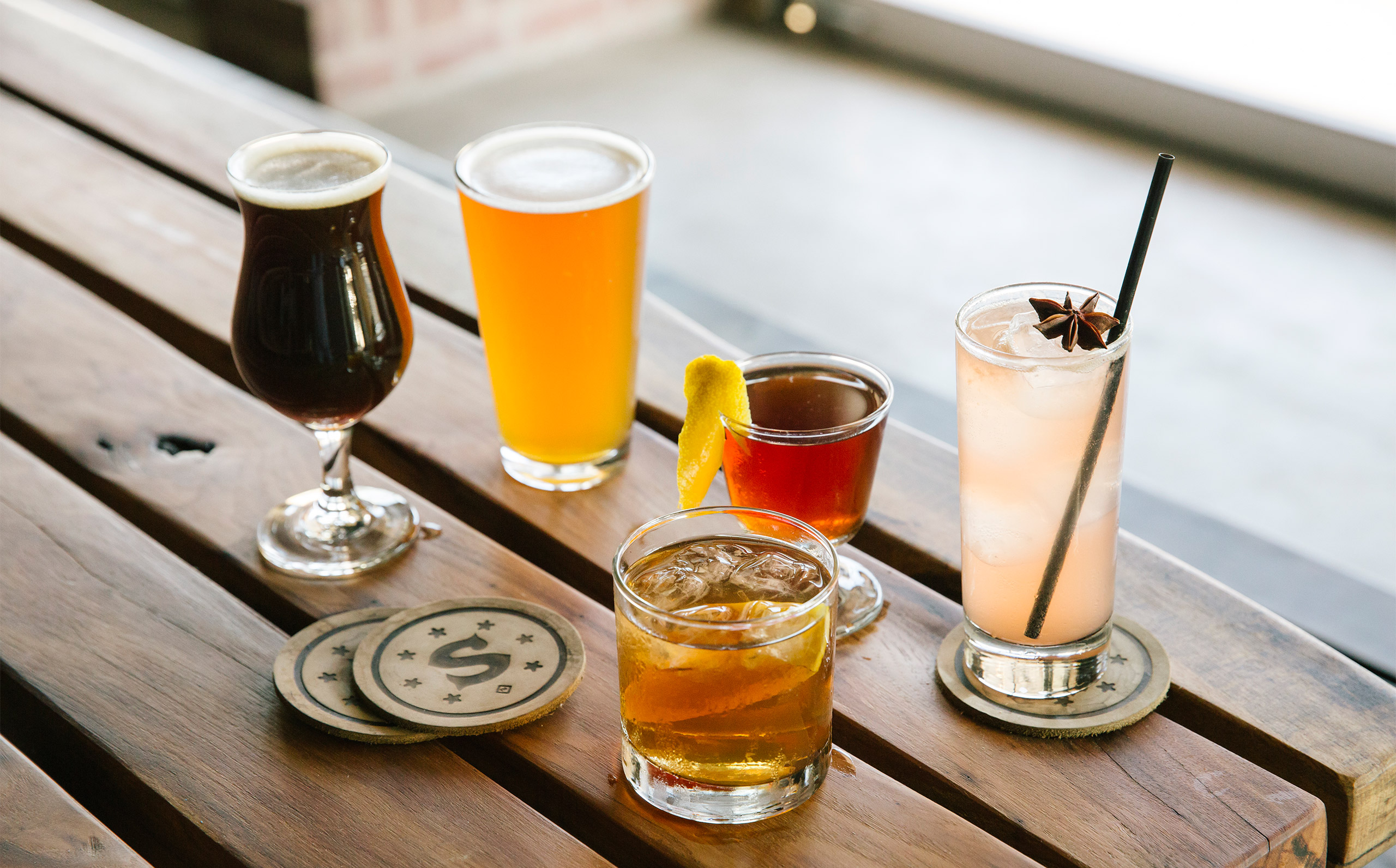
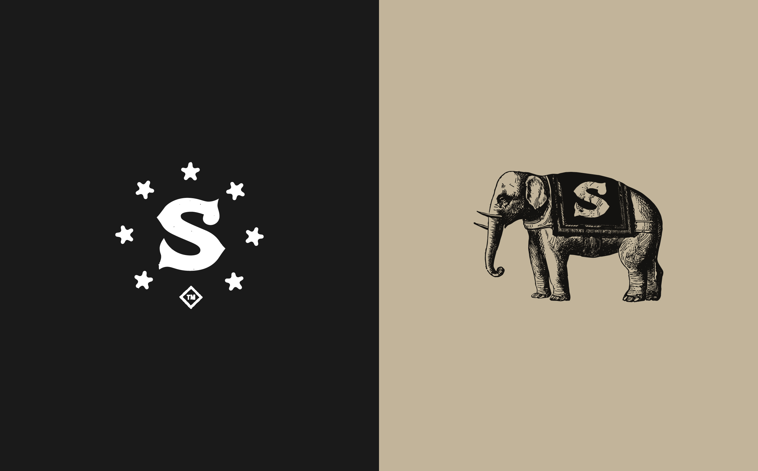
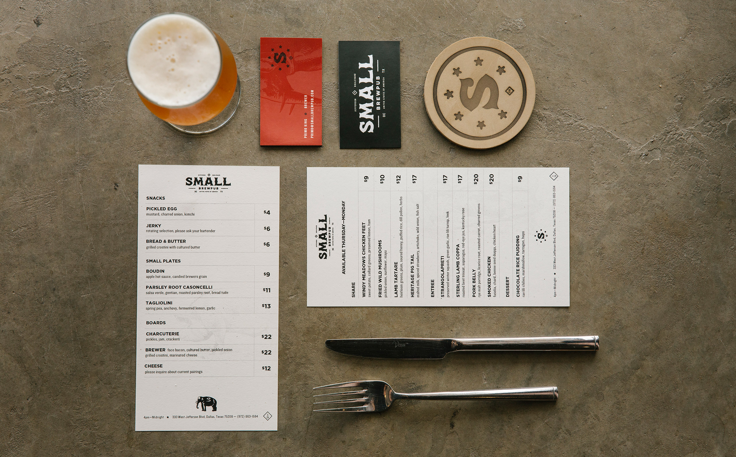
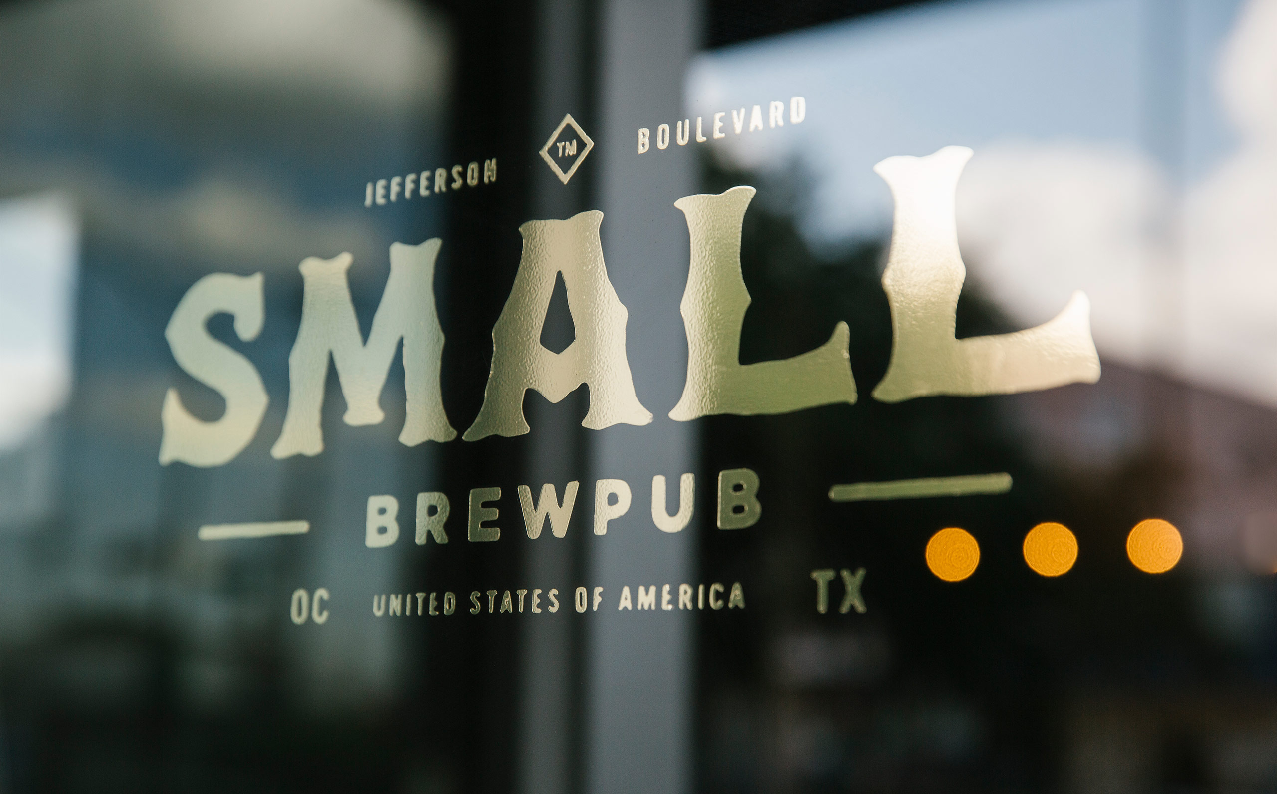
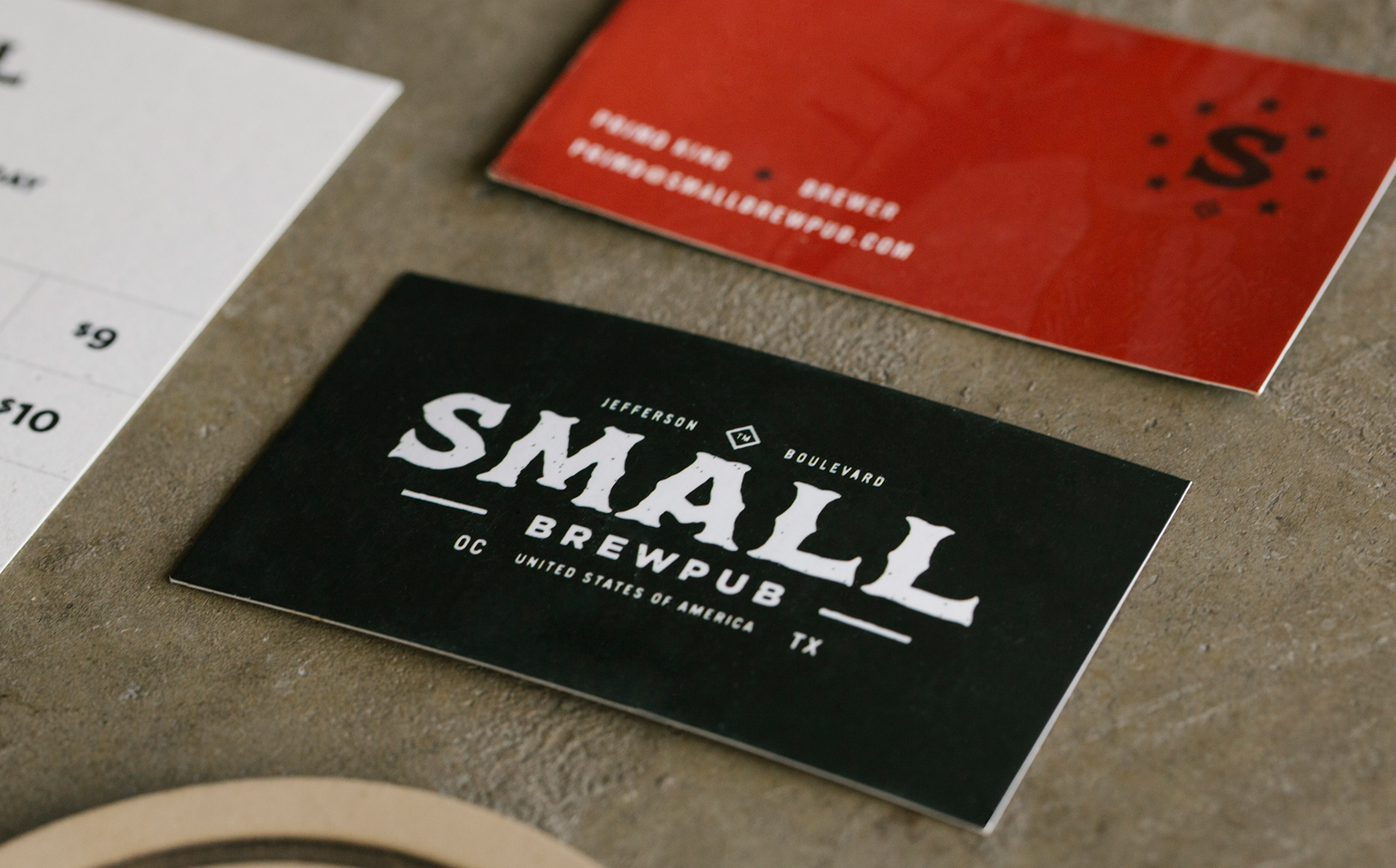
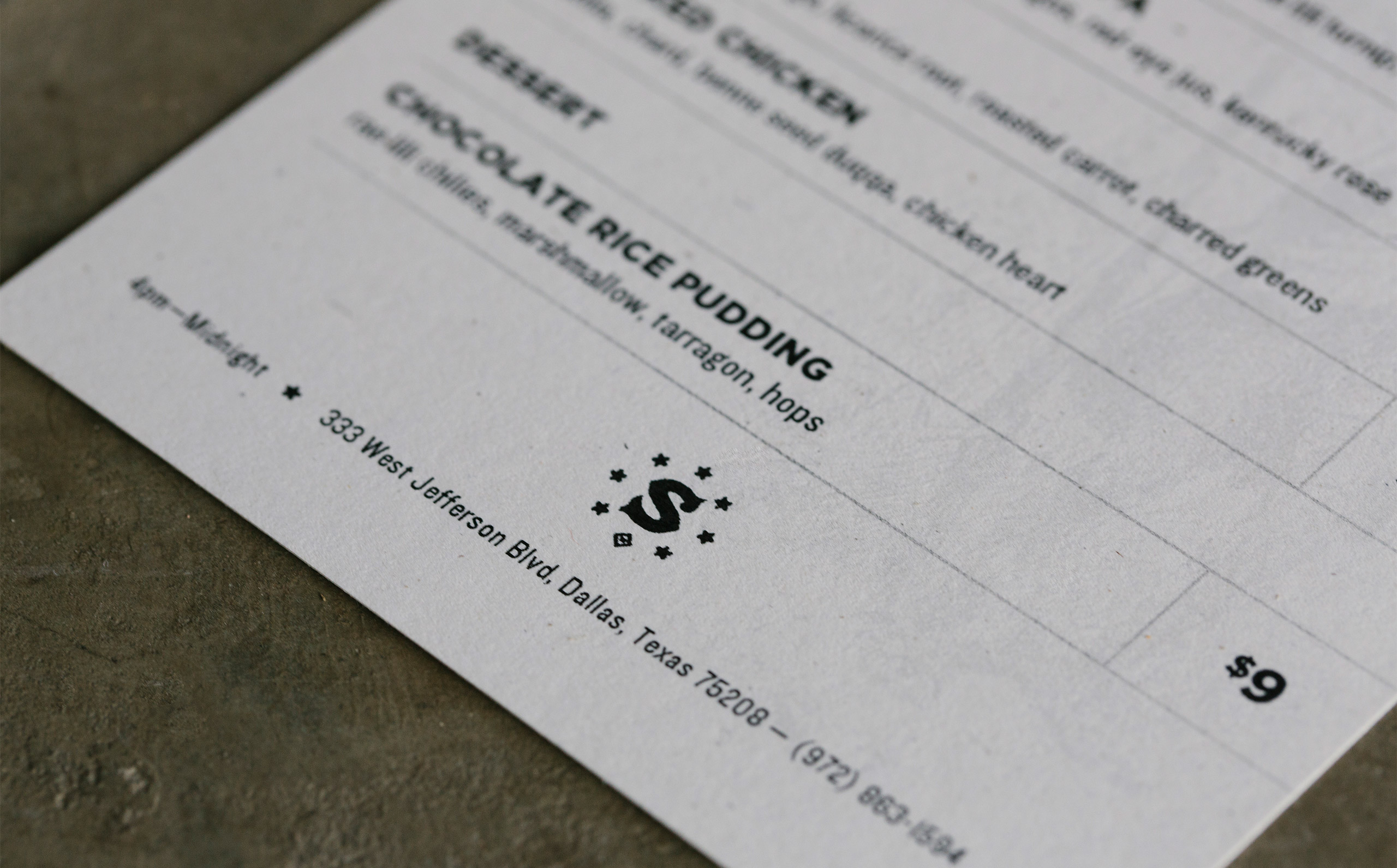
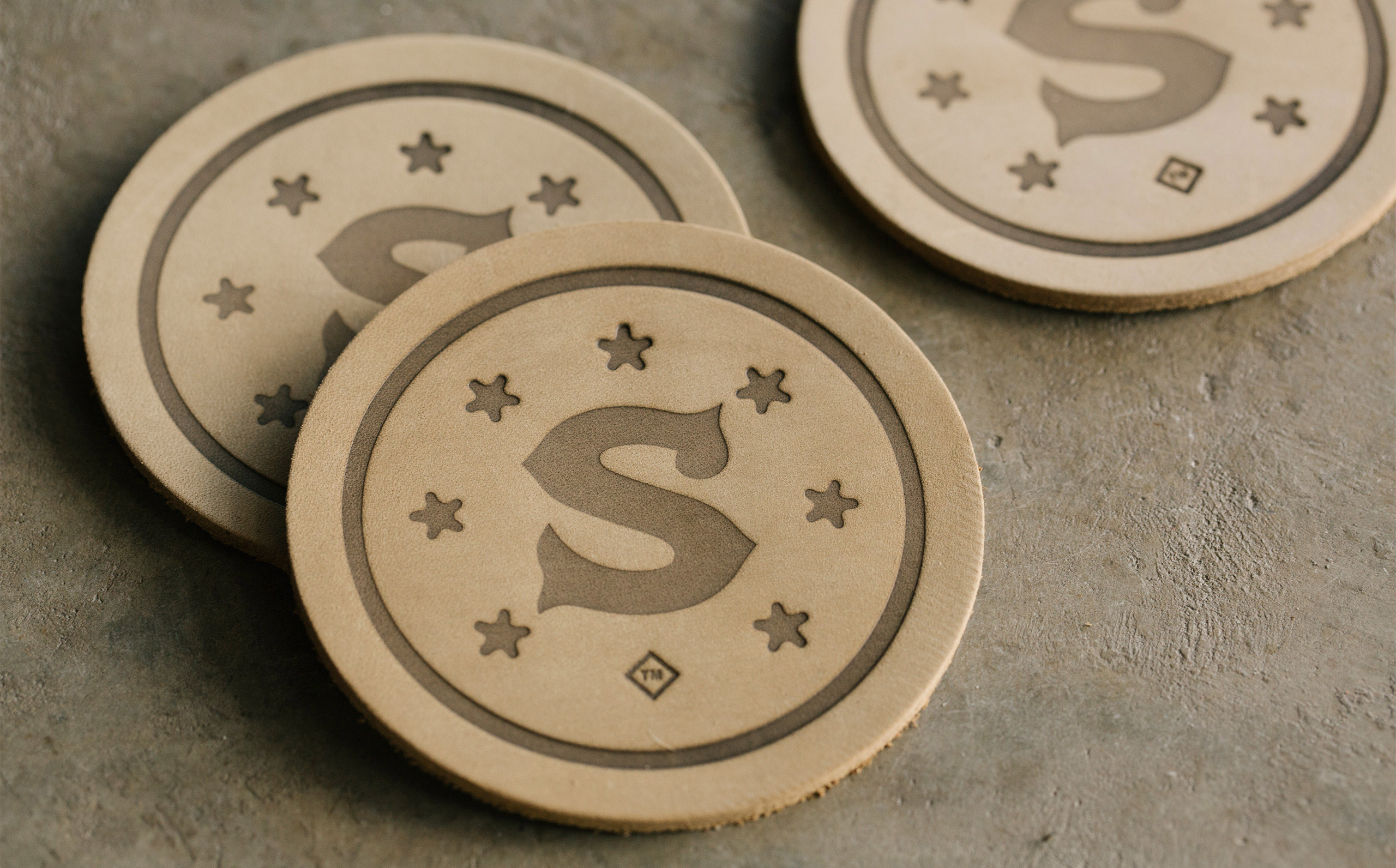
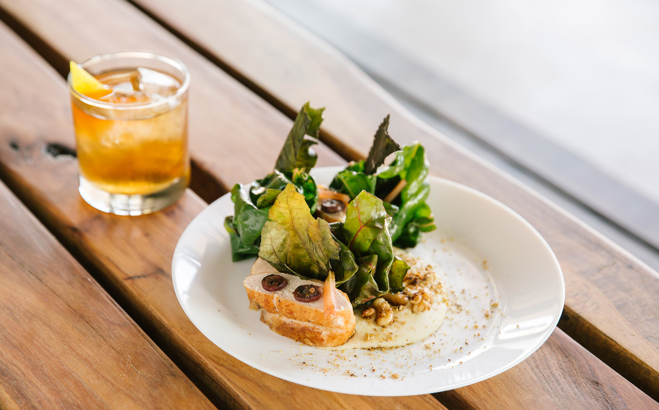
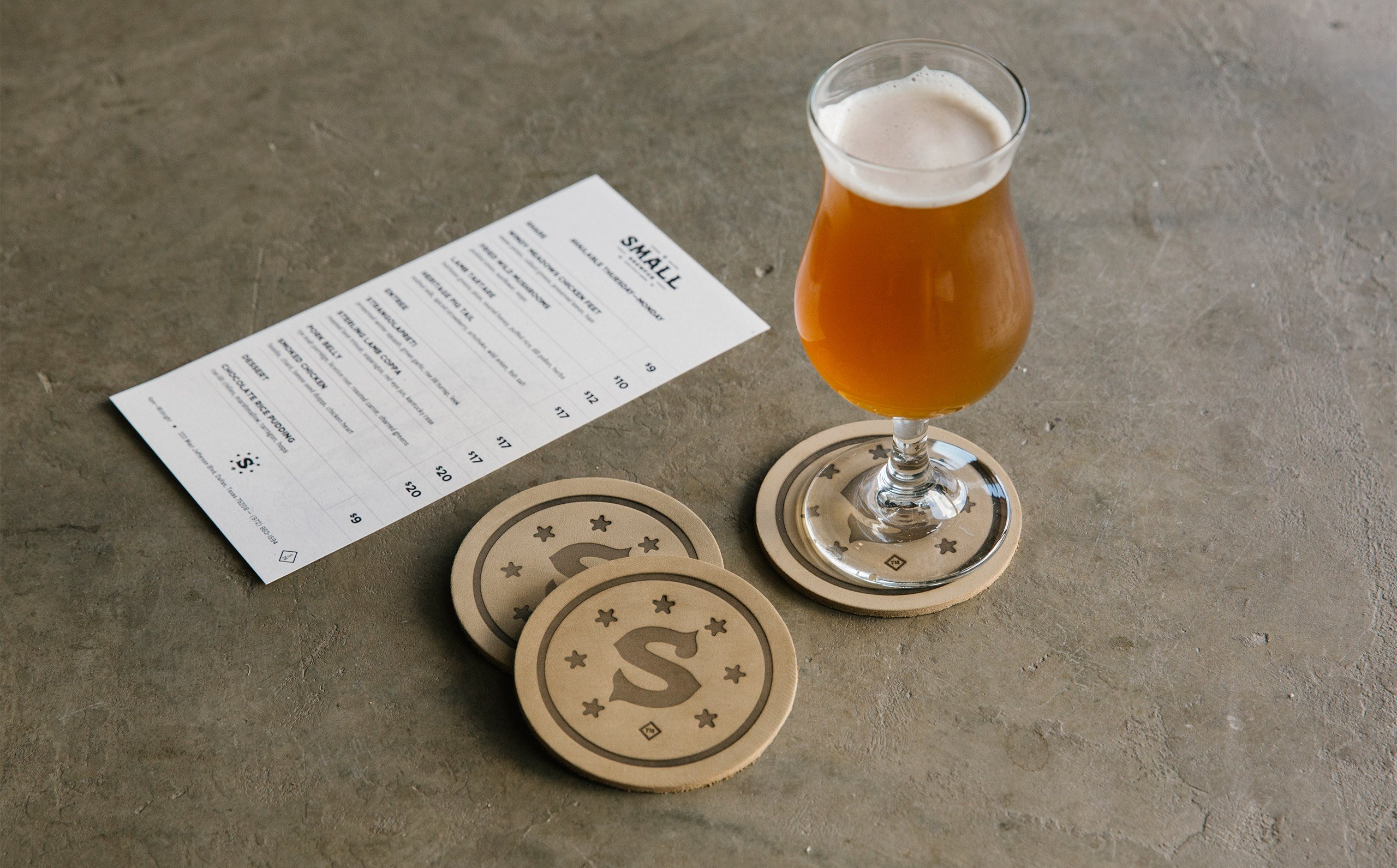
Small is the appropriate moniker for this brewpub. Not for derogatory reasons, but for the story of how they came to fruition. What started as a few friends hosting a weekly backyard party to share the beer they made, eventually grew into a full brewing operation, bar, and restaurant. A unique brand approach was chosen, which combined Texas heritage with a vintage circus motif as a play on the name itself. It was important to the owners to represent where they call home, but also not take themselves too seriously. Done in collaboration with Scott Hill for Studio Mast.
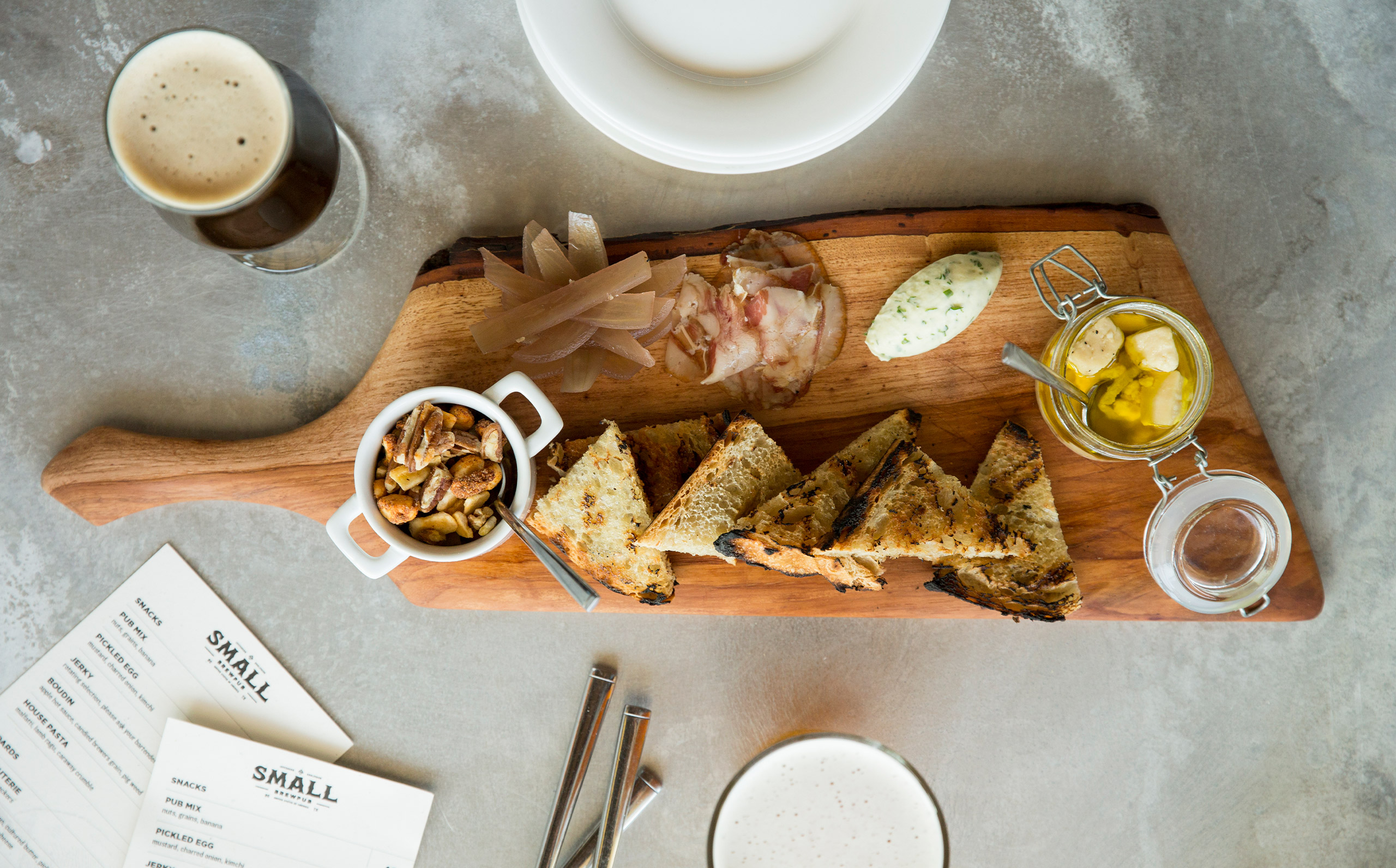
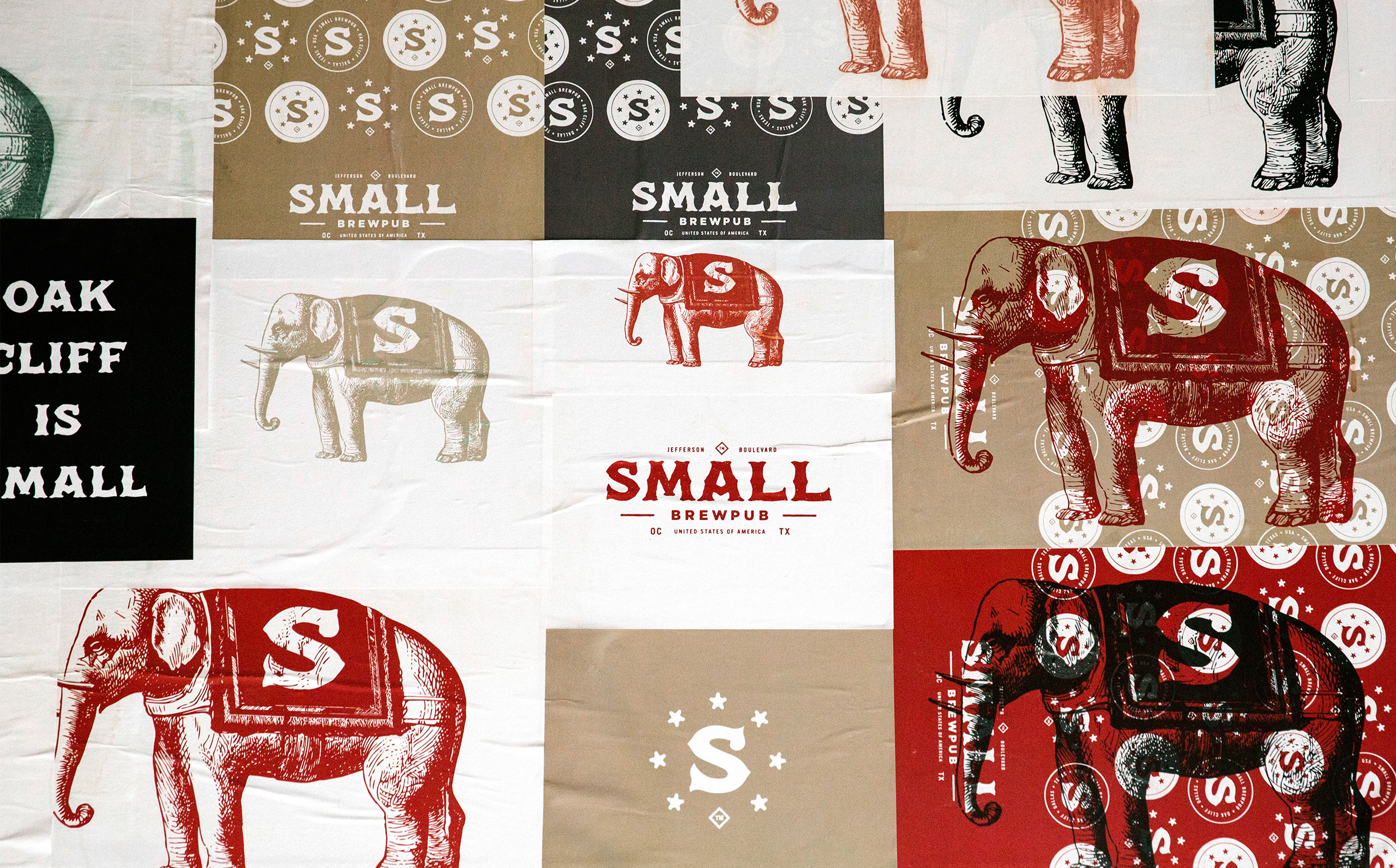
During construction, Small wanted to put something up to give the community a preview of things to come. We developed a group of posters that were wheat-pasted on the plywood construction barrier. When Small opened, we took down the barrier and completed a new wheat-paste on one of the inside walls.
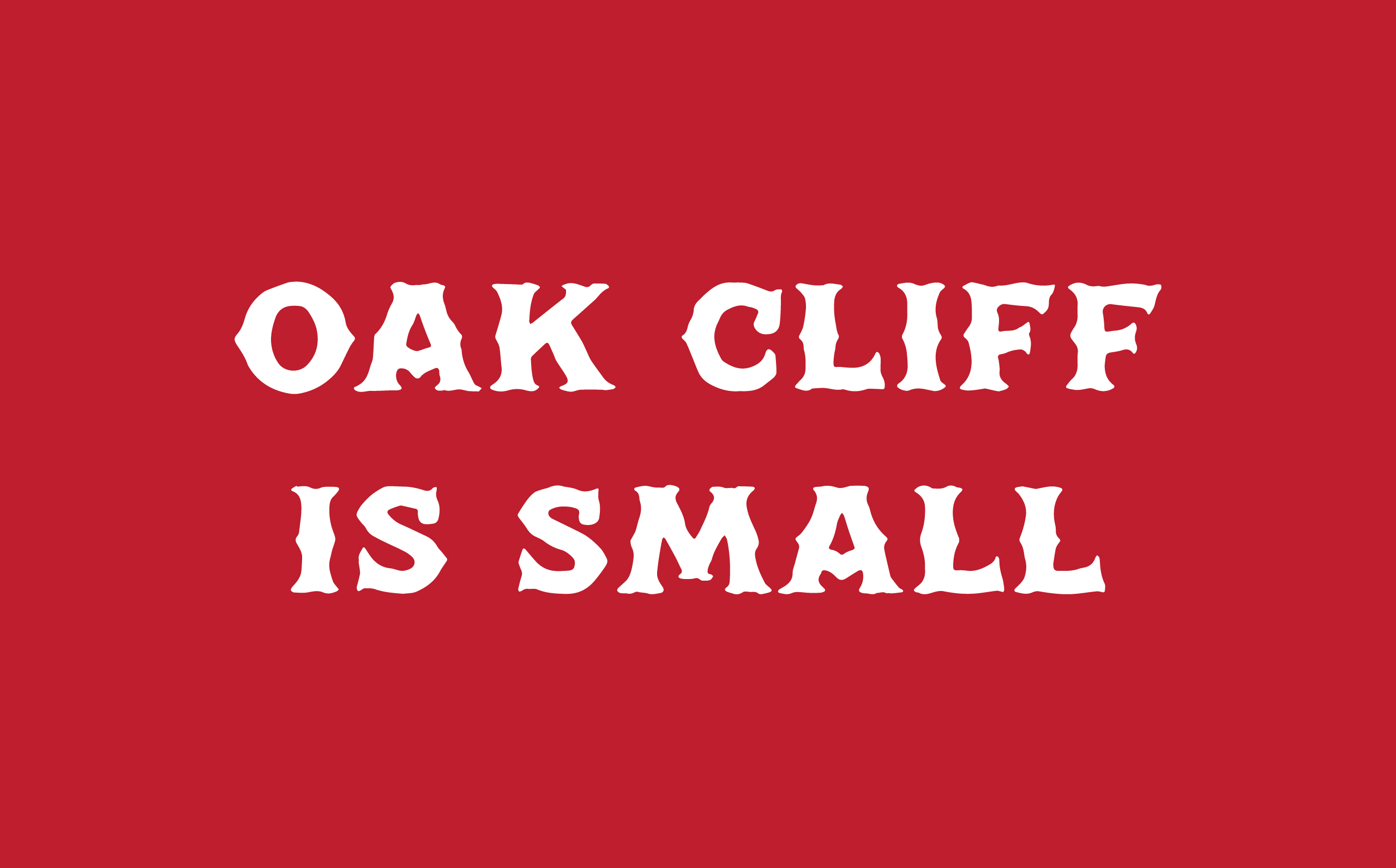
The Oak Cliff neighborhood in Dallas is a very tight-knit group of people. Walking into the neighborhood coffee shop, you are bound to see at least one friend, if not 10. Small is no different, as they truly believe in their community.
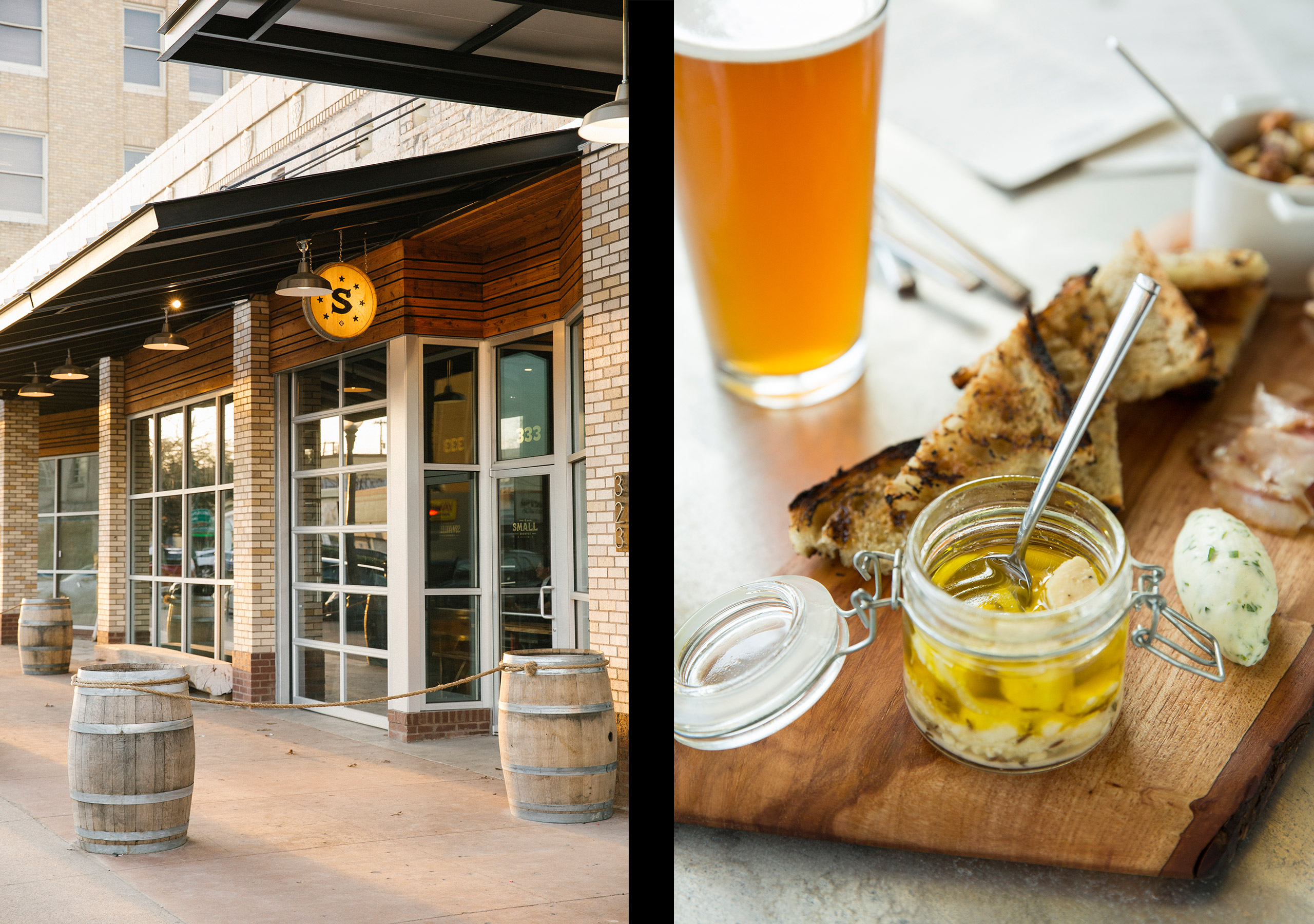
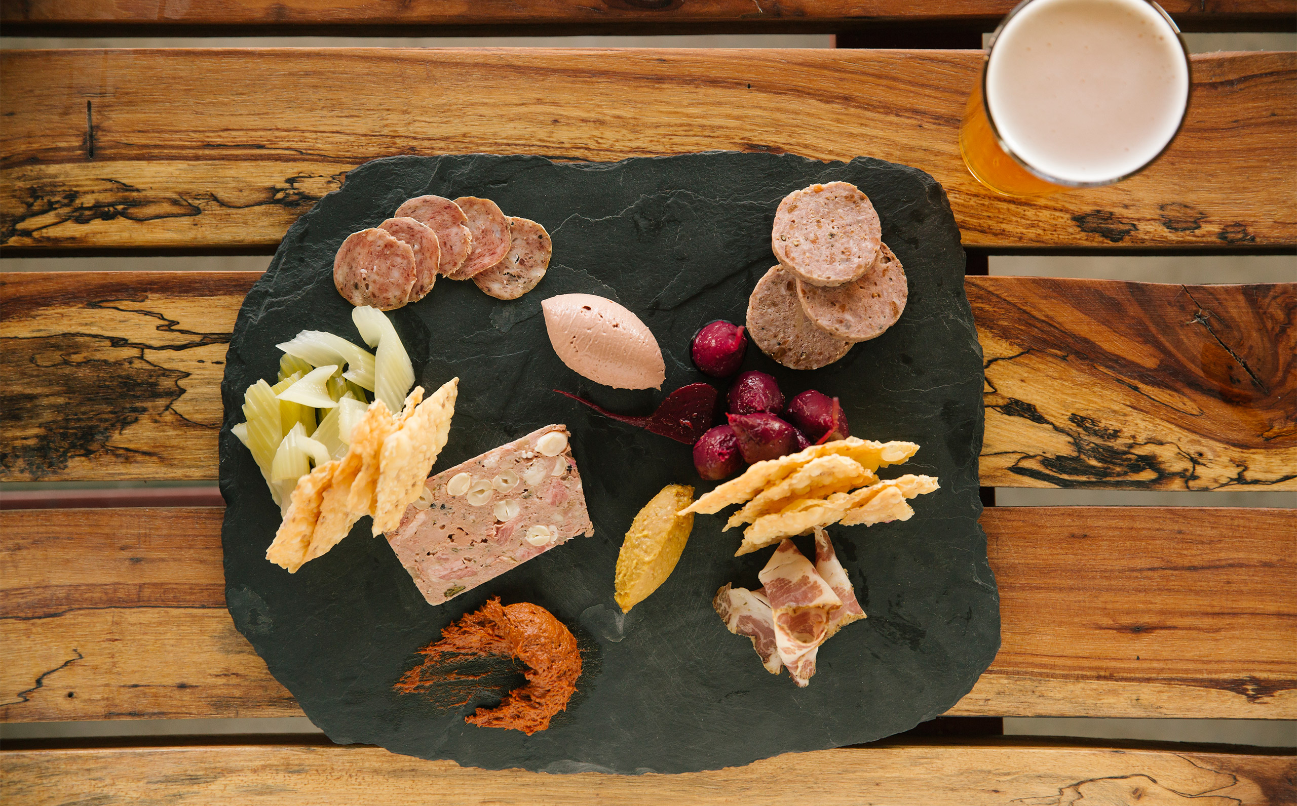
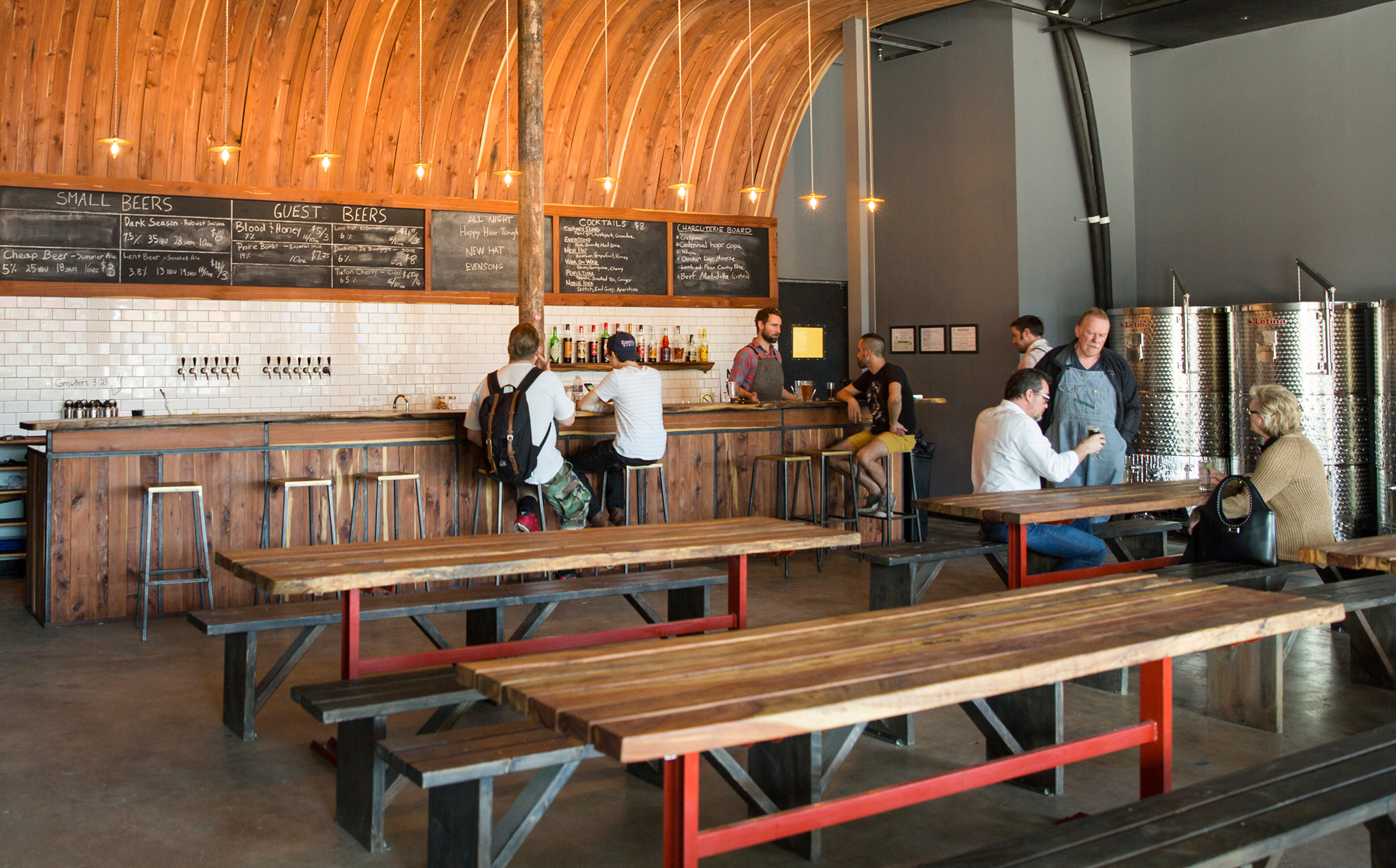
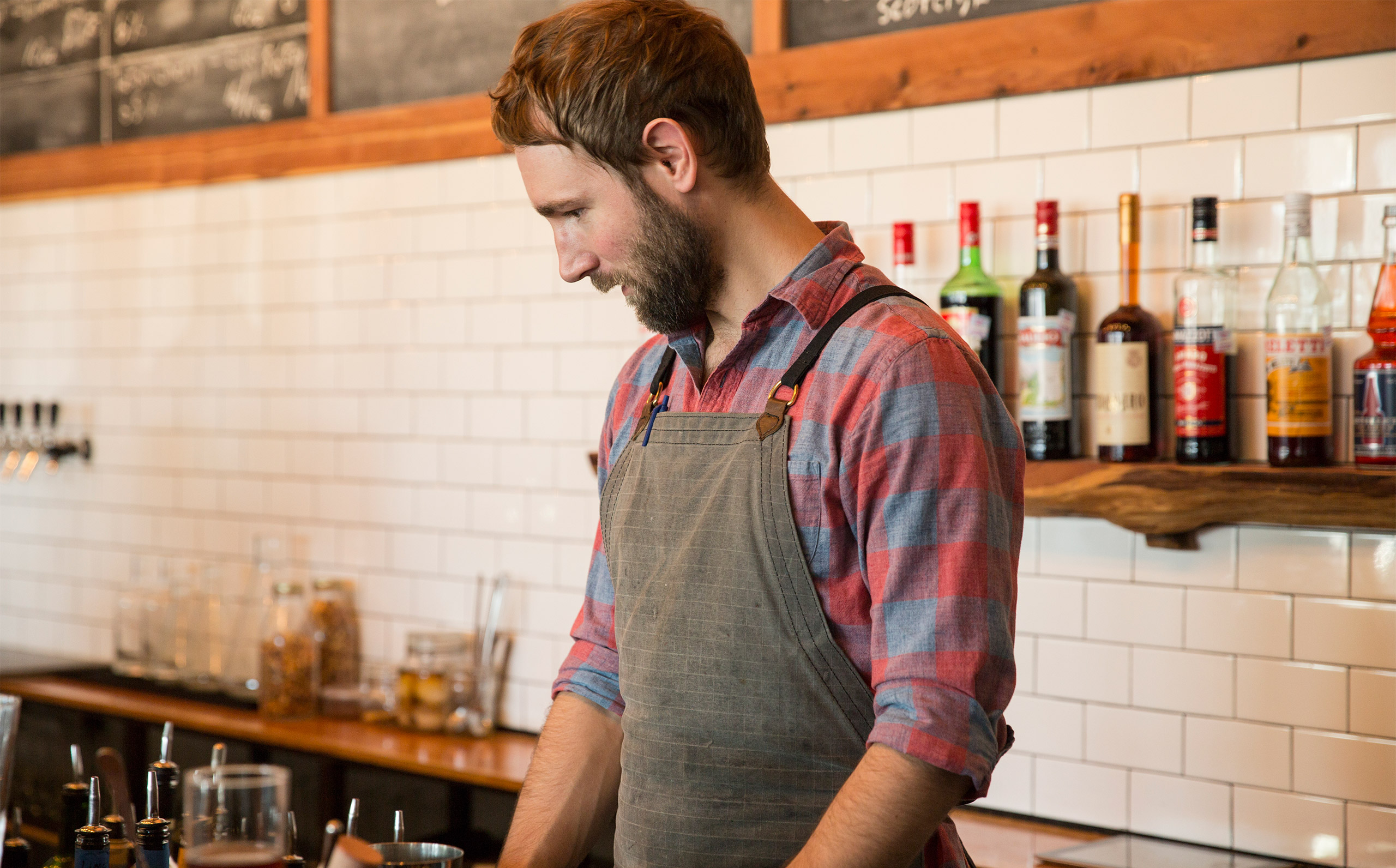
The Small Brewpub space, just like the beer and food, was a labor of love for the owners. Already accomplished craftsmen, they designed and built the space themselves, including the towering bent-wood bar back and giant community tables.
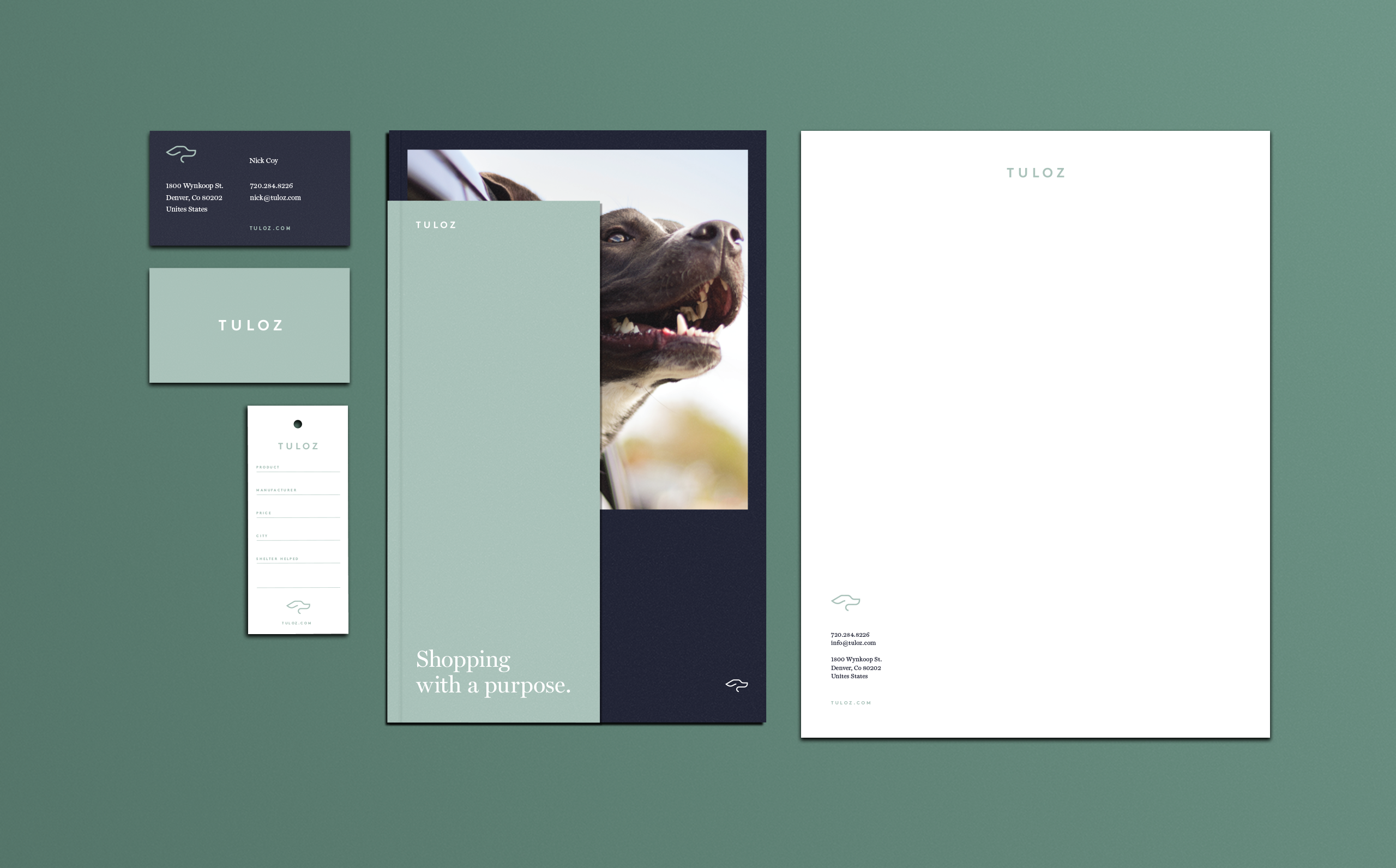
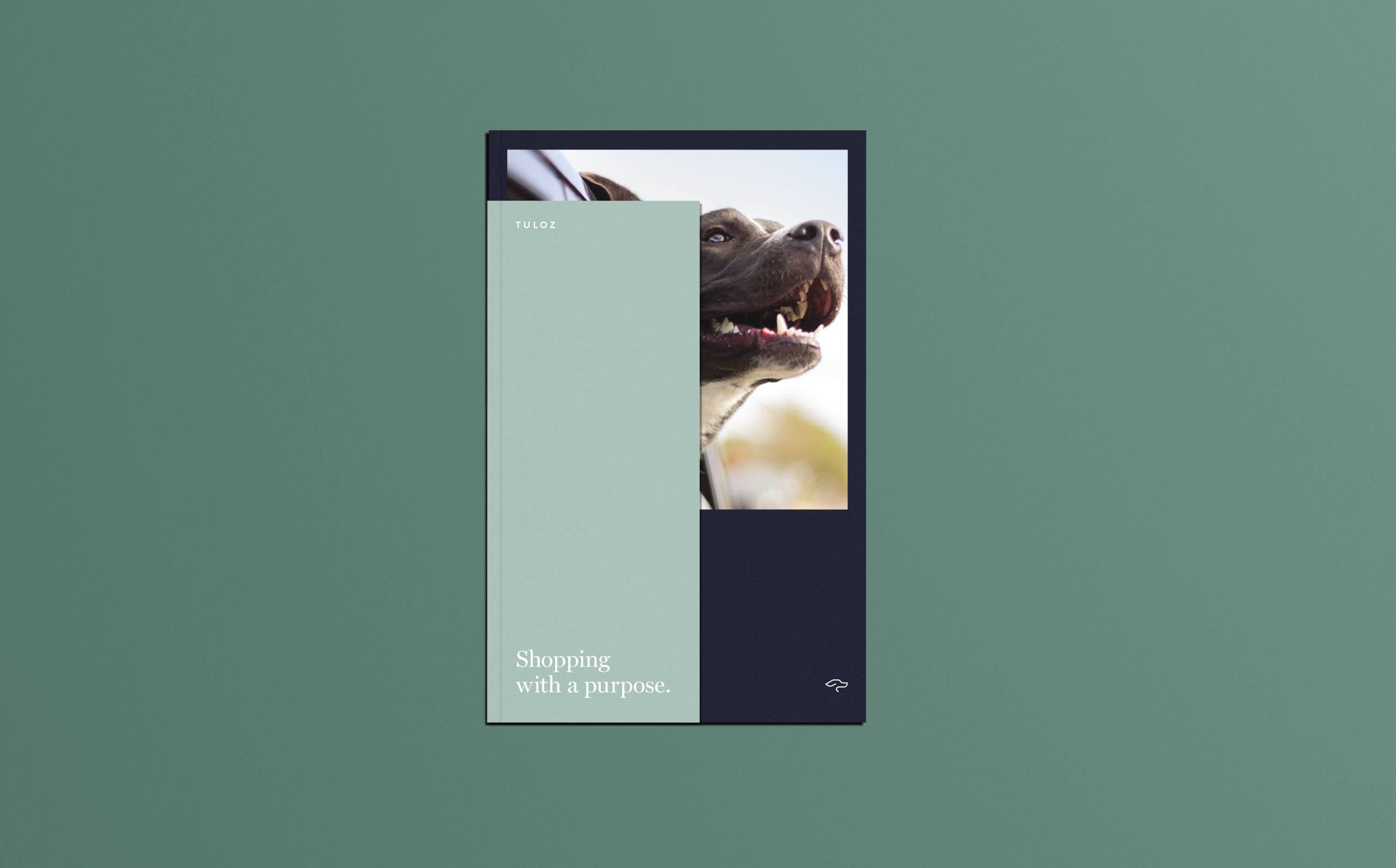
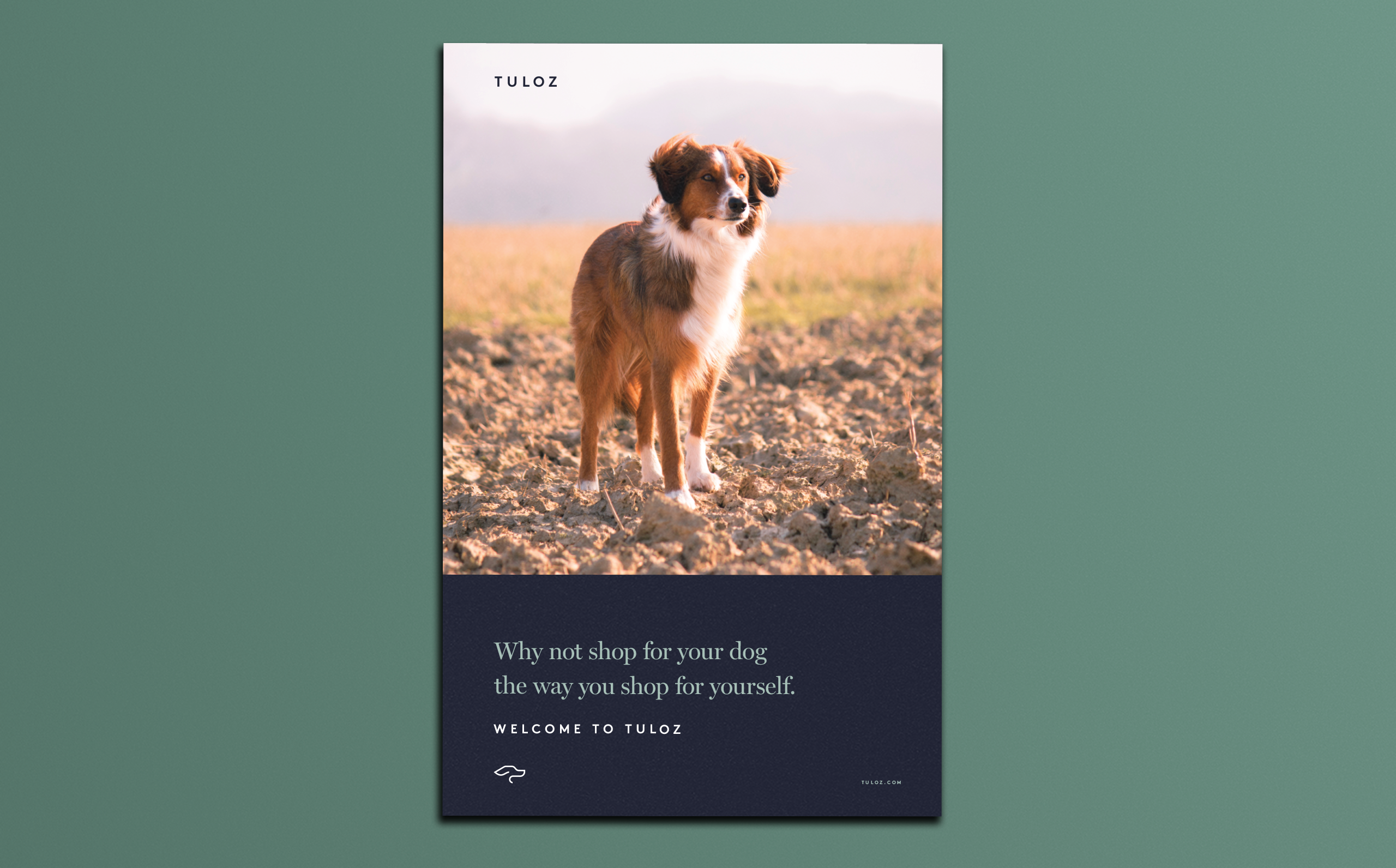
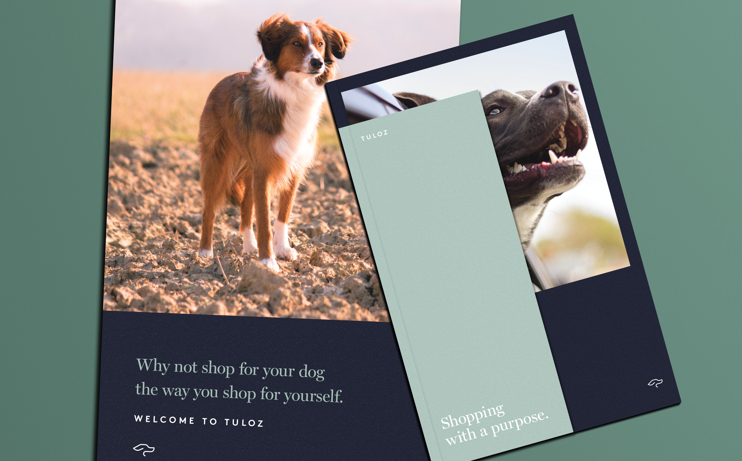
Products With a Purpose. When Nick Coy created Tuloz, he set out to create a store that carried quality dog products with a focus on the well being of all dogs. Tuloz takes vested interest in the futures of local animal shelters. They donate 25% of their sales to these shelters. When developing their brand it was important to evoke emotion, compassion, and loyalty. The same feeling that you get from your pet.

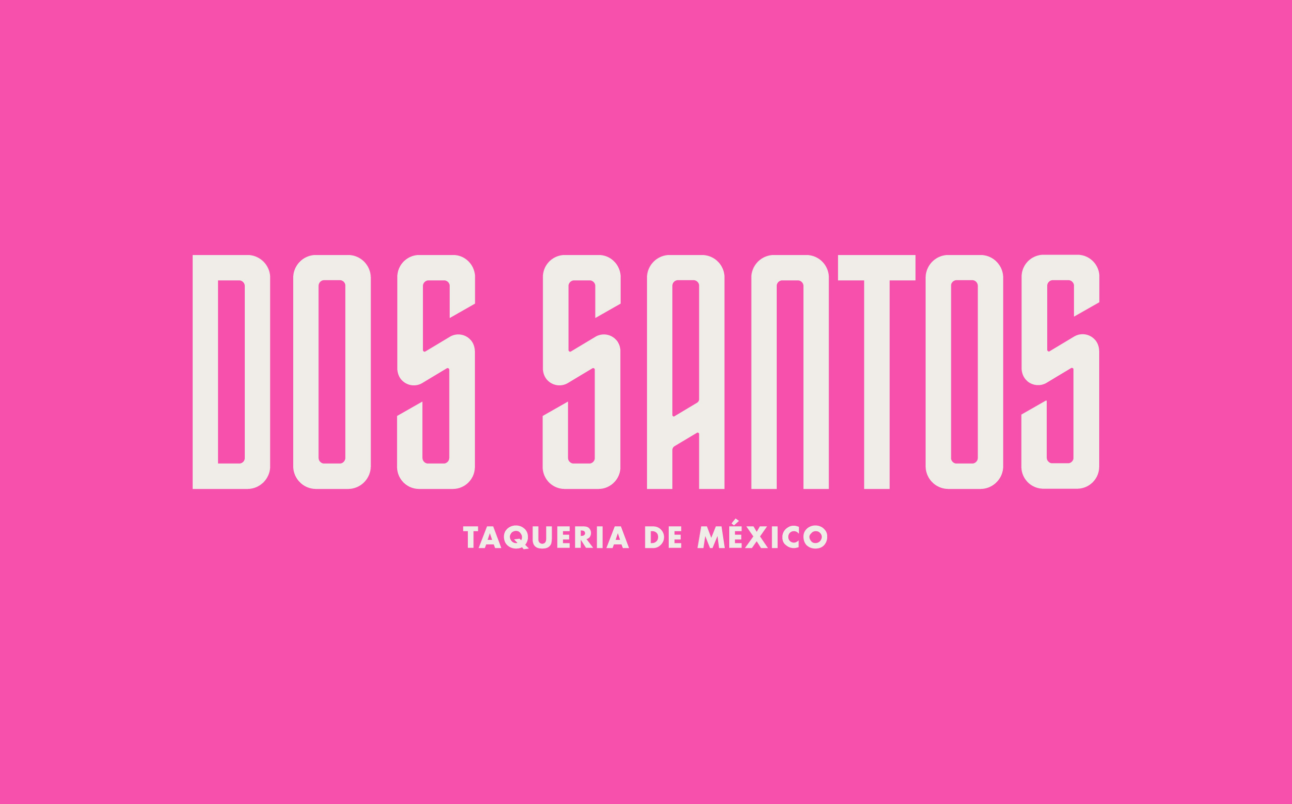
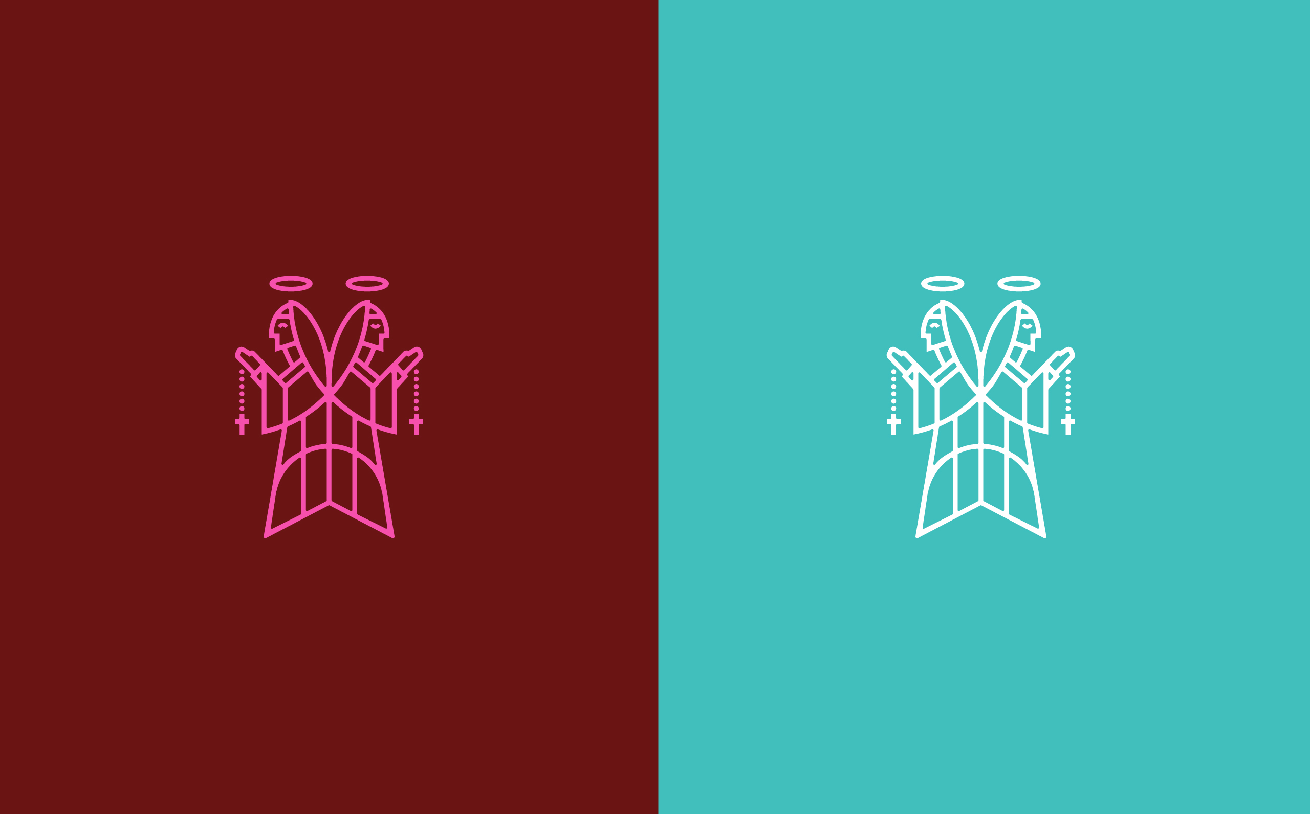
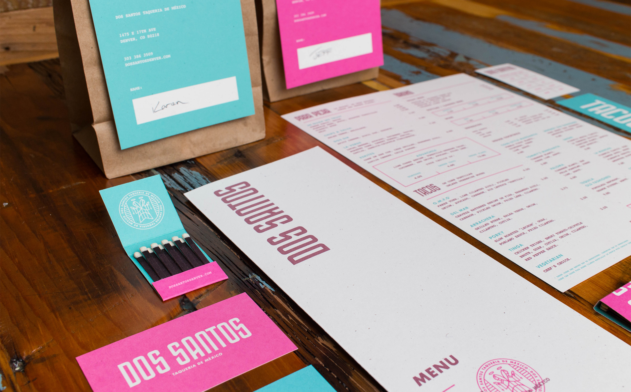
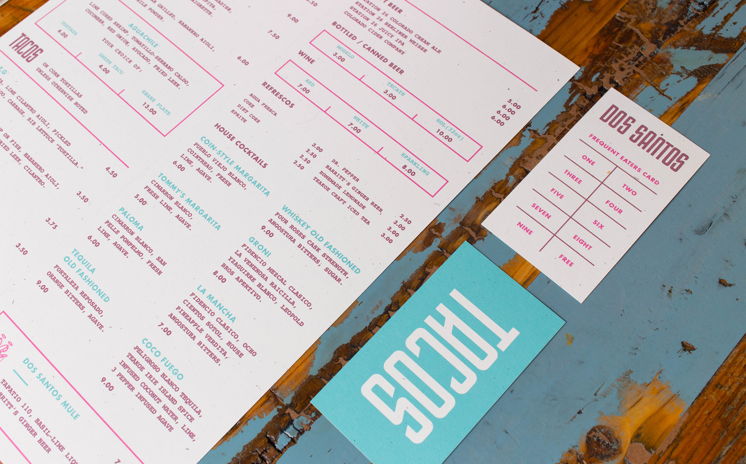
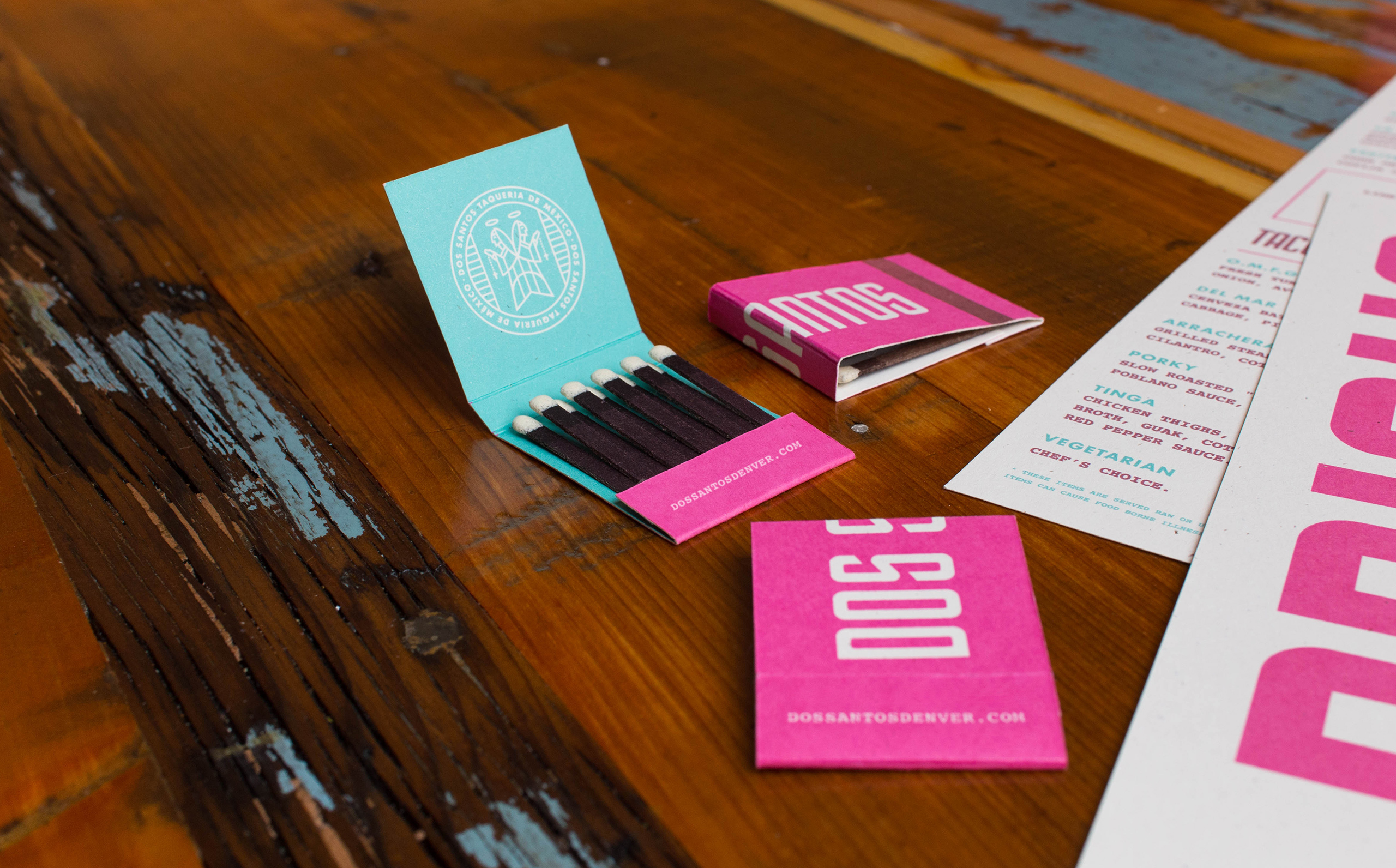
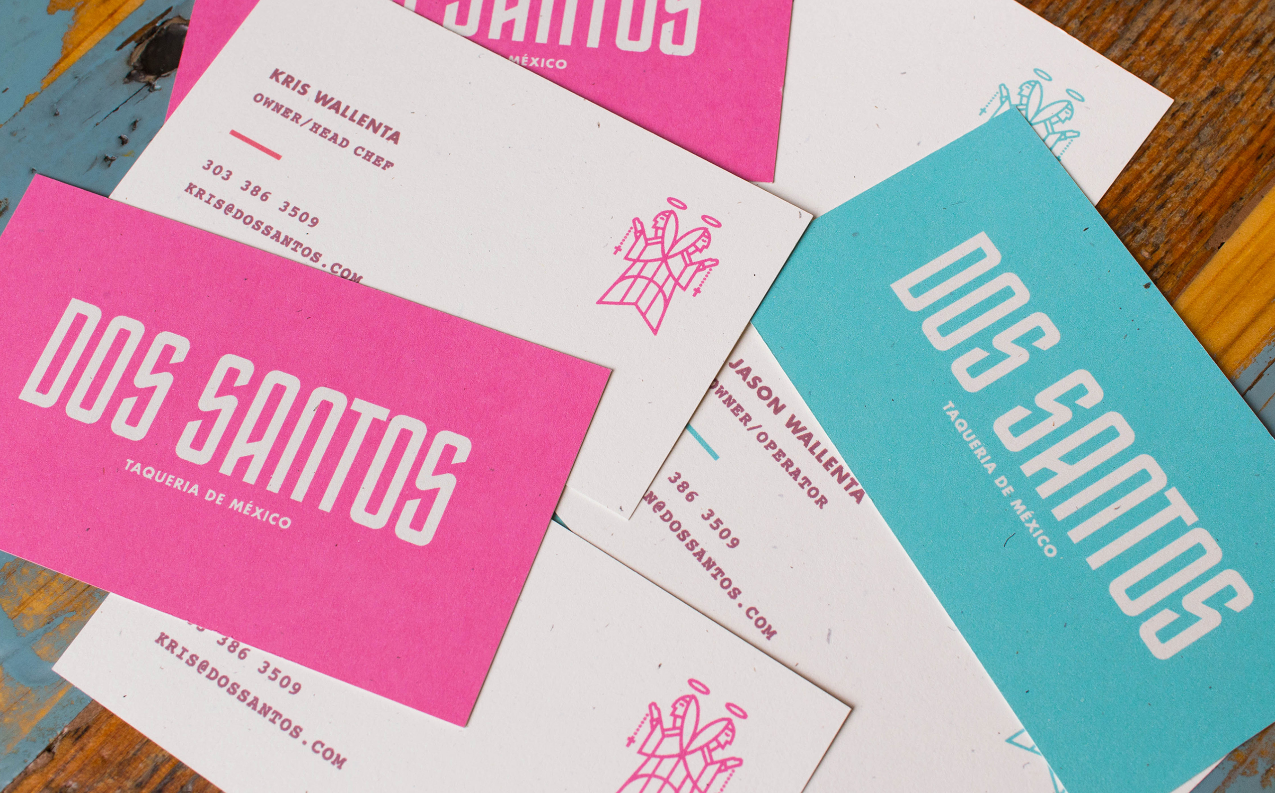
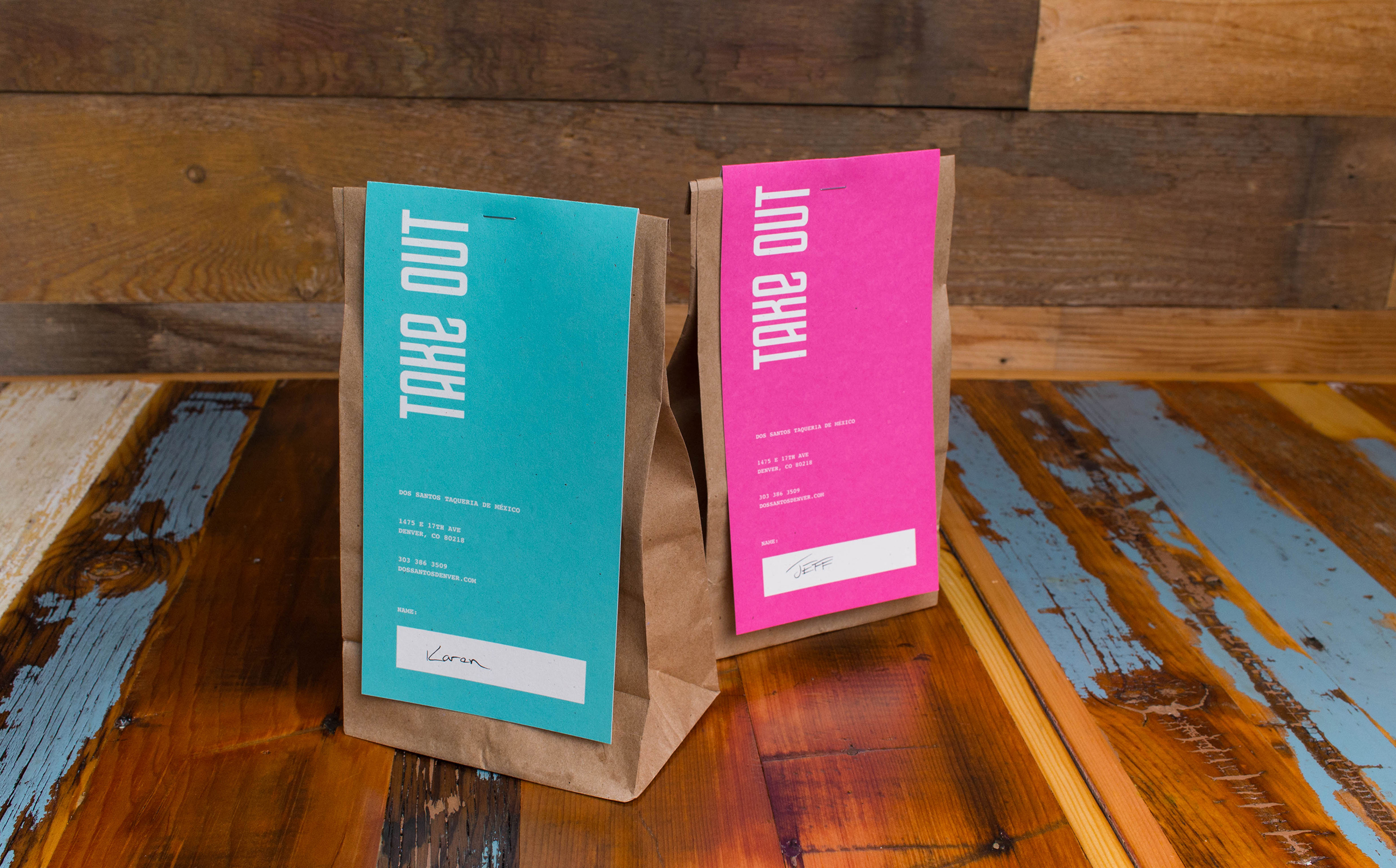
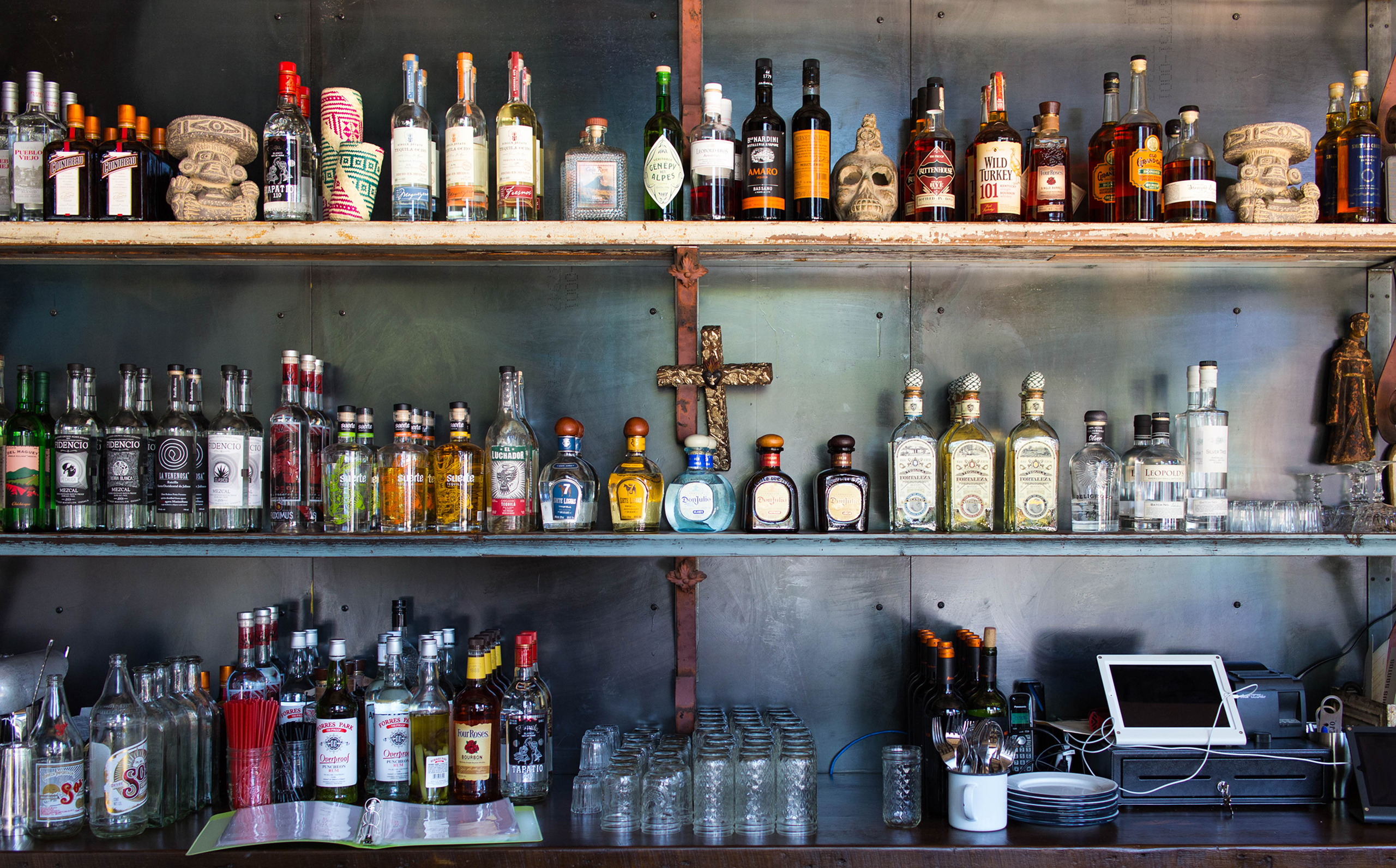
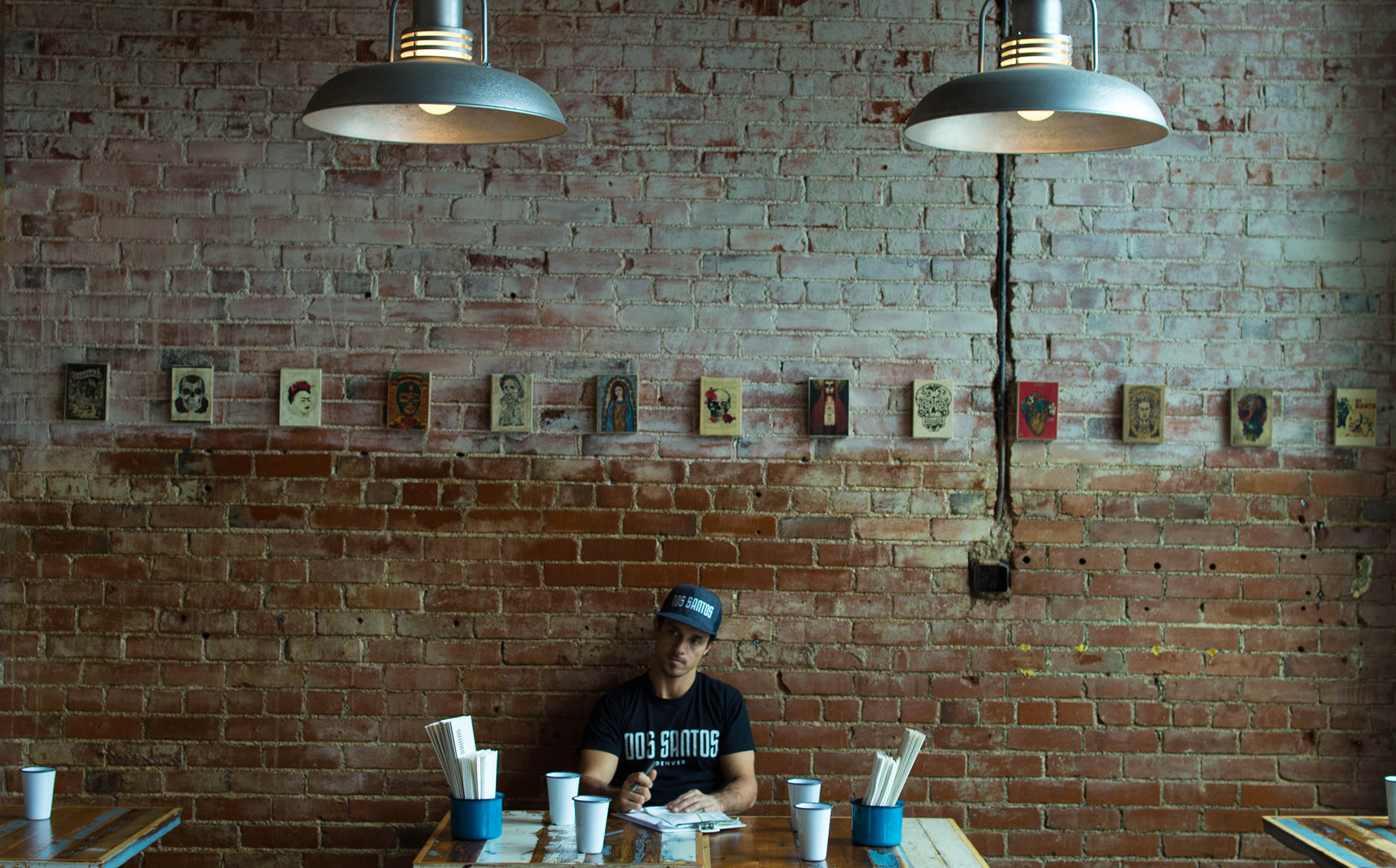
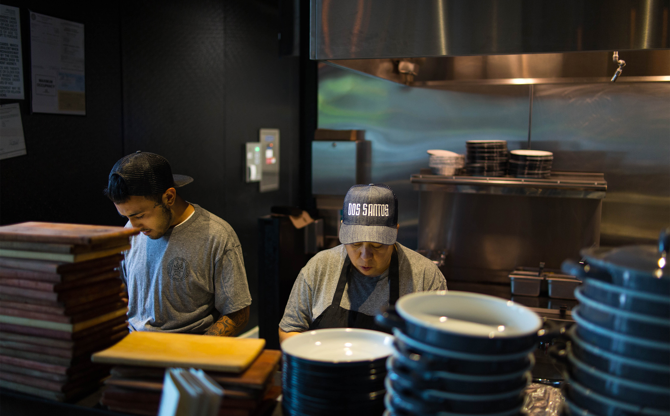
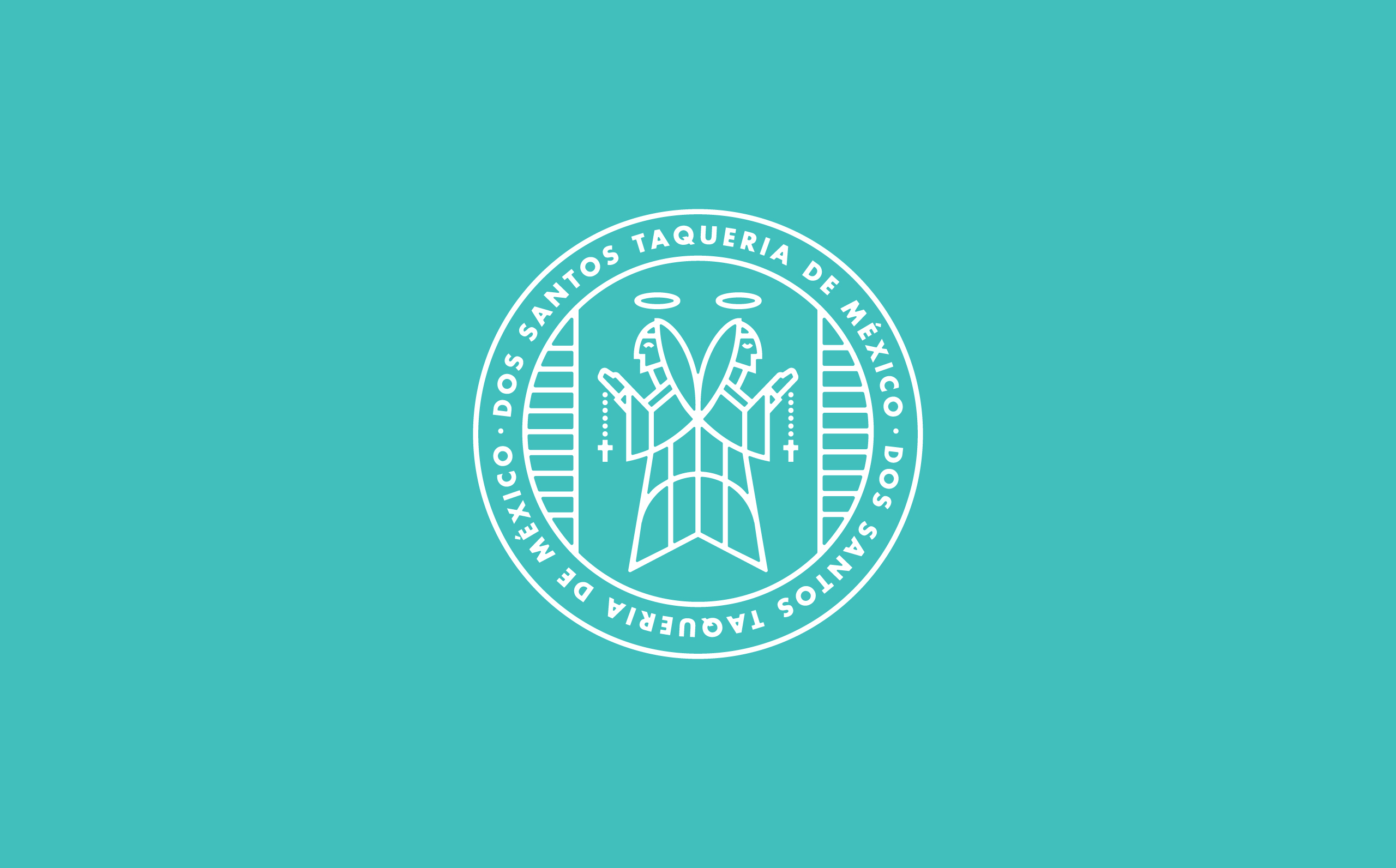
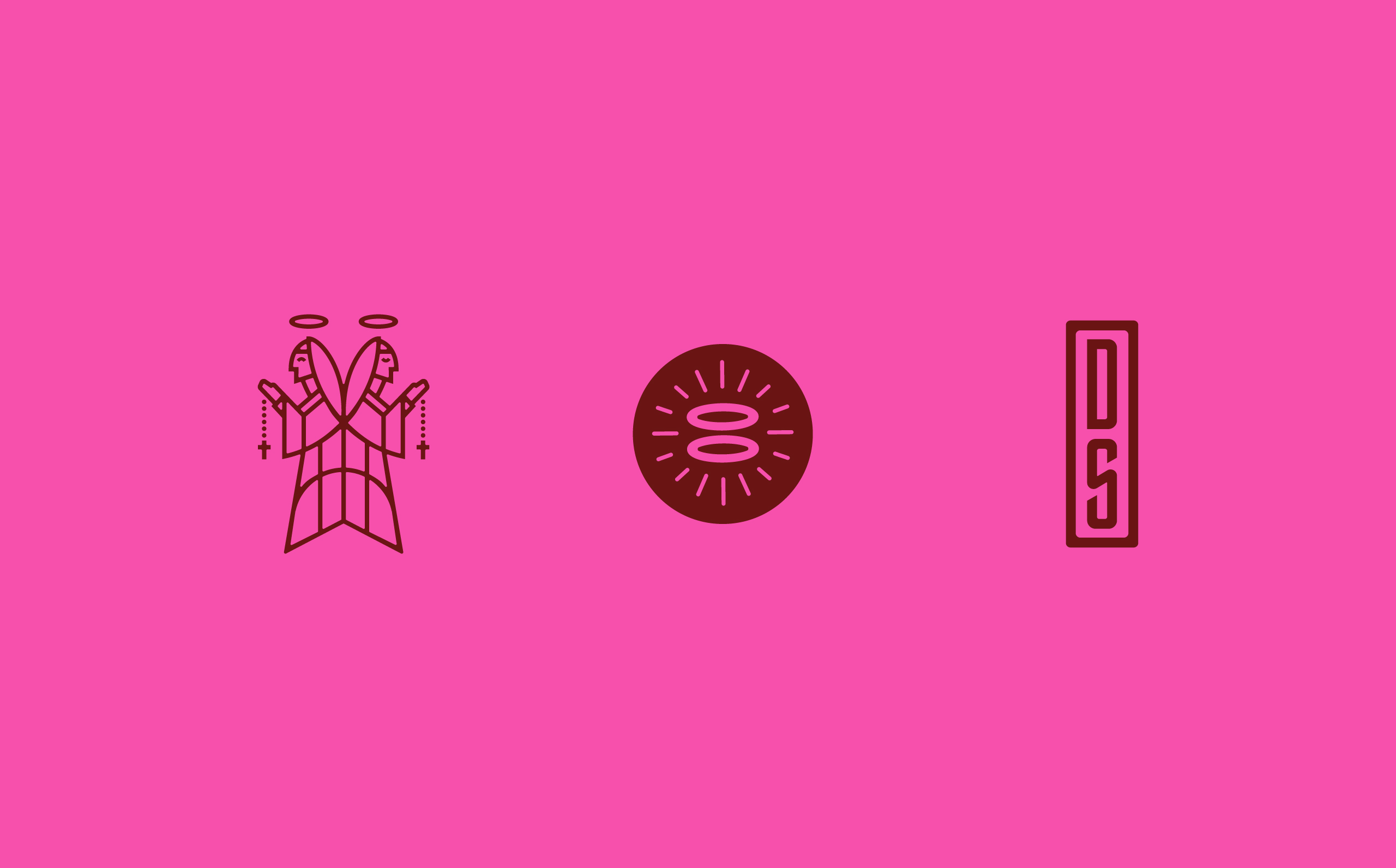
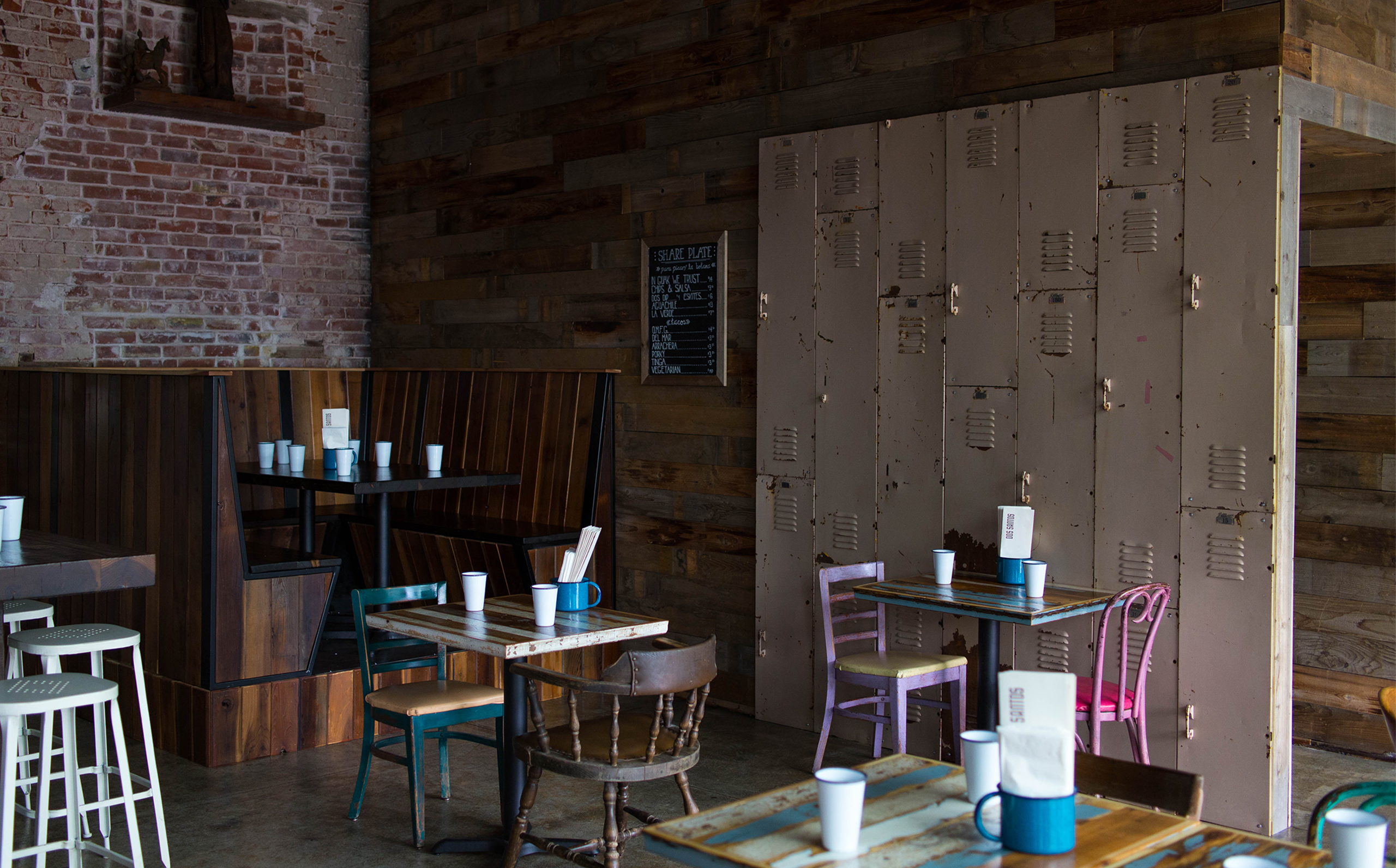
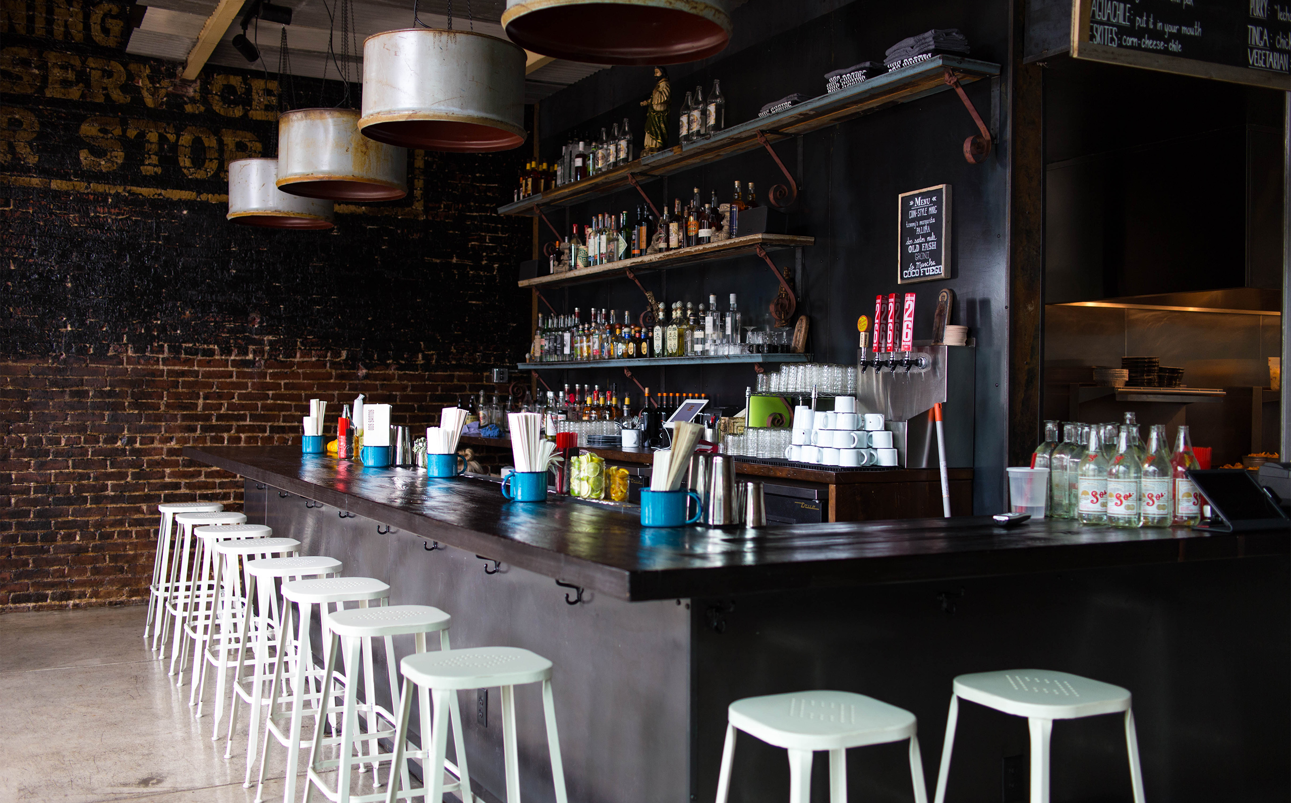
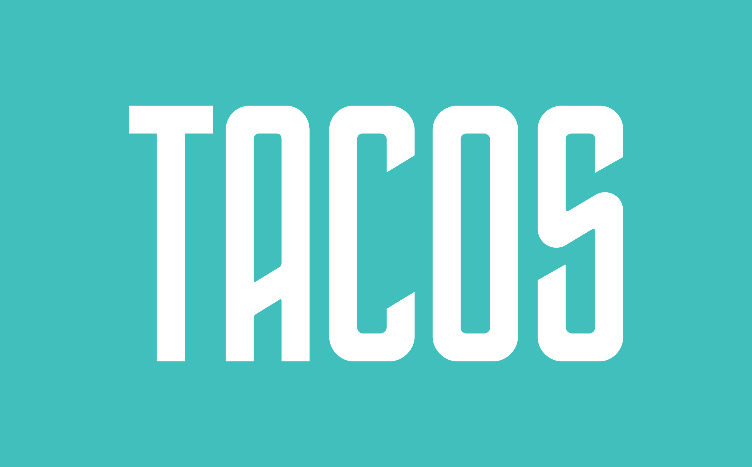
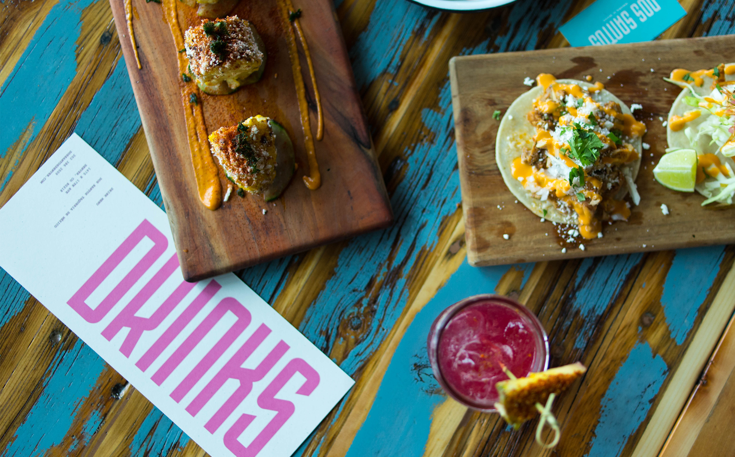
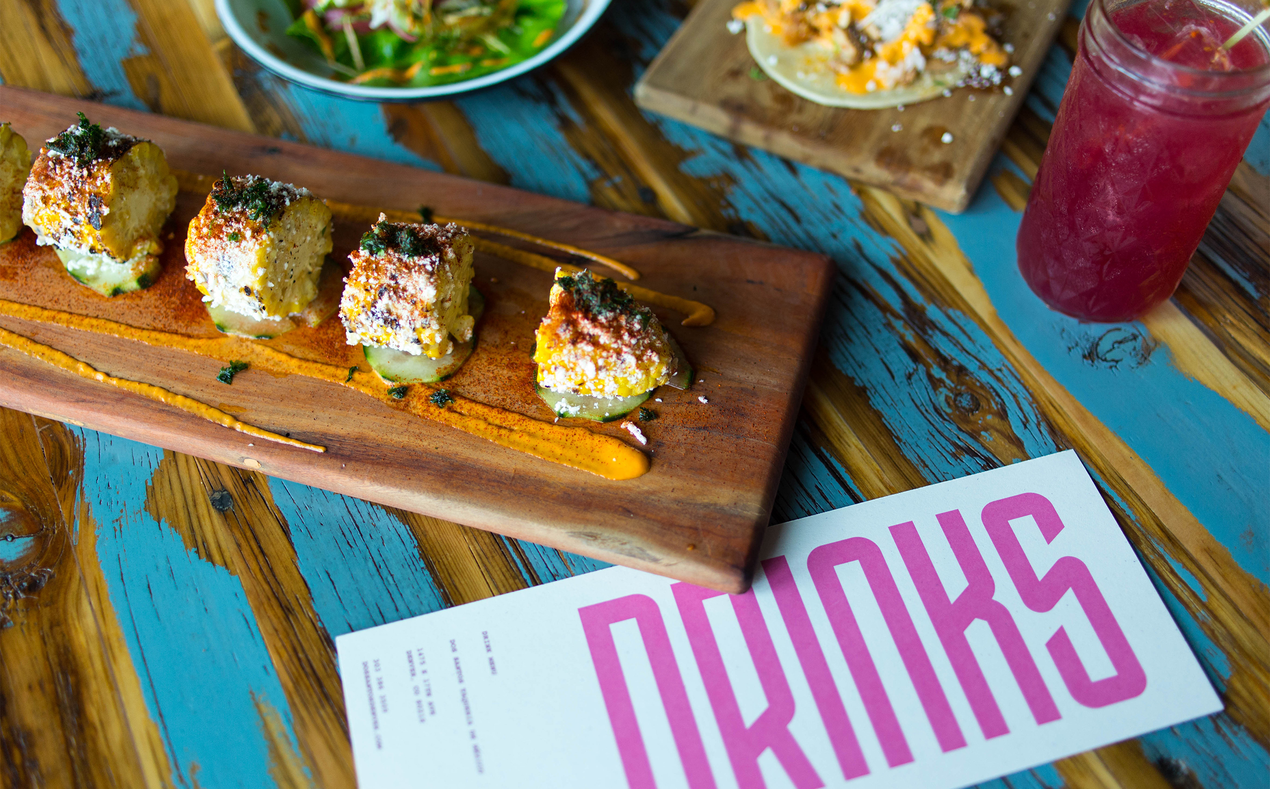
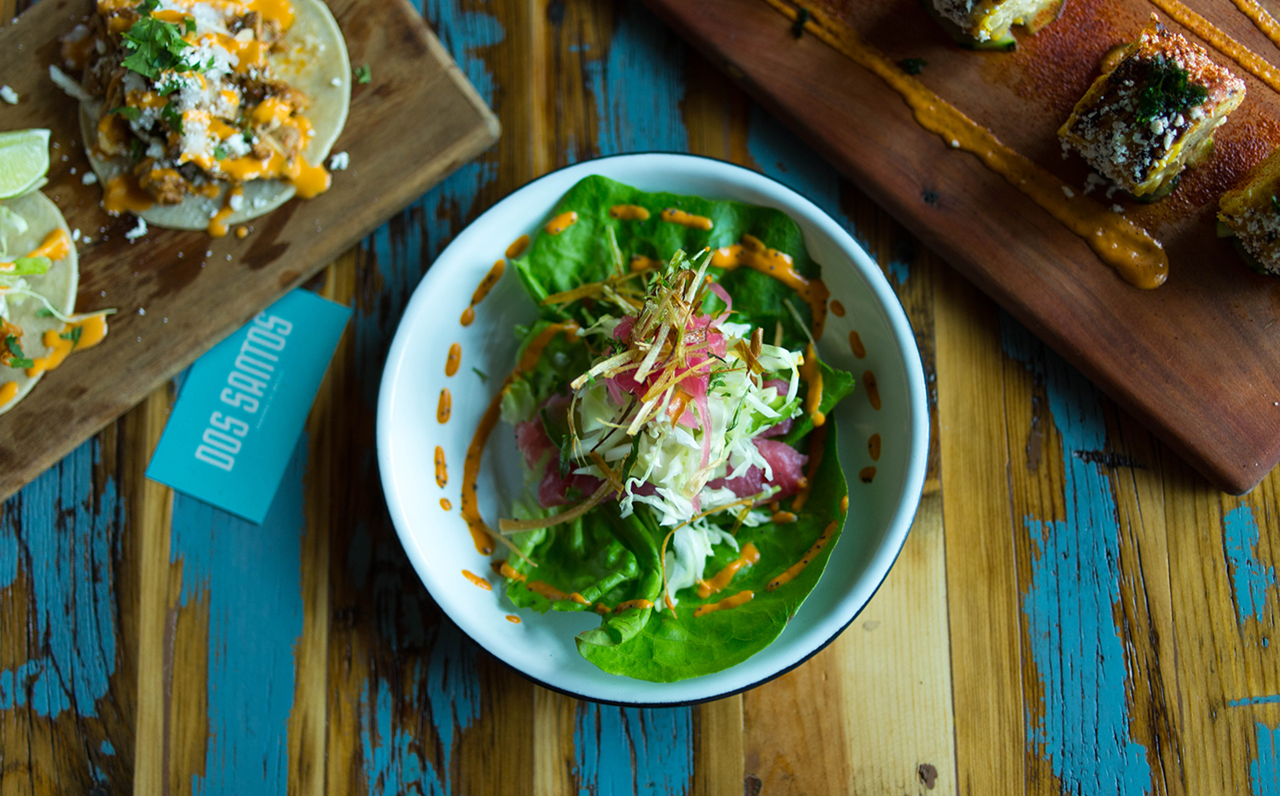
After opening two successful restaurants in Mexico, the Wallenta brothers set their sights on sharing Mexican authenticity with America. It was important to the brothers to pair their experiences with Mexican street food and the historic, industrial roots of the new space in Denver. A modern take on a graffiti motif was chosen to blend these concepts and set Dos Santos apart from the other taco shops in their market. Done in collaboration with Scott Hill for Studio Mast.
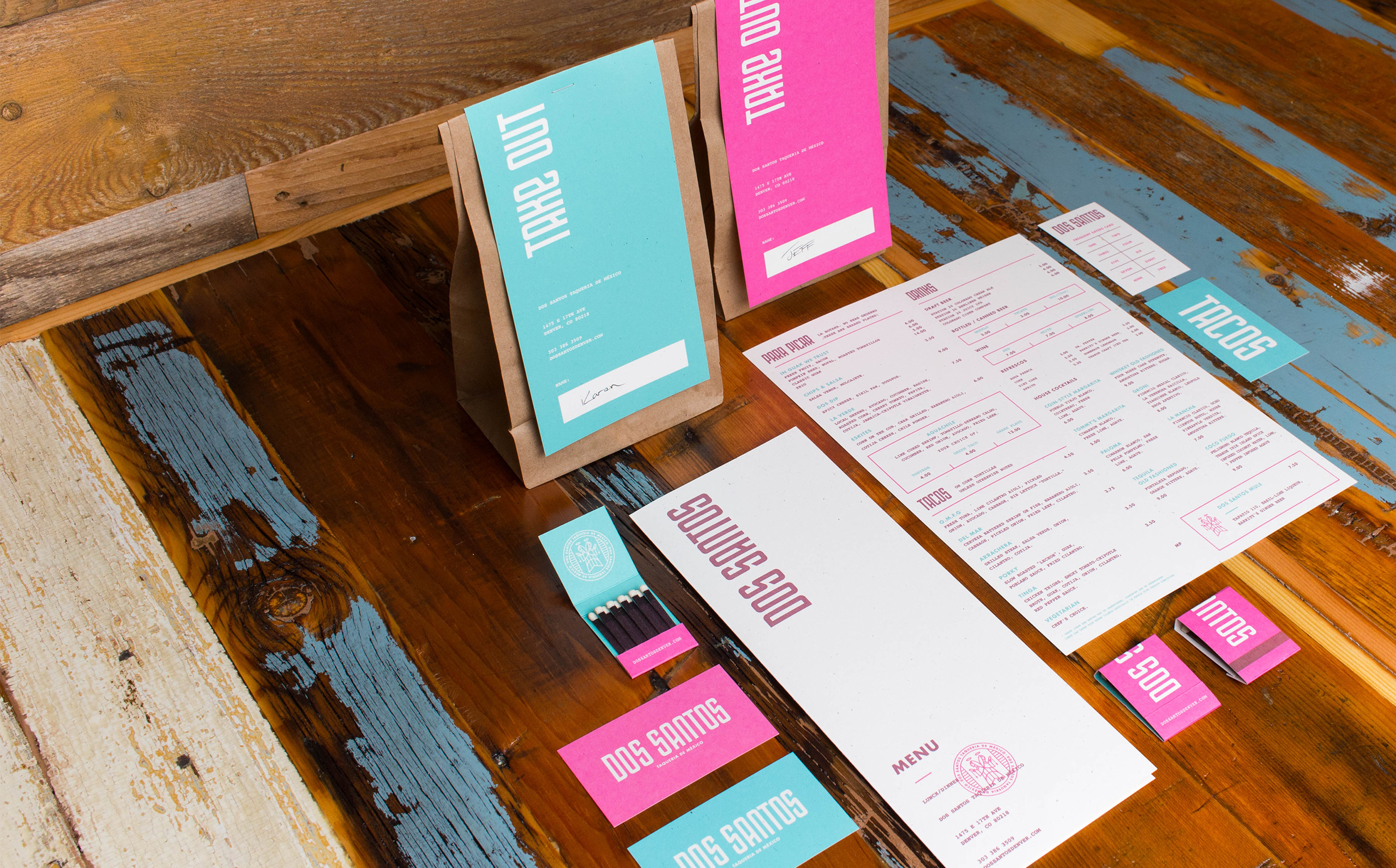
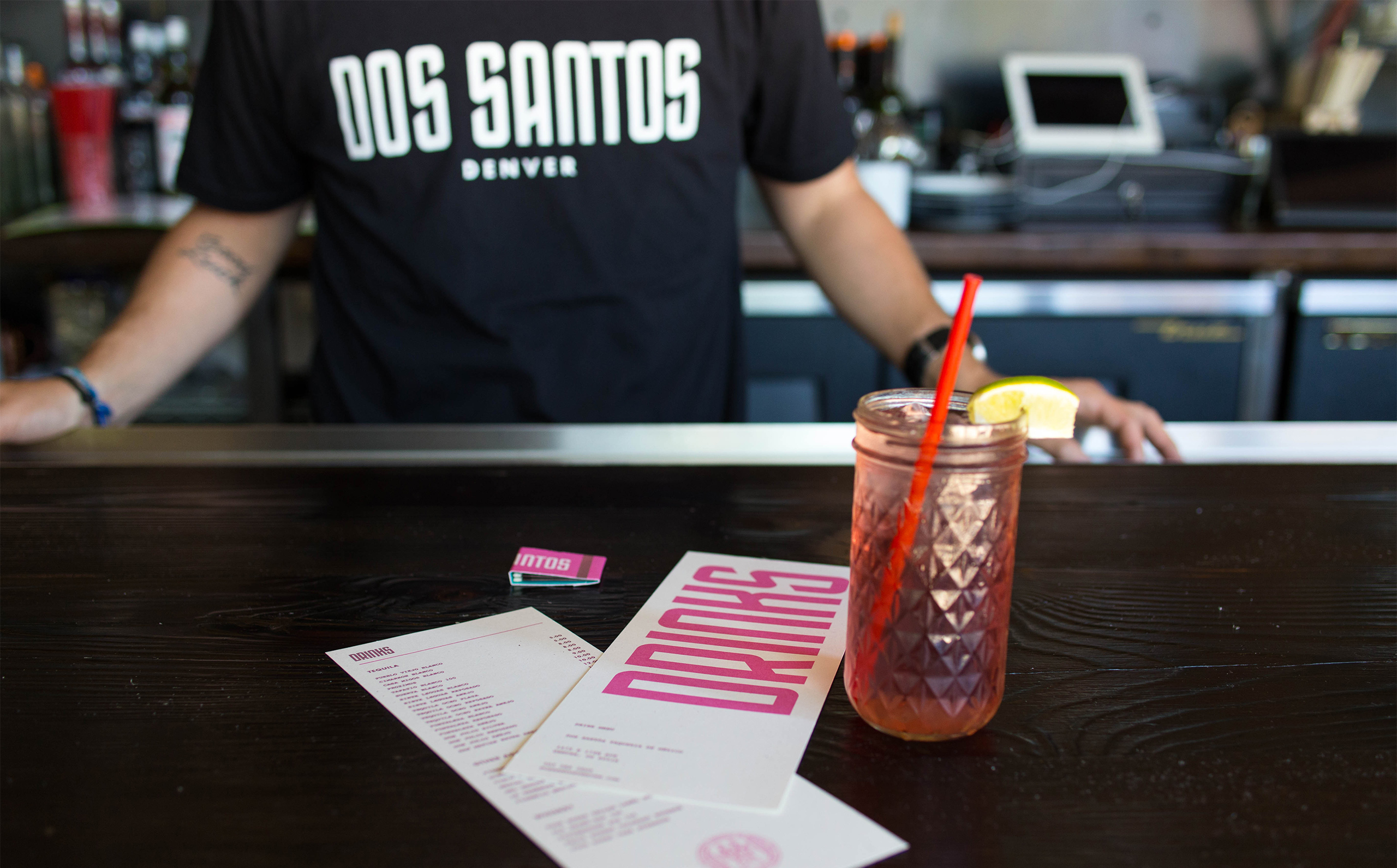
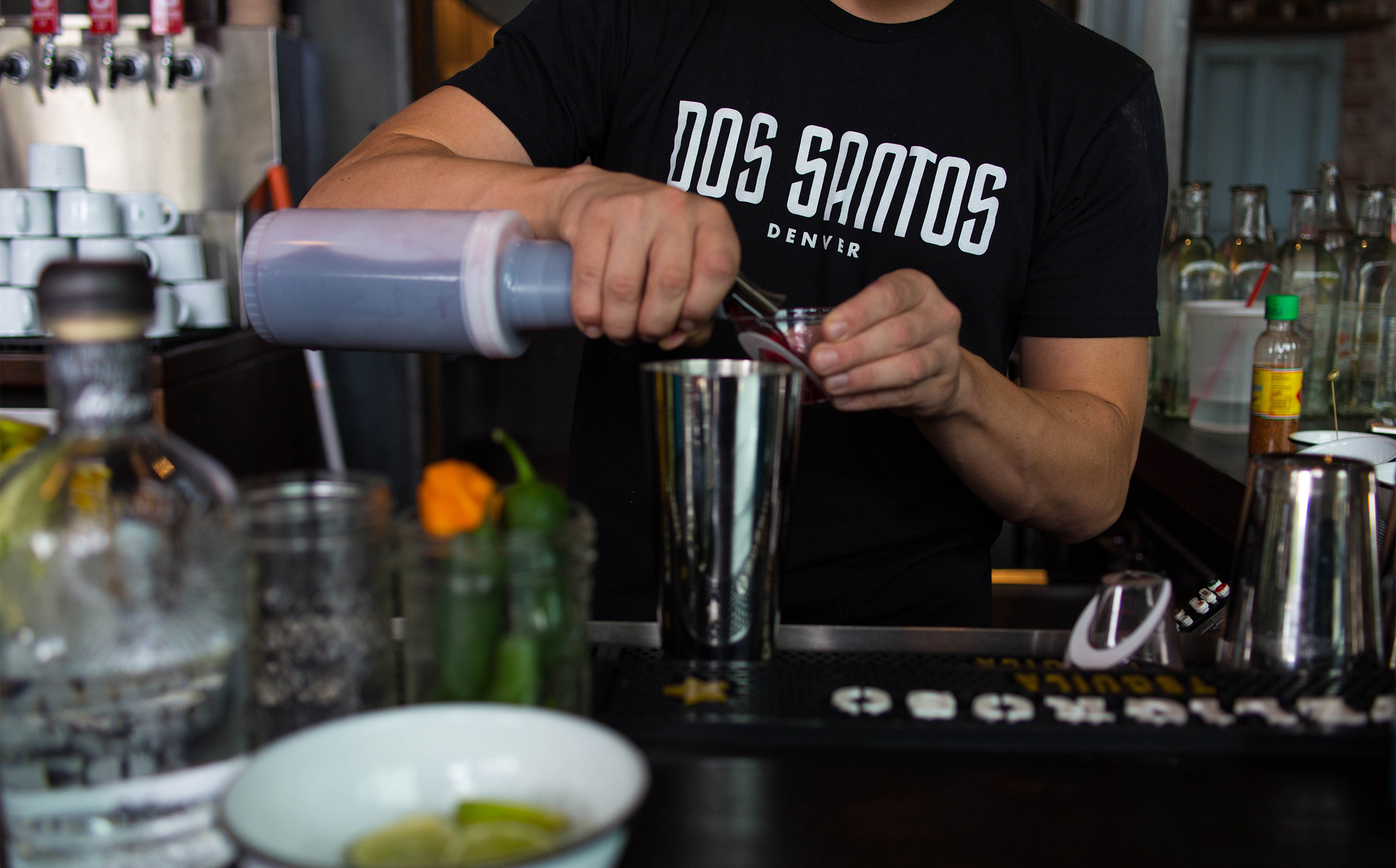
The Wallenta brothers’ love of soccer was at the center of visual explorations for the Dos Santos collateral. The creation of posters, a Dos Santos futbol crest, and actual jerseys for the staff, illustrates that love throughout the brand.
The inspiration for Dos Santos can be found in the design of their space as well, they brought together the gritty feel of the Mexican taco stands with clean modernity.
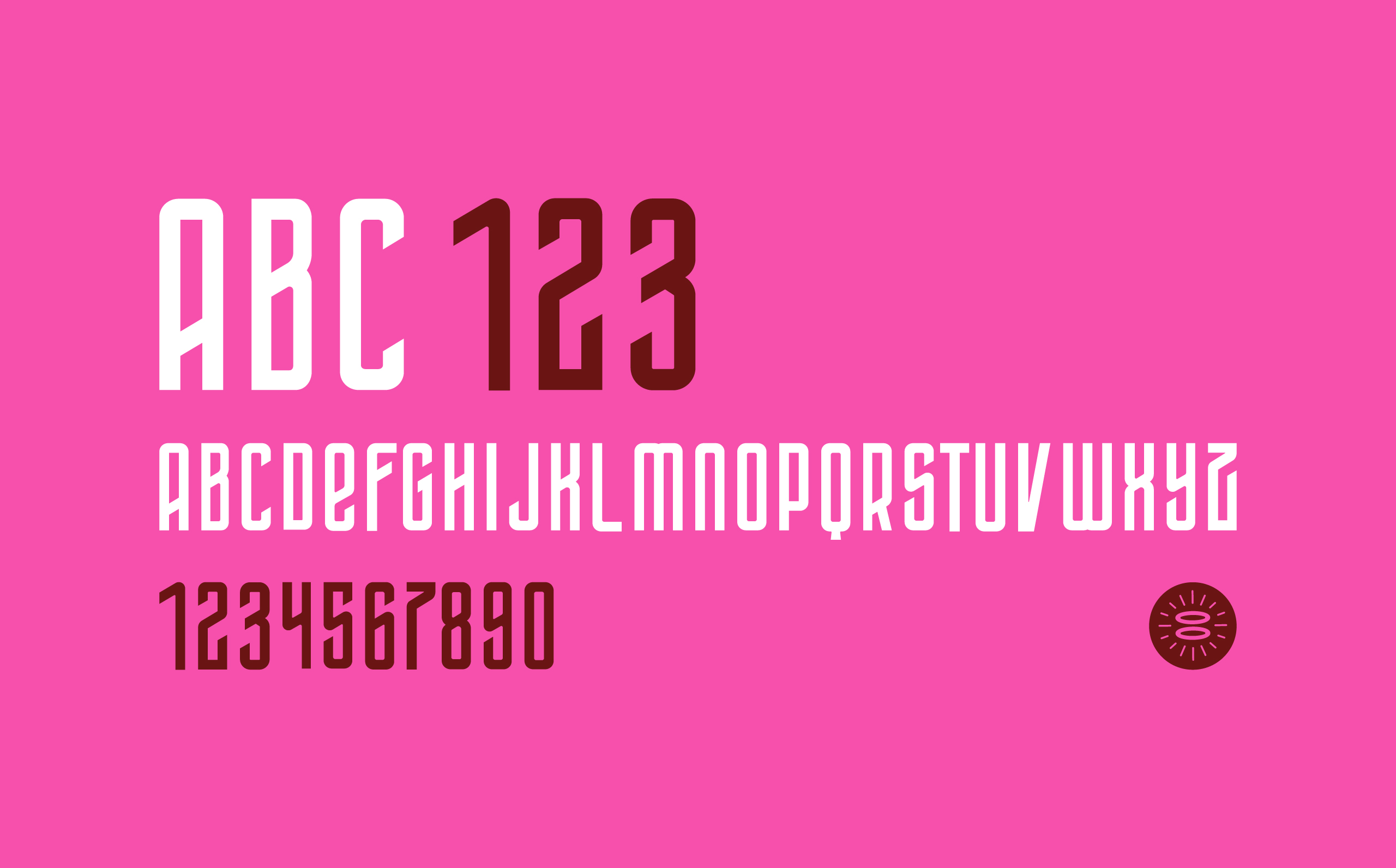
When developing the core identity for Dos Santos, we first created a fully custom wordmark based on a vintage graffiti style. We then created Dos Sans, a fully custom, display typeface derived from the wordmark.
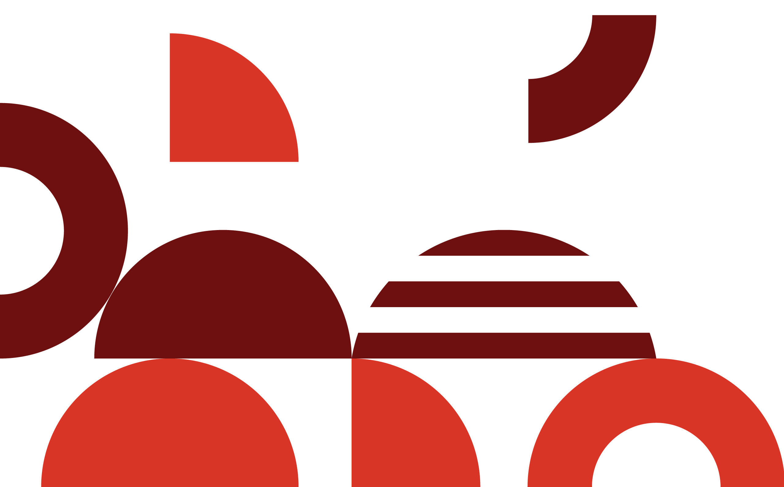
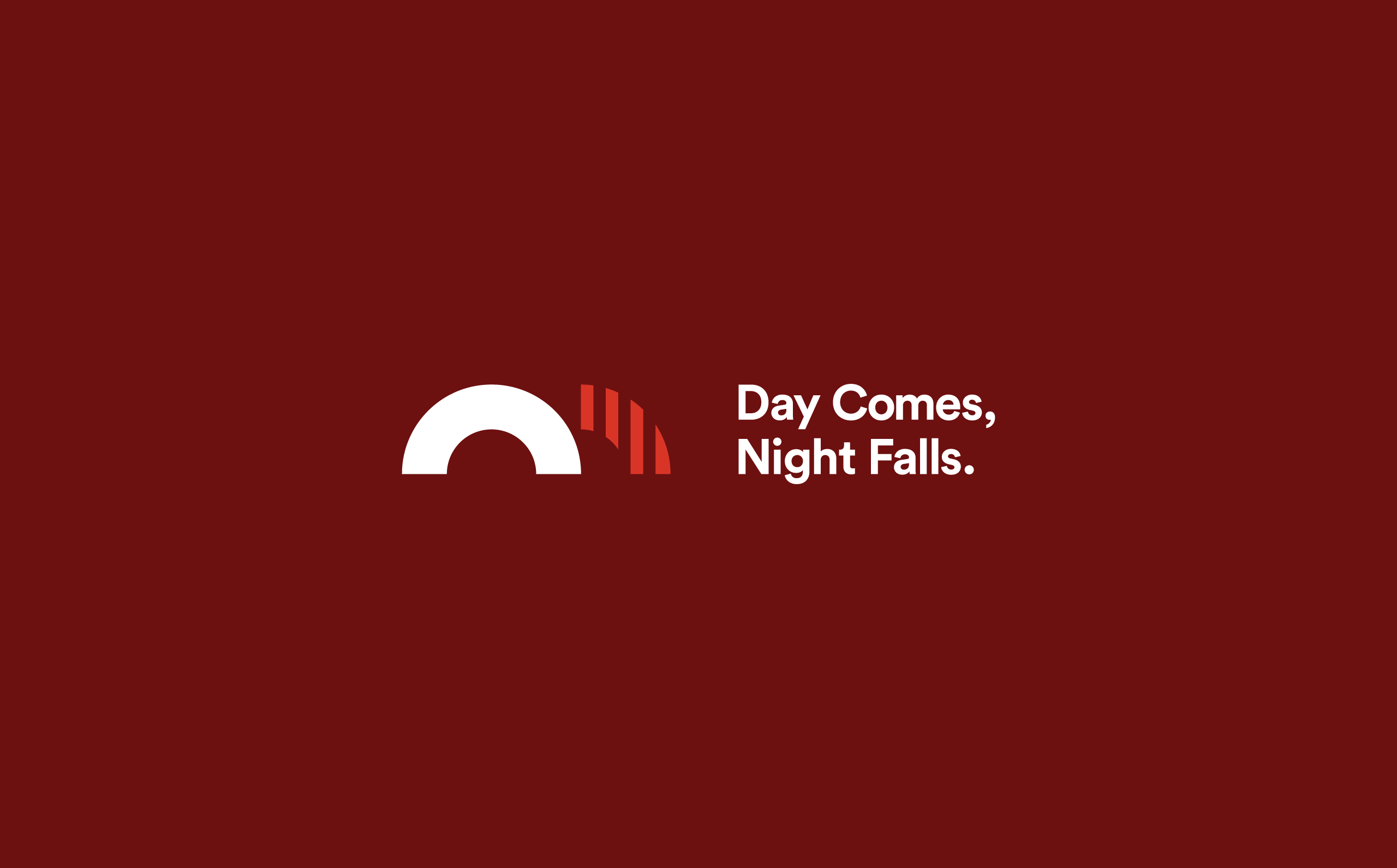
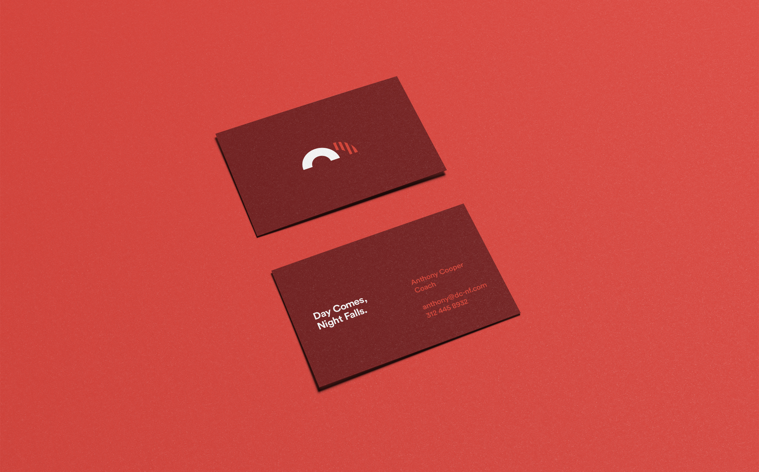
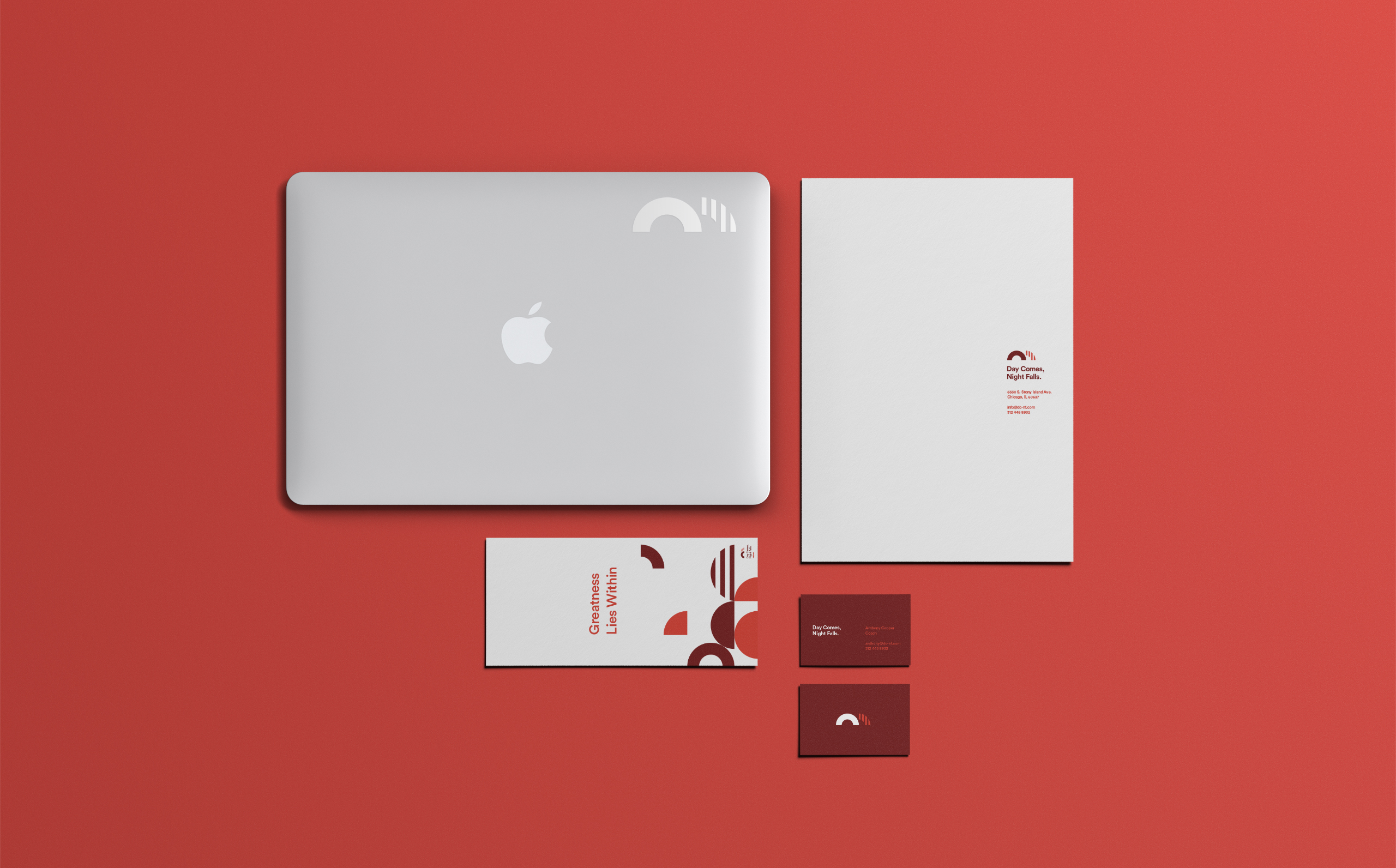
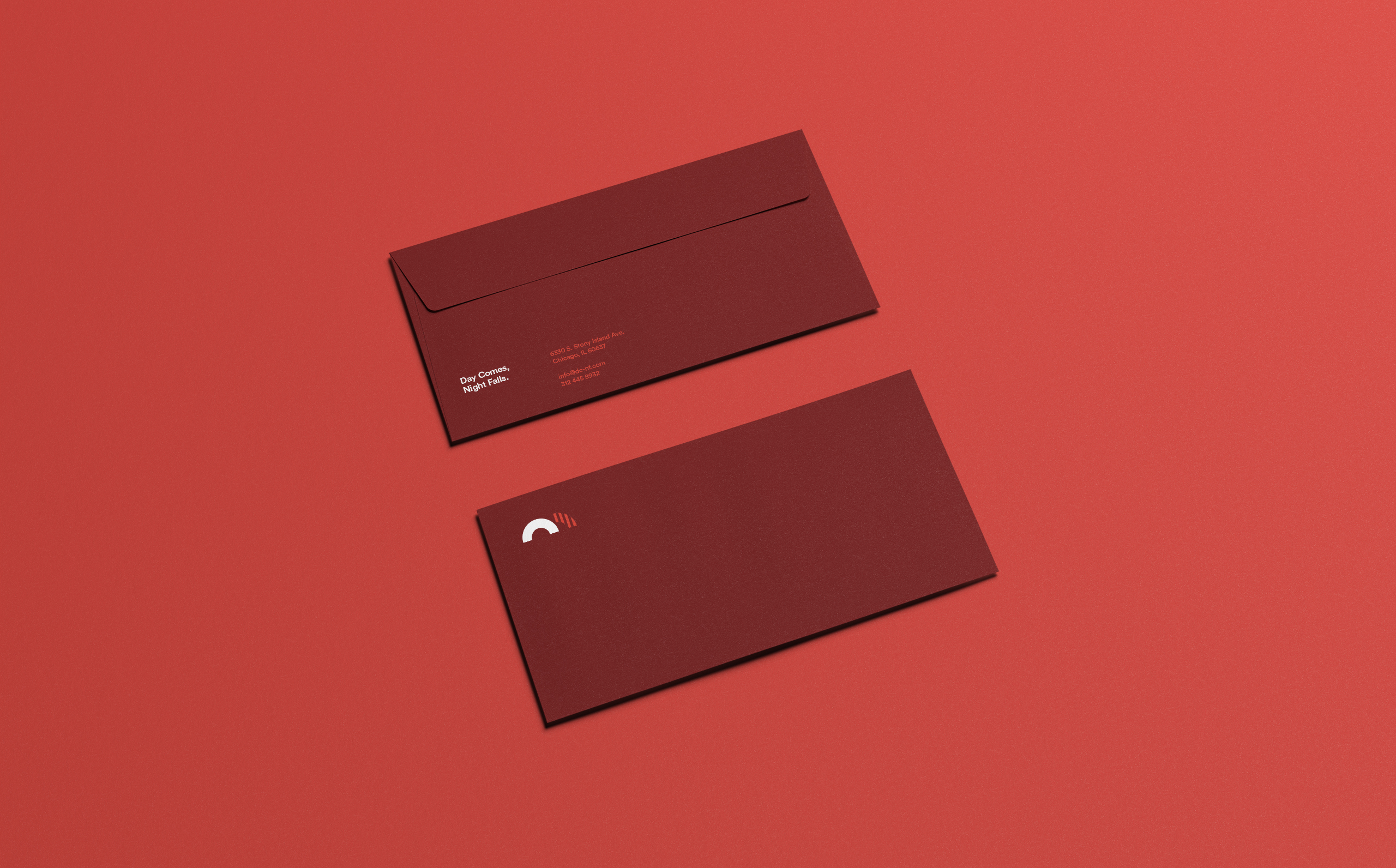
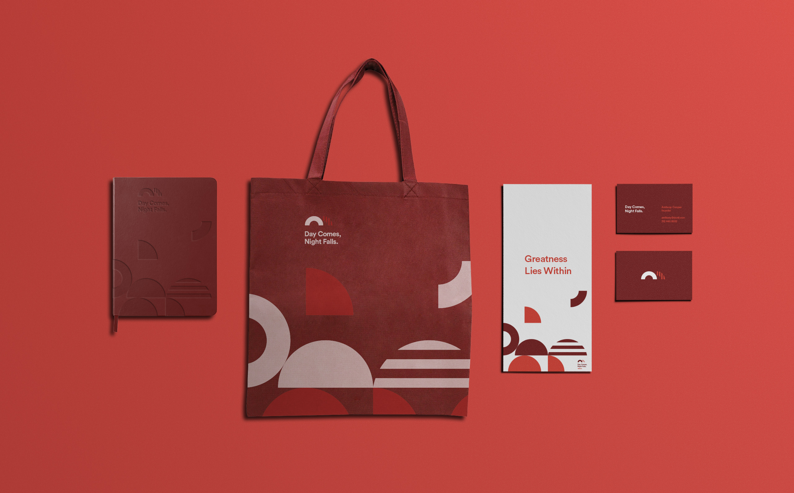
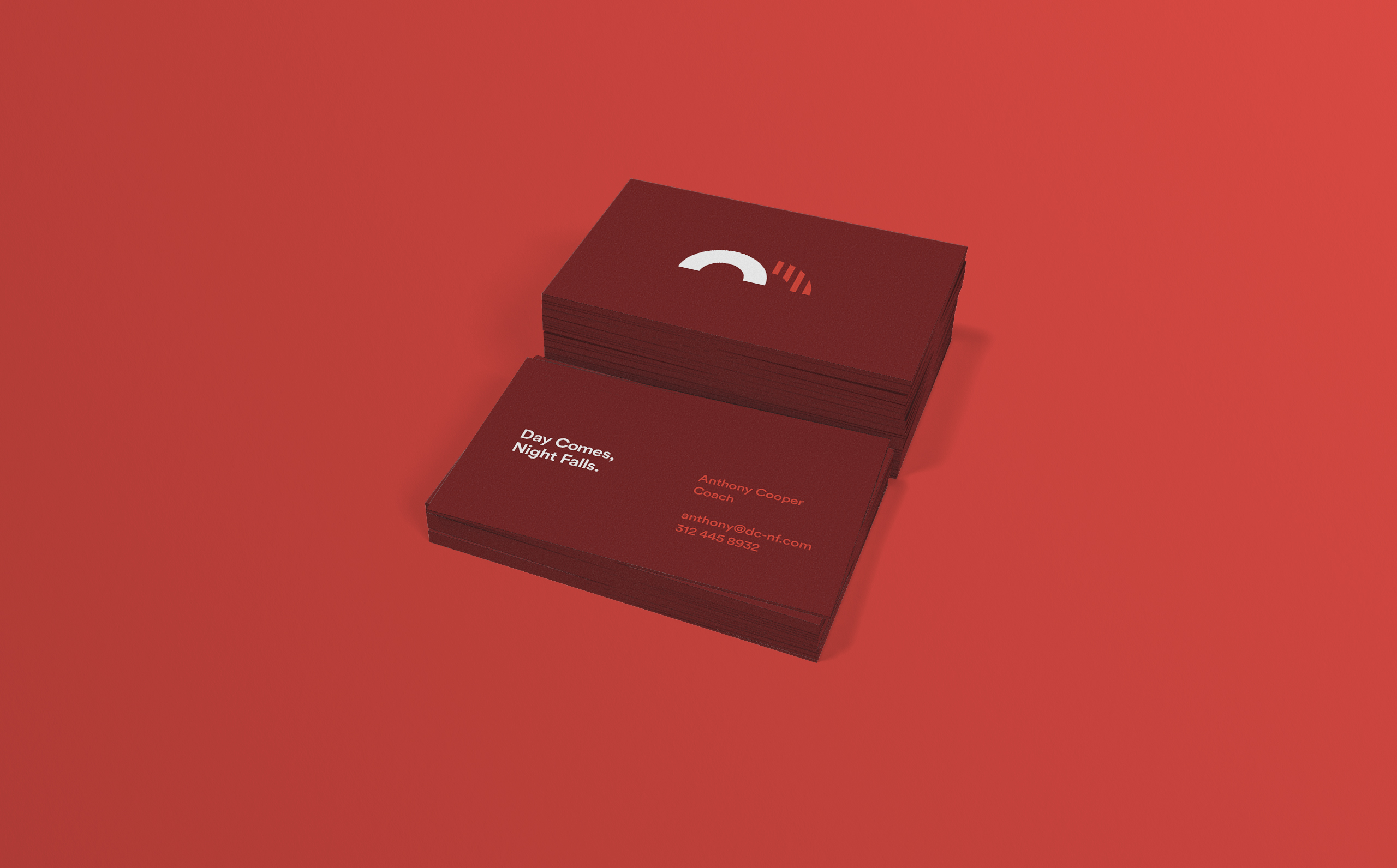
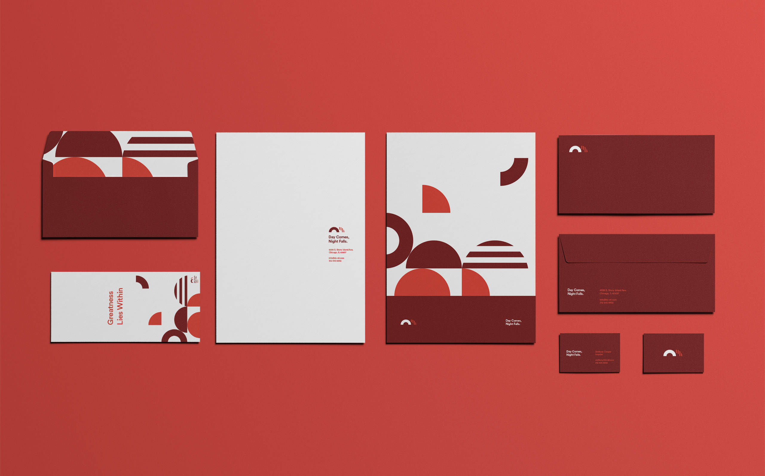
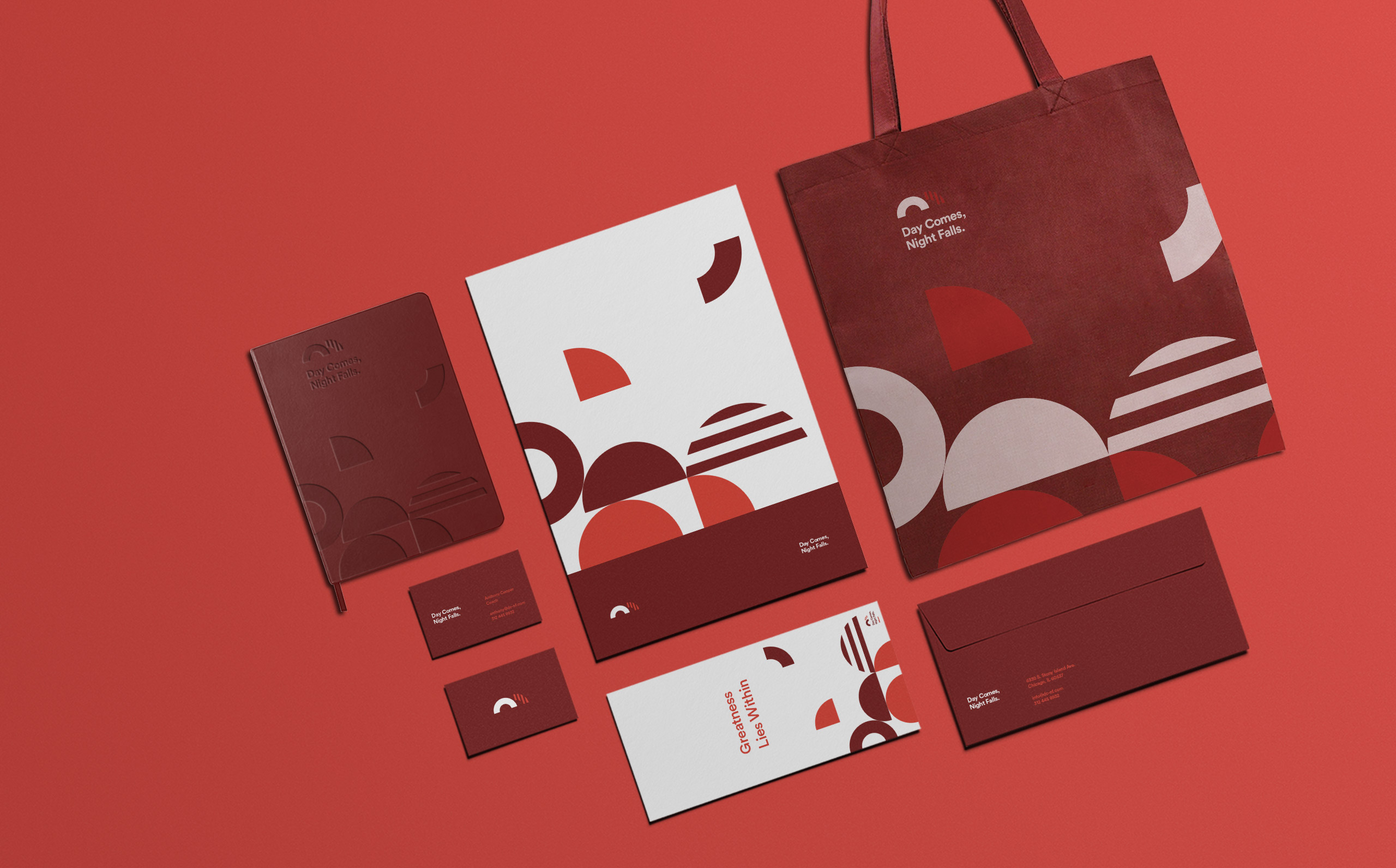
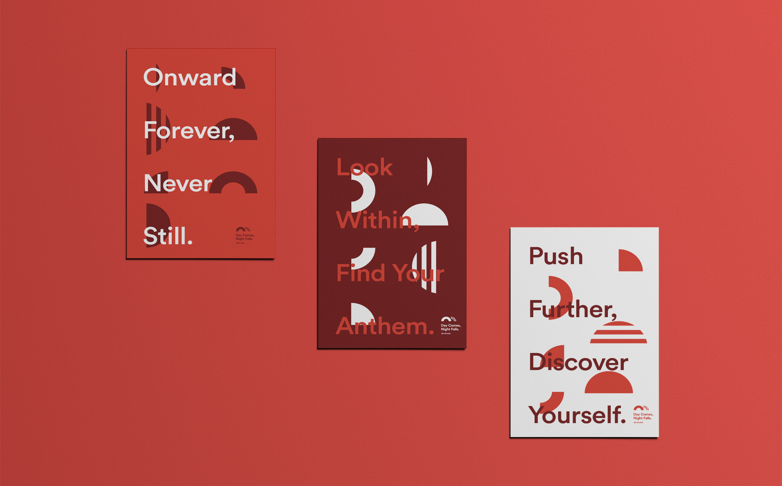
Anthony Cooper started Day Comes, Night Falls to give back to the community that gave him so much. It operates to help people turn their lives around and get them on the right track. The brand needed to be energy forward and lively. Balancing abstracted shapes with simple typography, we created a strong brand that people will gravitate towards and trust. It is the team you wear on your chest, it is your sense of home.


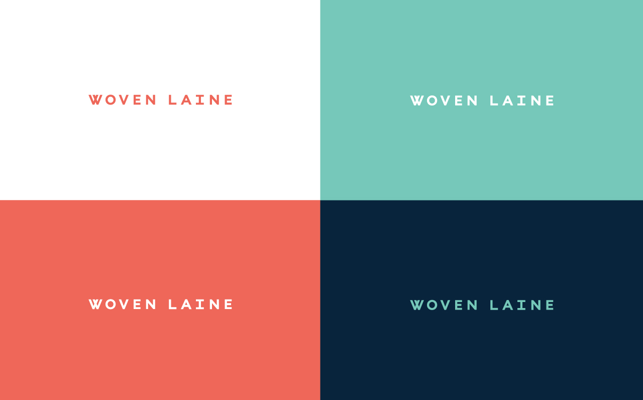
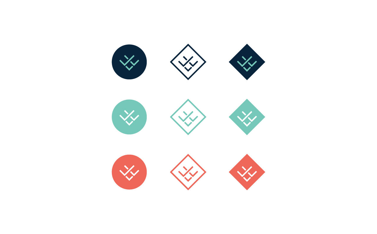
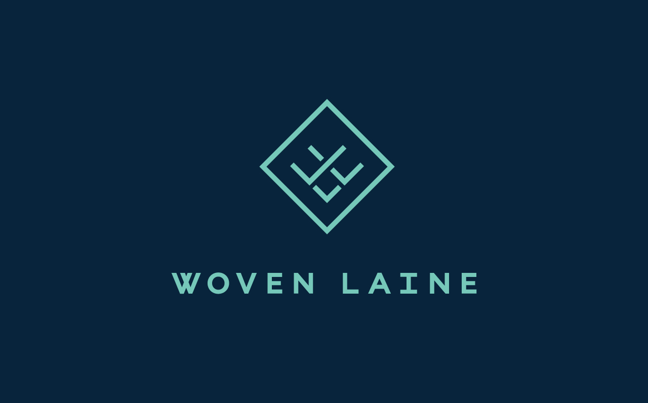
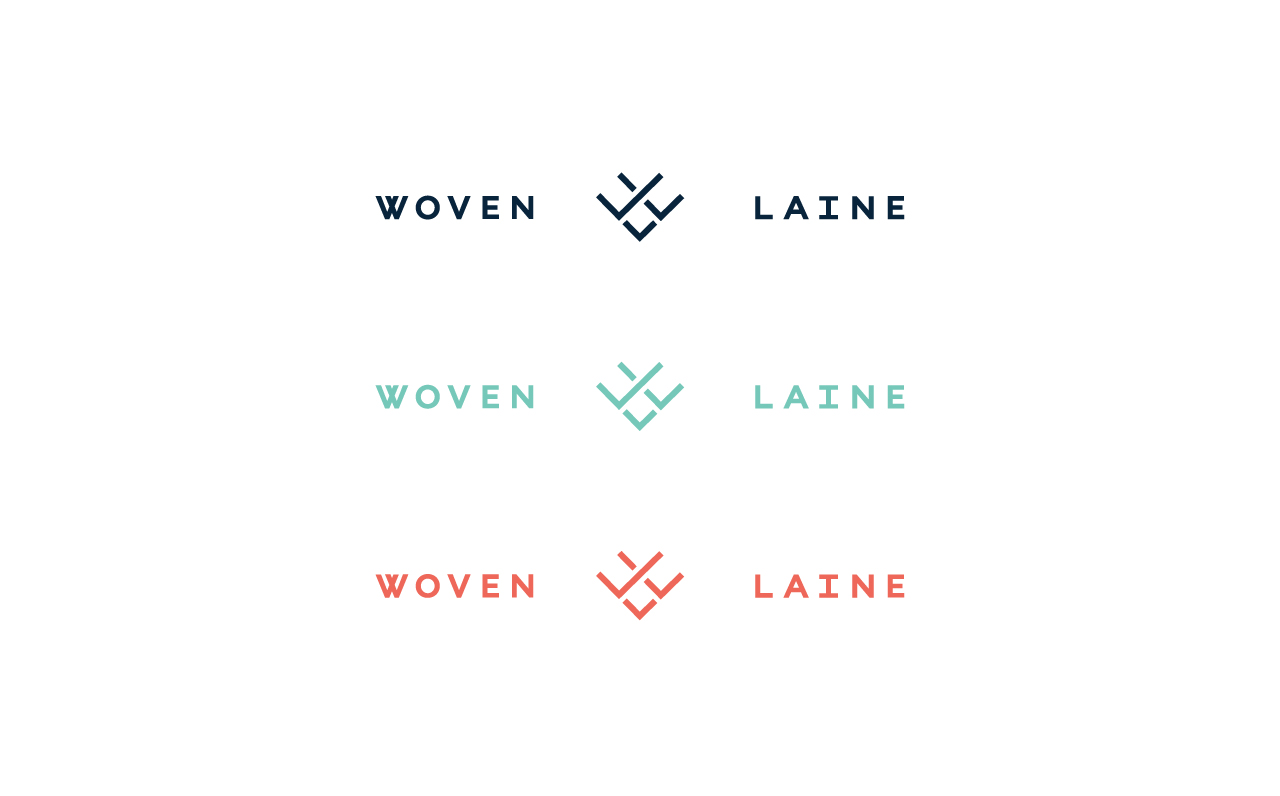
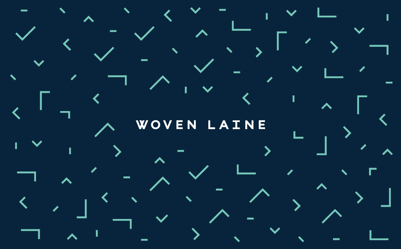
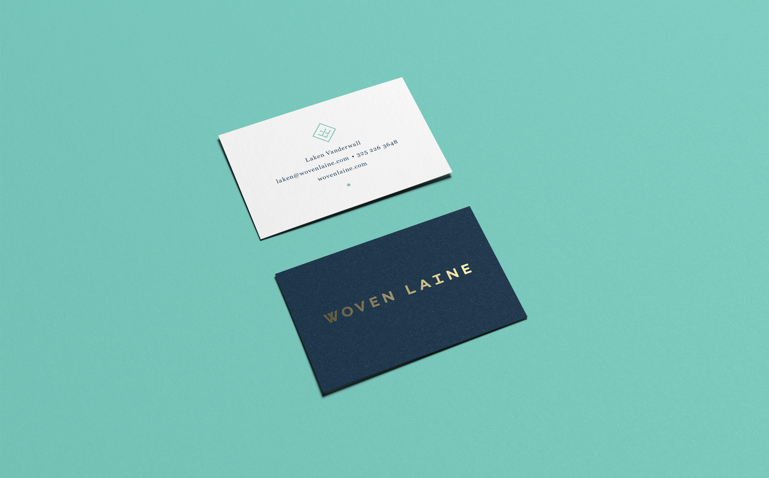
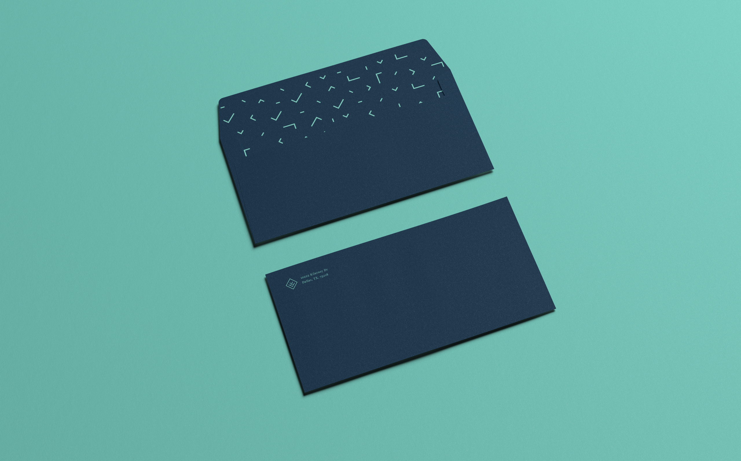
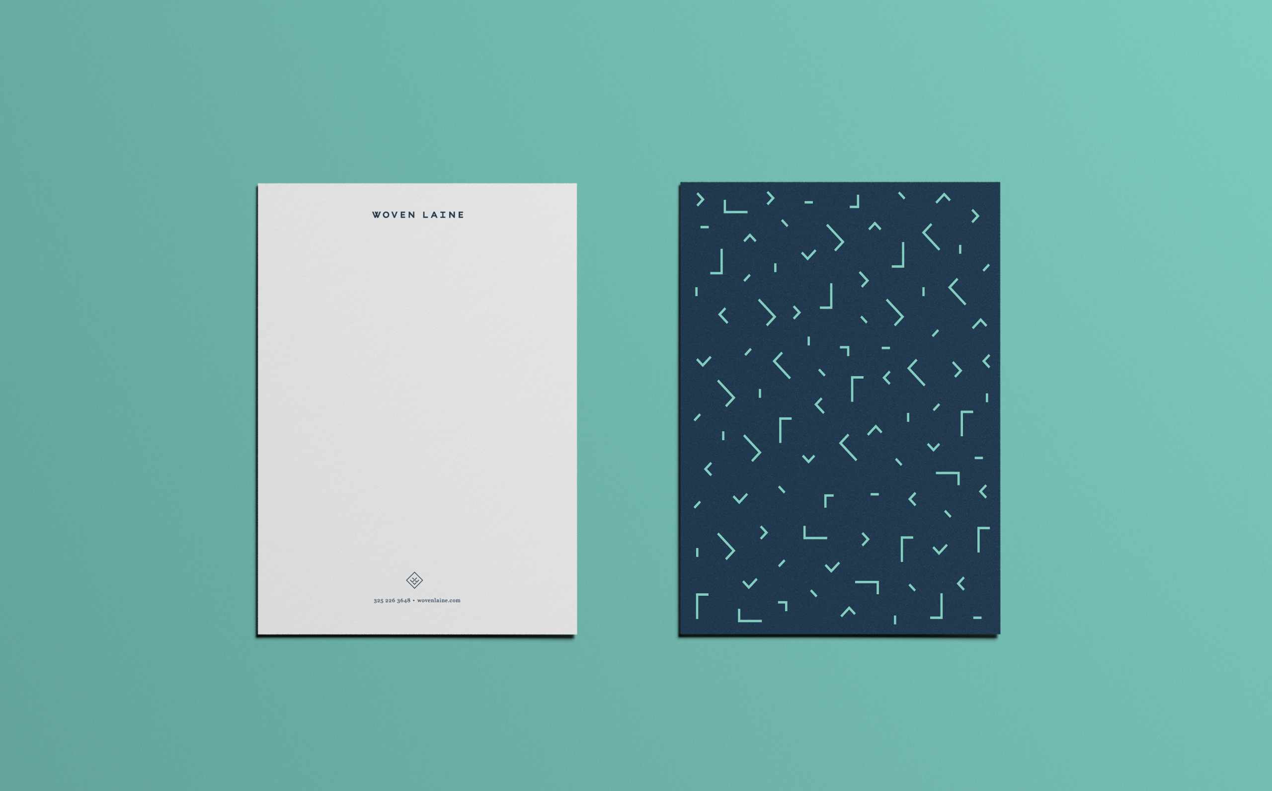
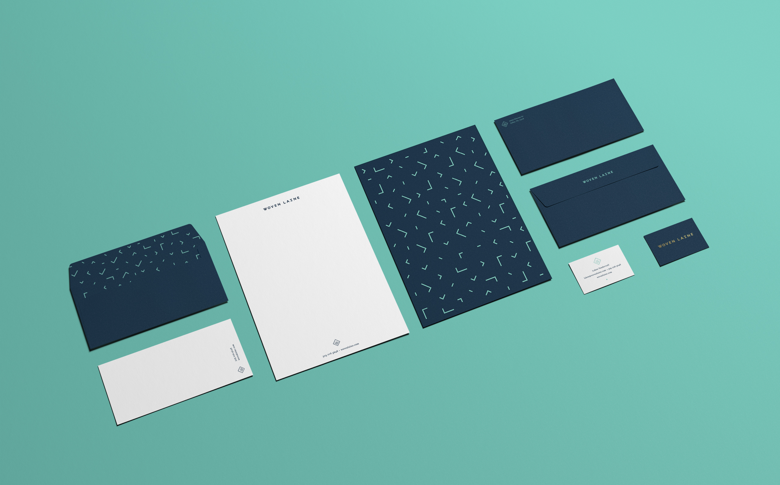
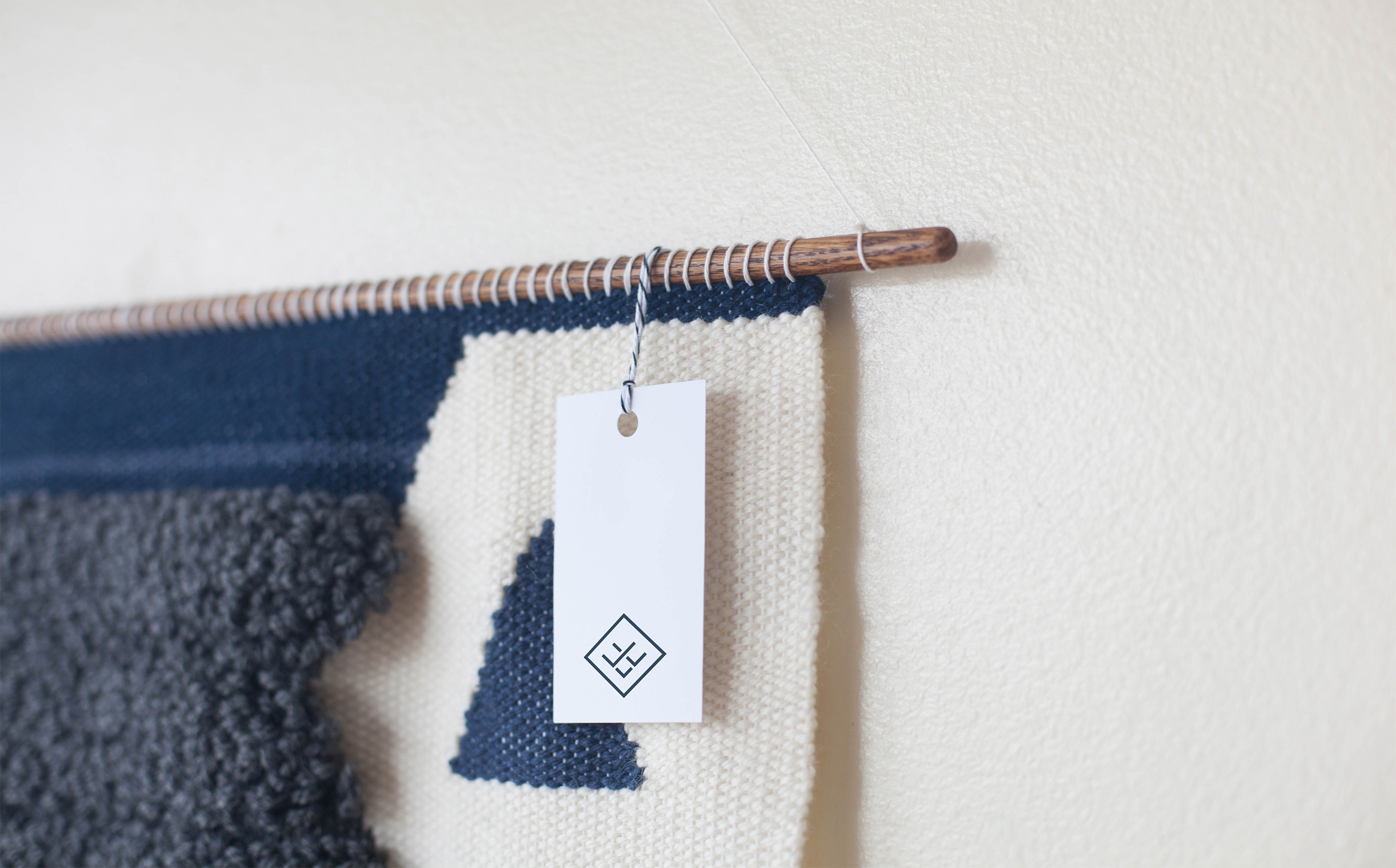
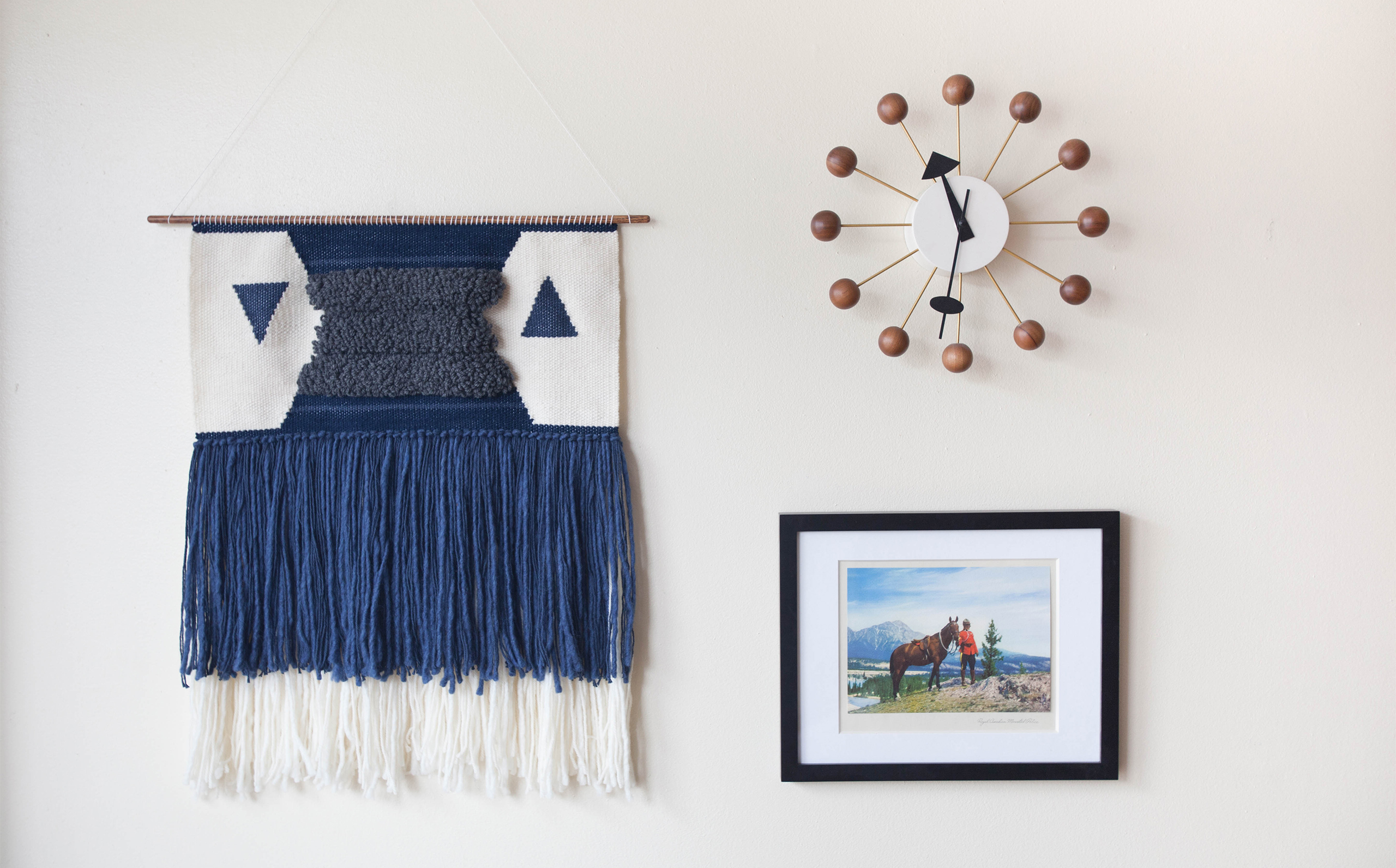
When creating the brand for Woven Laine, it was important to show the process of creation. The ornate geometric tapestries start out as many different colored balls of yarn and are molded and woven into something precise and beautiful.The brand becomes flexible throughout the use of the exploded pattern consisting of the pieces of the logo. The logo itself is a representation of the final product—concise and thoughtfully assembled.

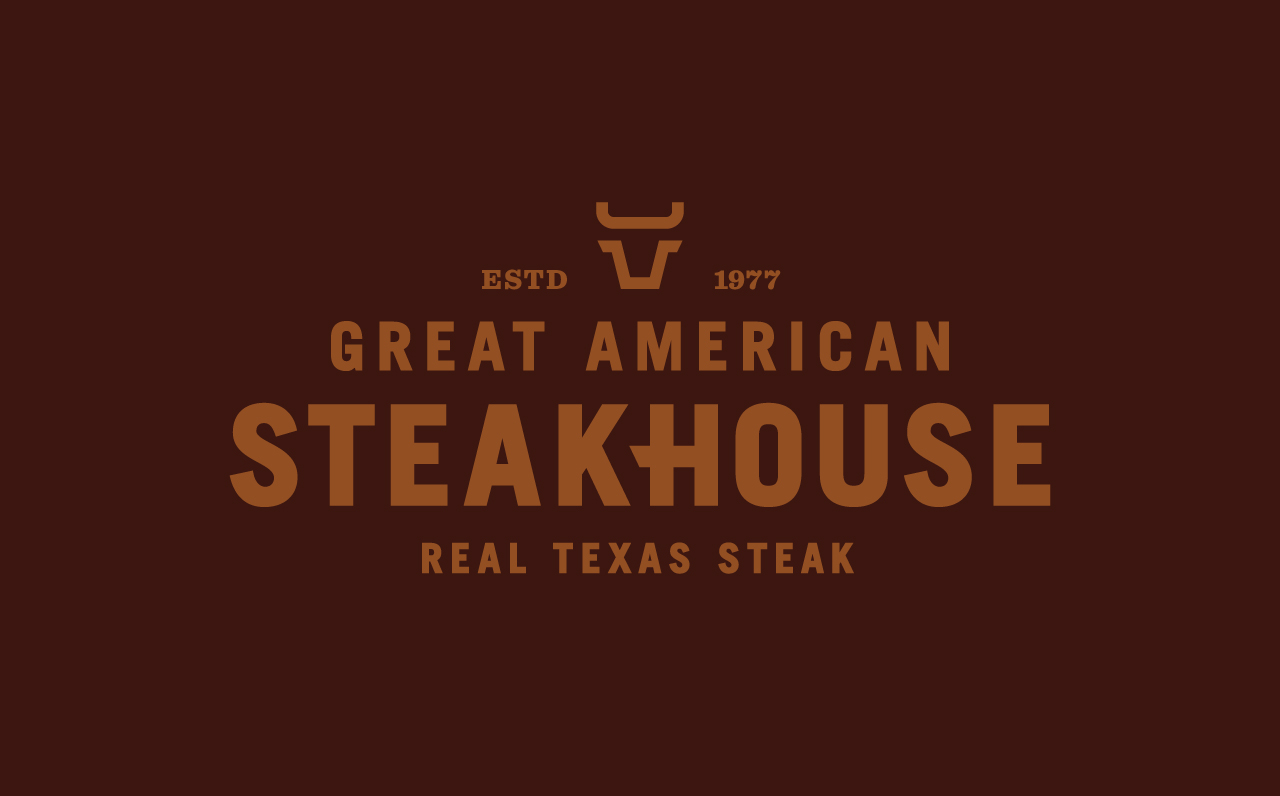
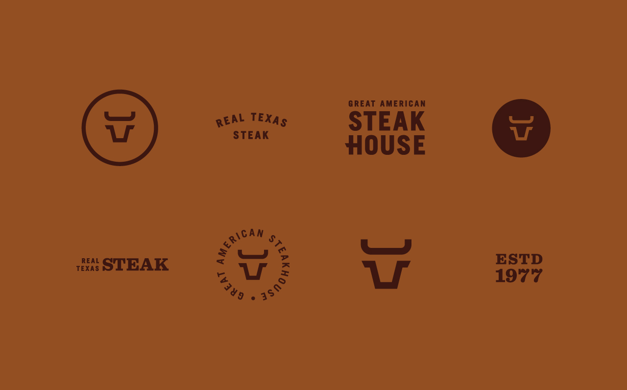
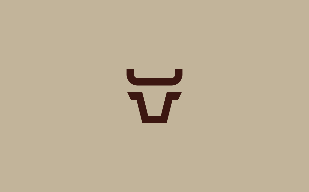
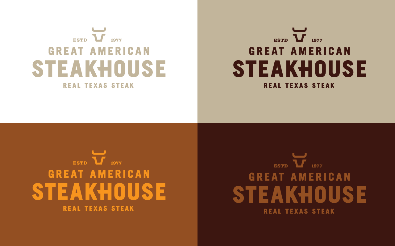
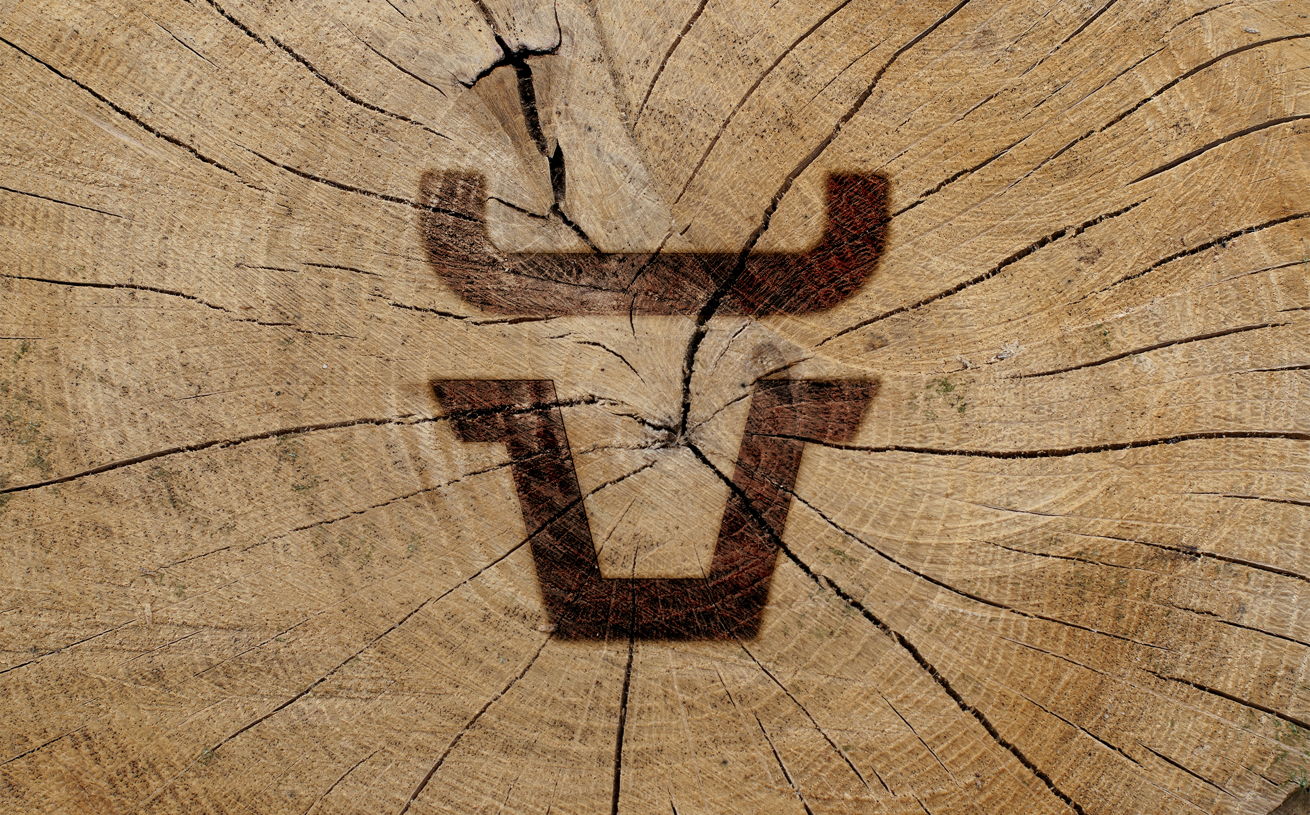
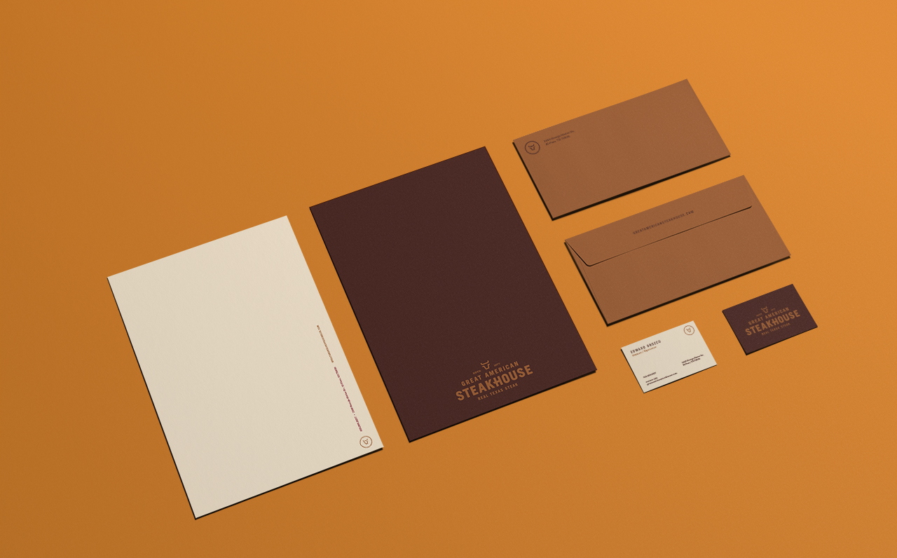
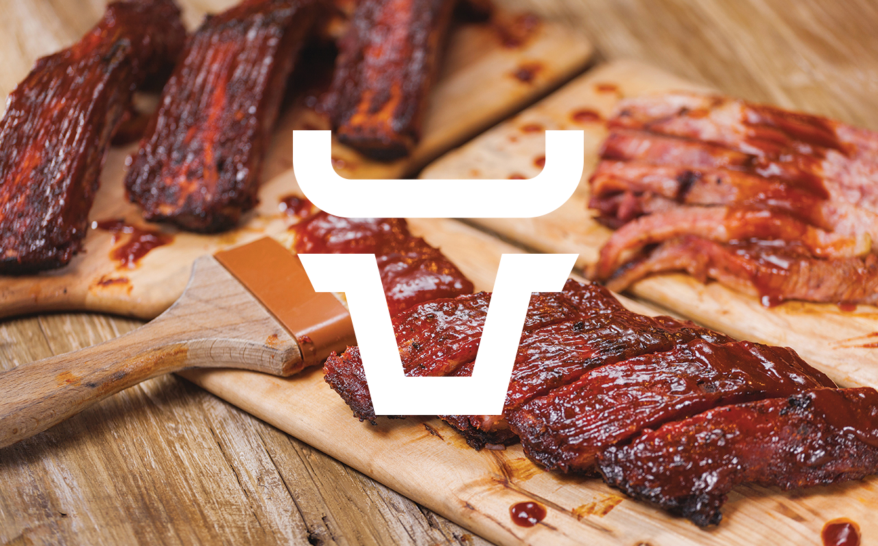
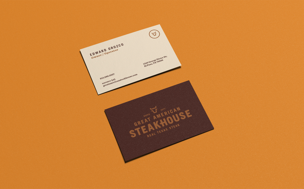
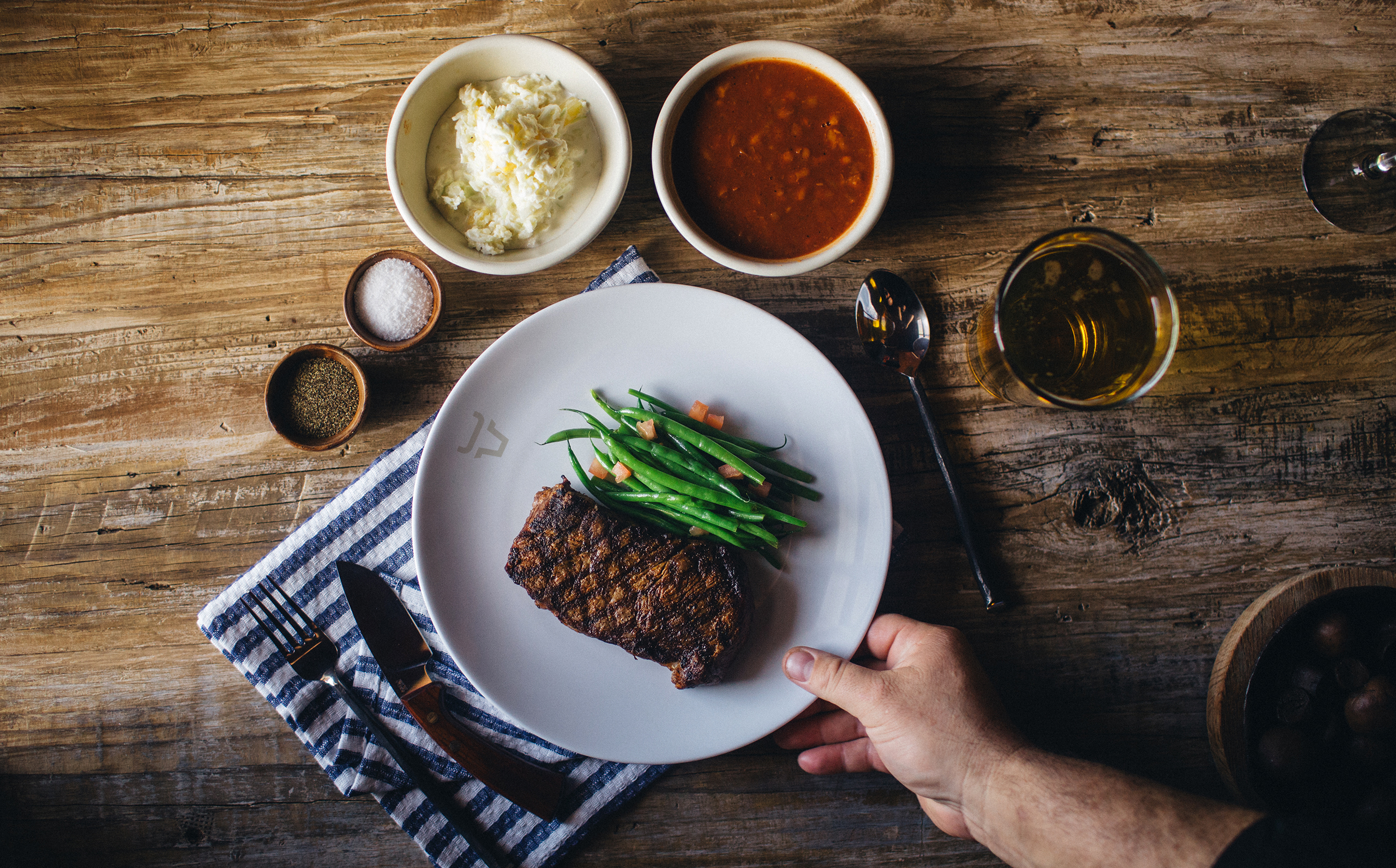
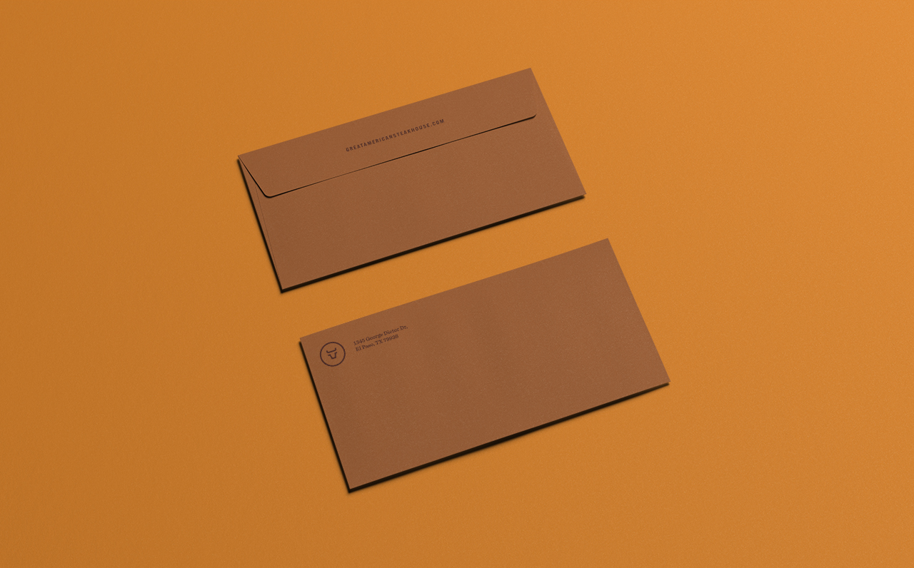
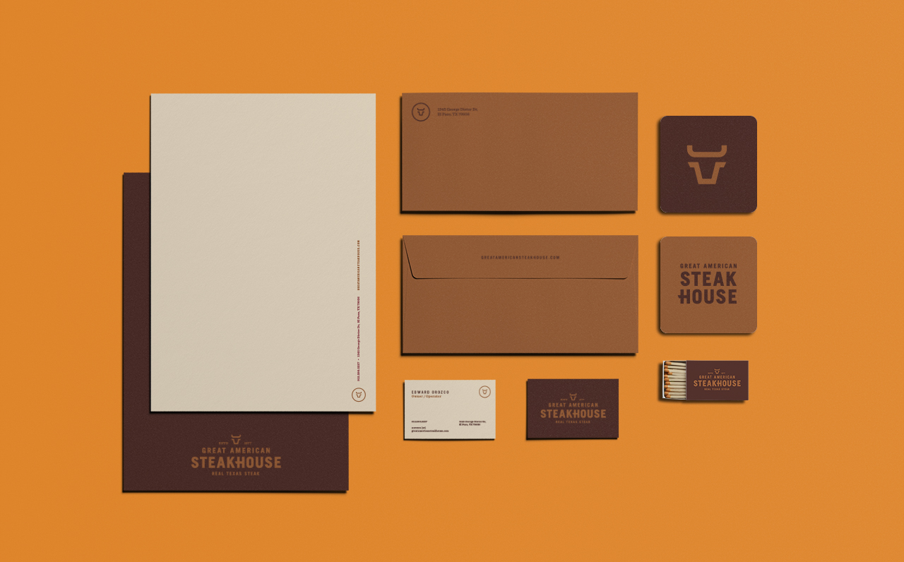
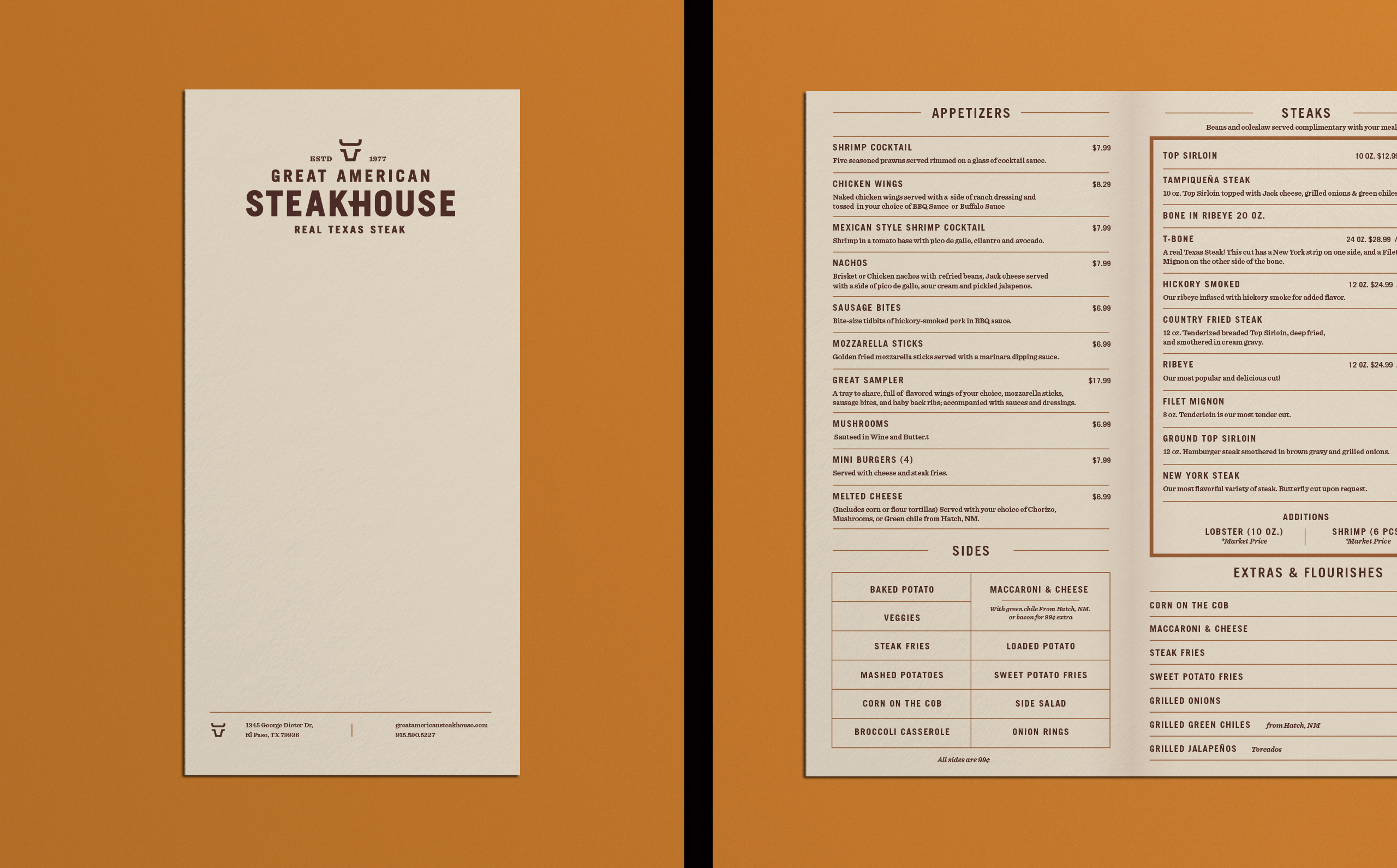
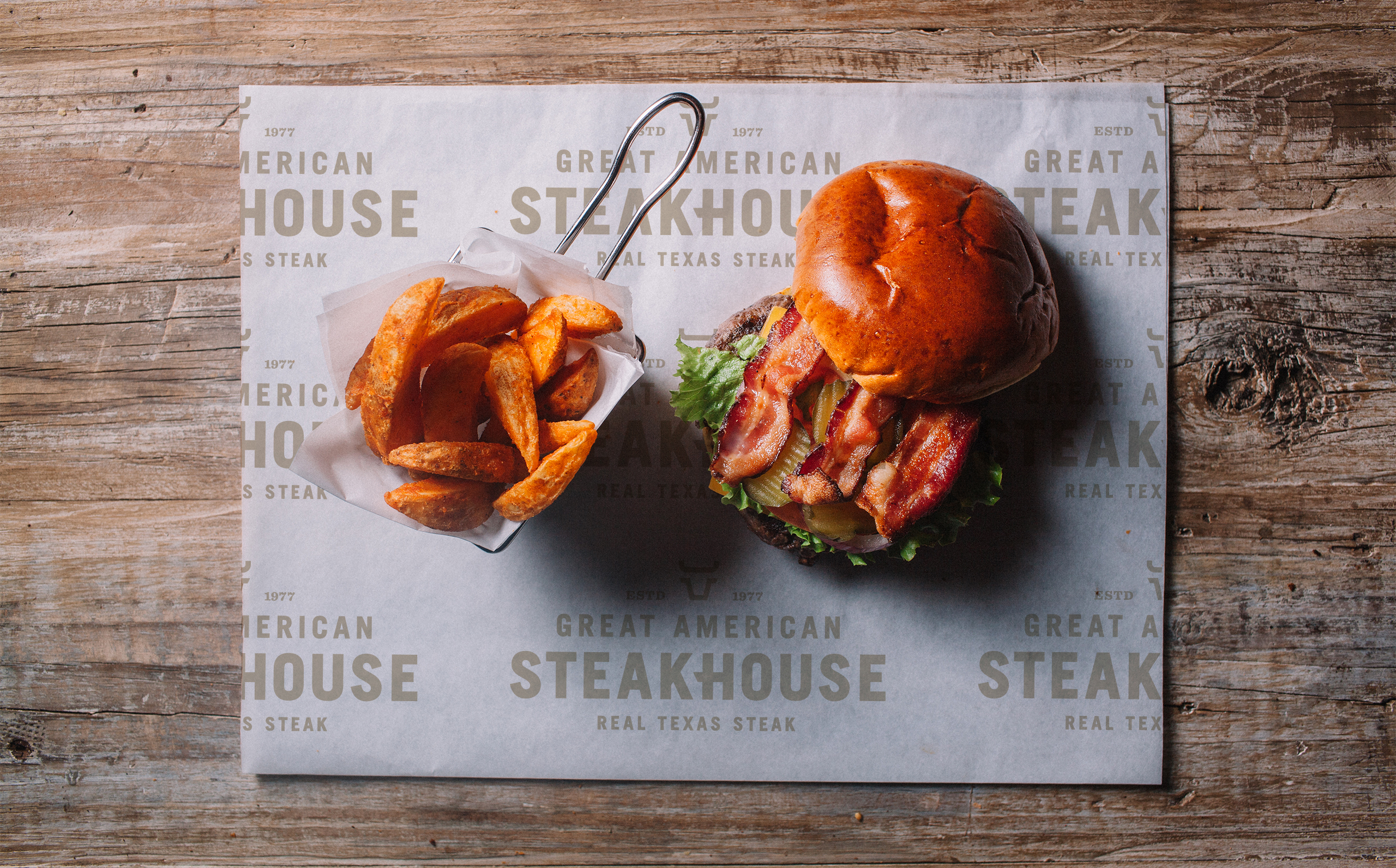
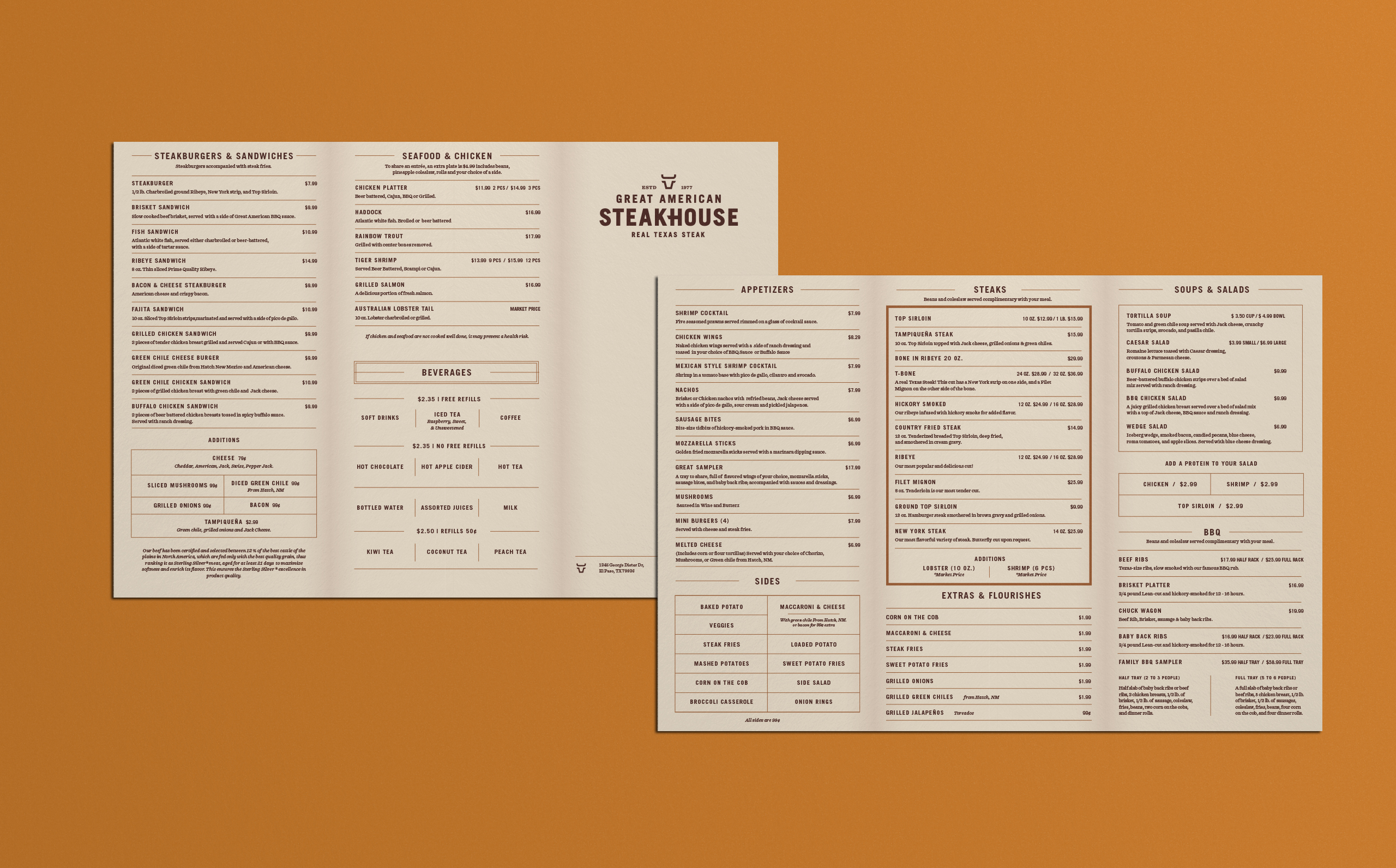
When seeking a re-brand, Great American Steakhouse needed something as bold and American as their name. The Orozco Family wanted to update the brand but keep their heritage as a mainstay of El Paso culture. I worked with them to develop their steer brand based on classic cattle brands and built a strong typographic wordmark around it, then chose a warm color palette that would compliment the identity. It was important for the Orozco Family to have an inviting color palette to pair with the strong typography.

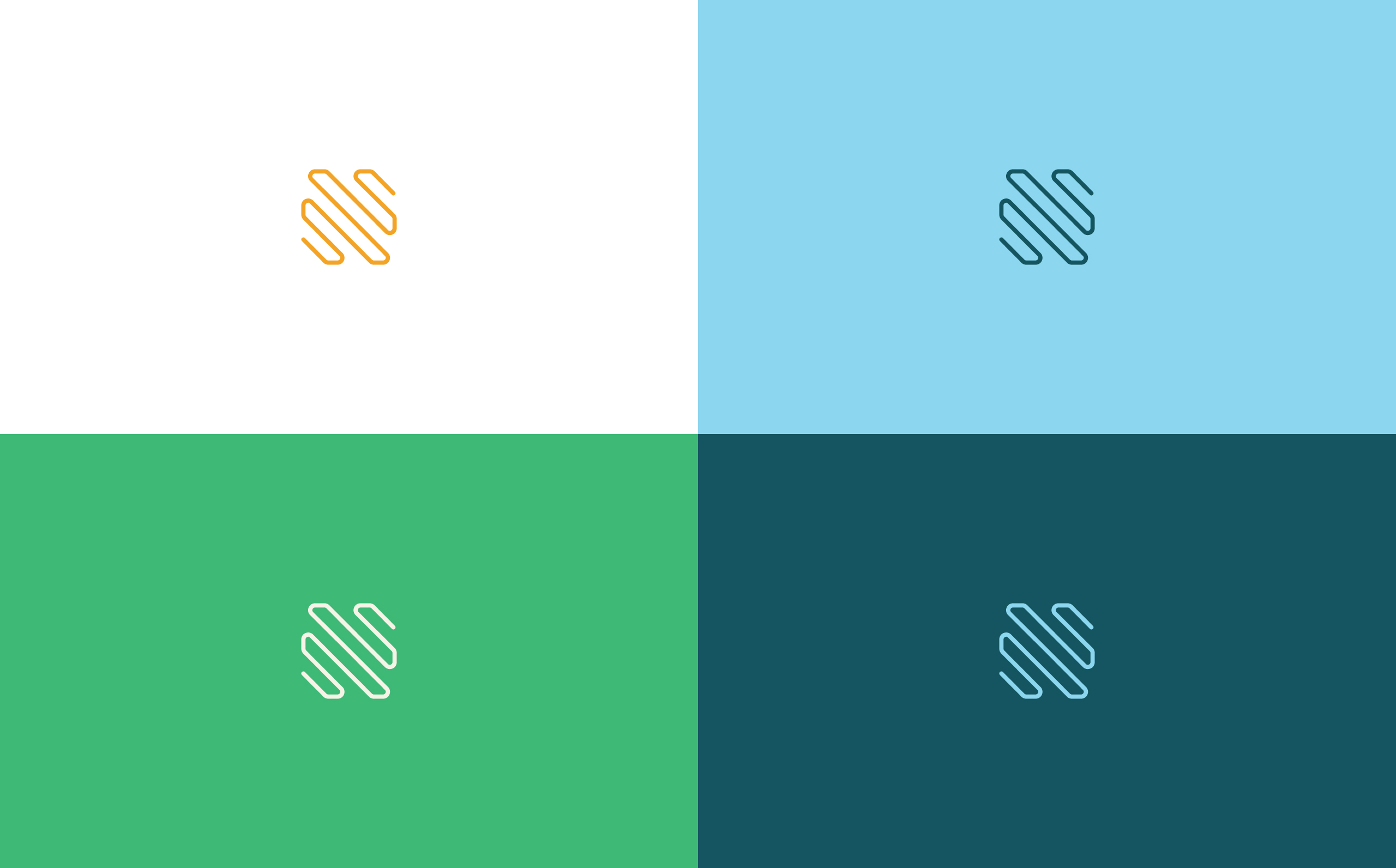
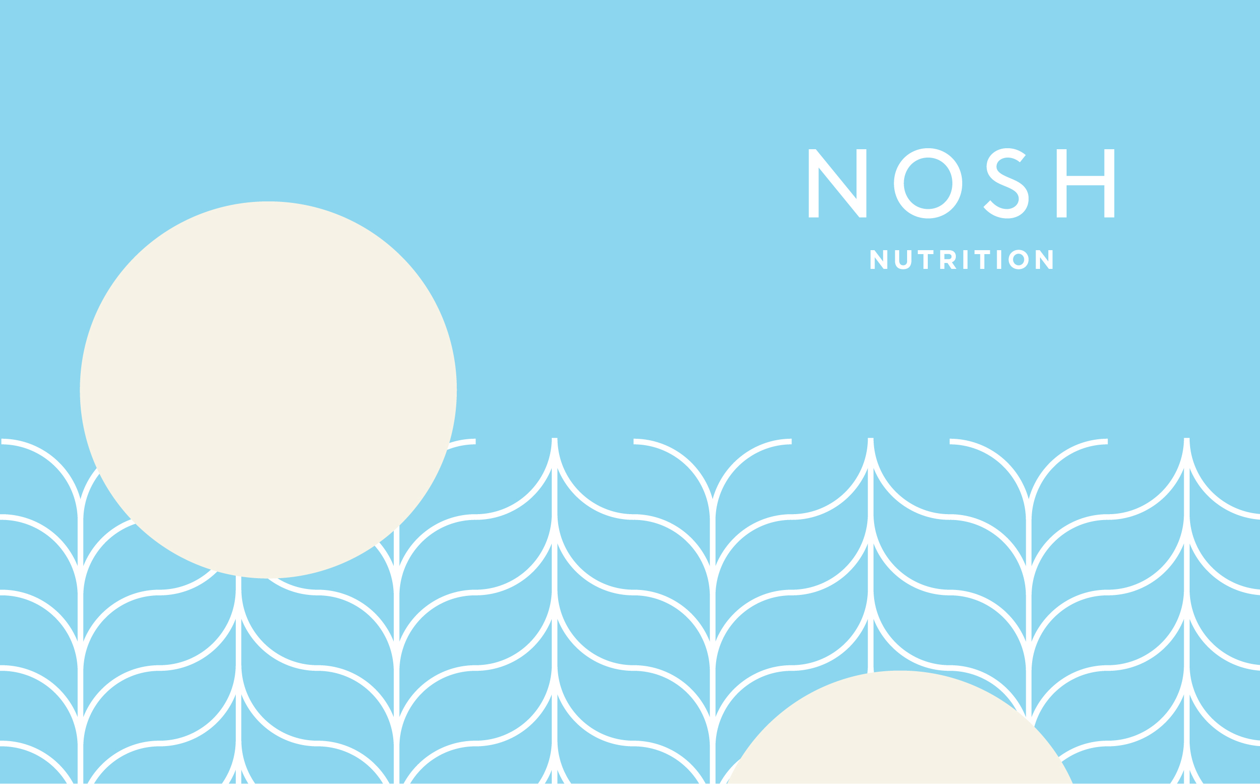
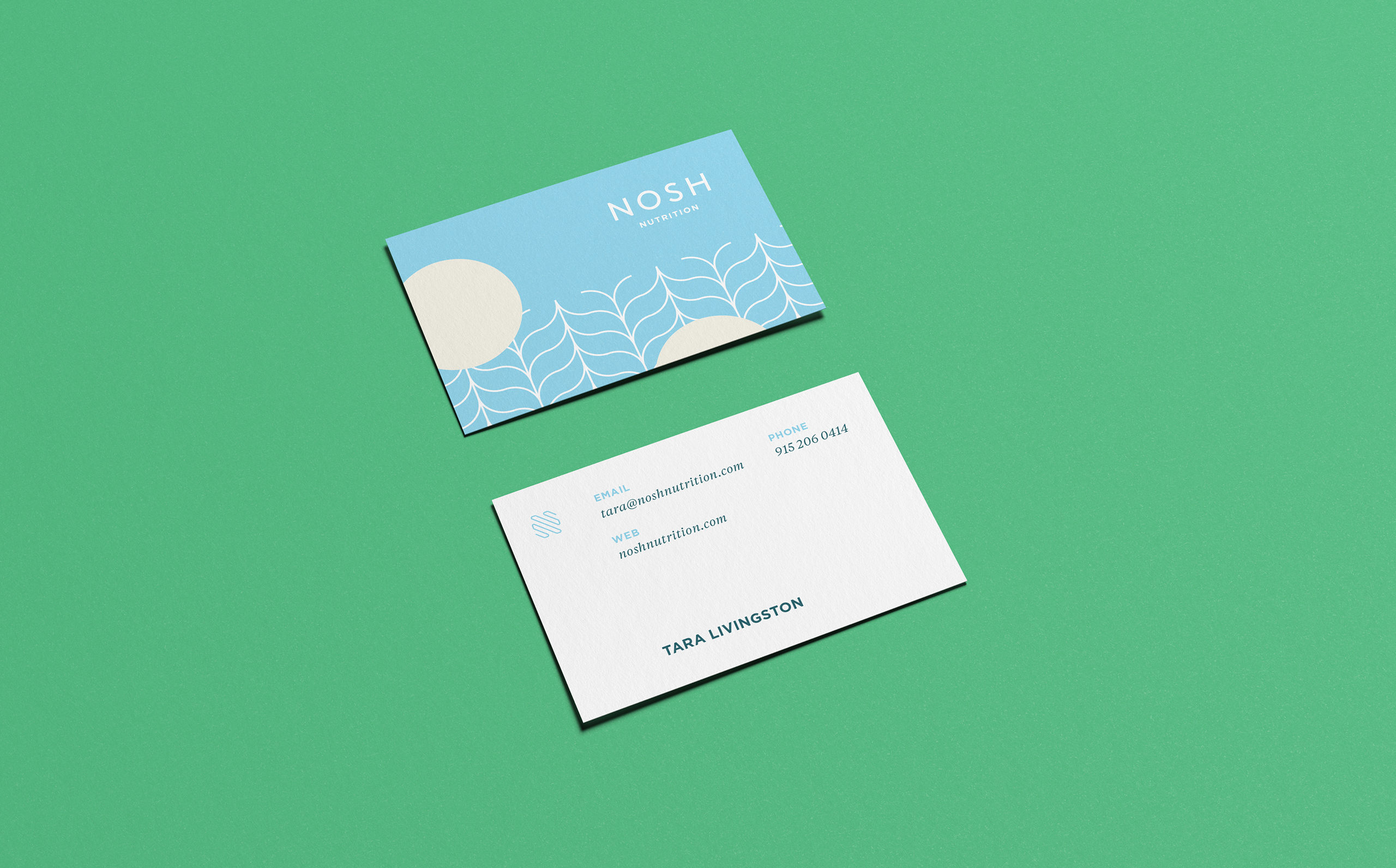
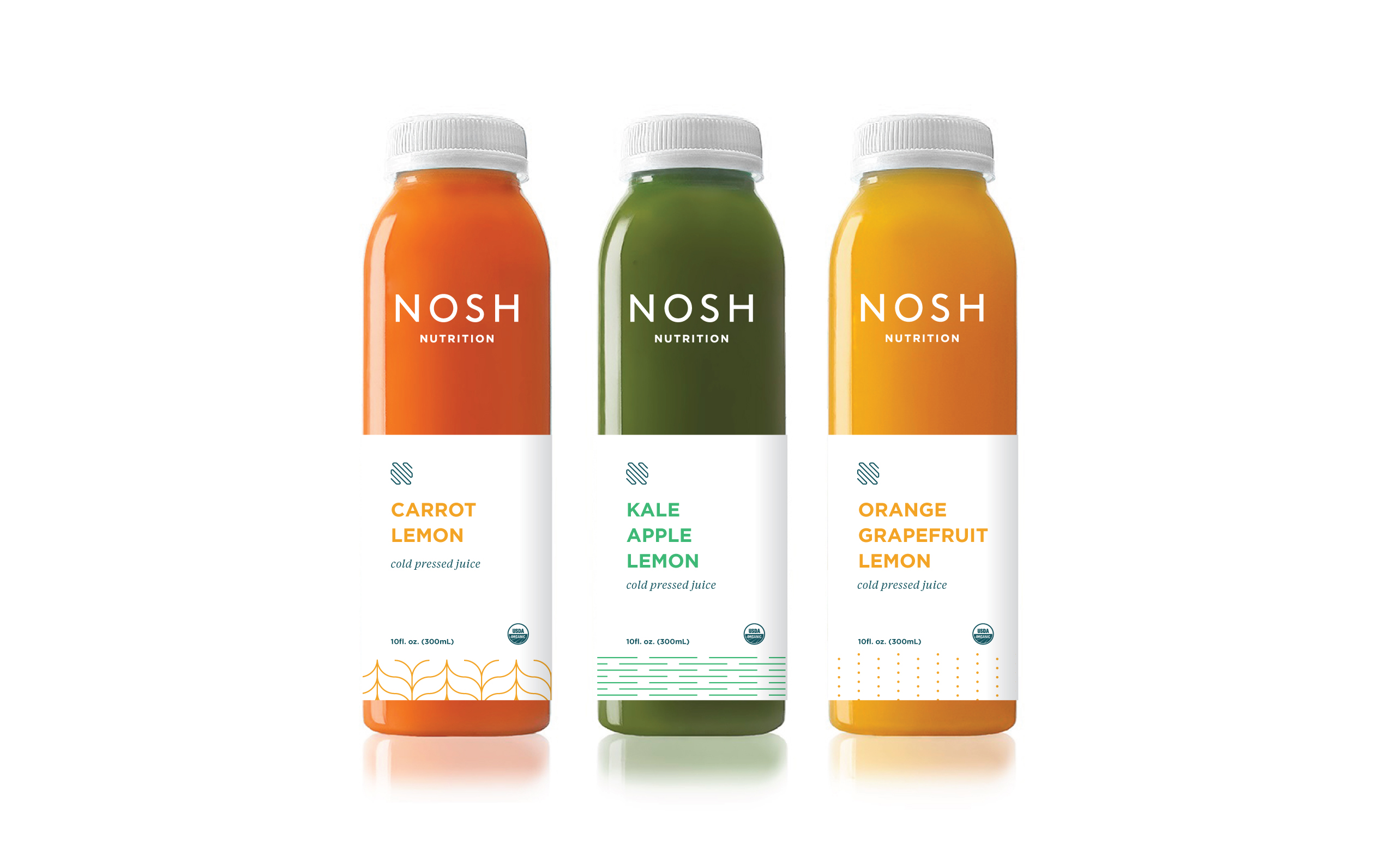
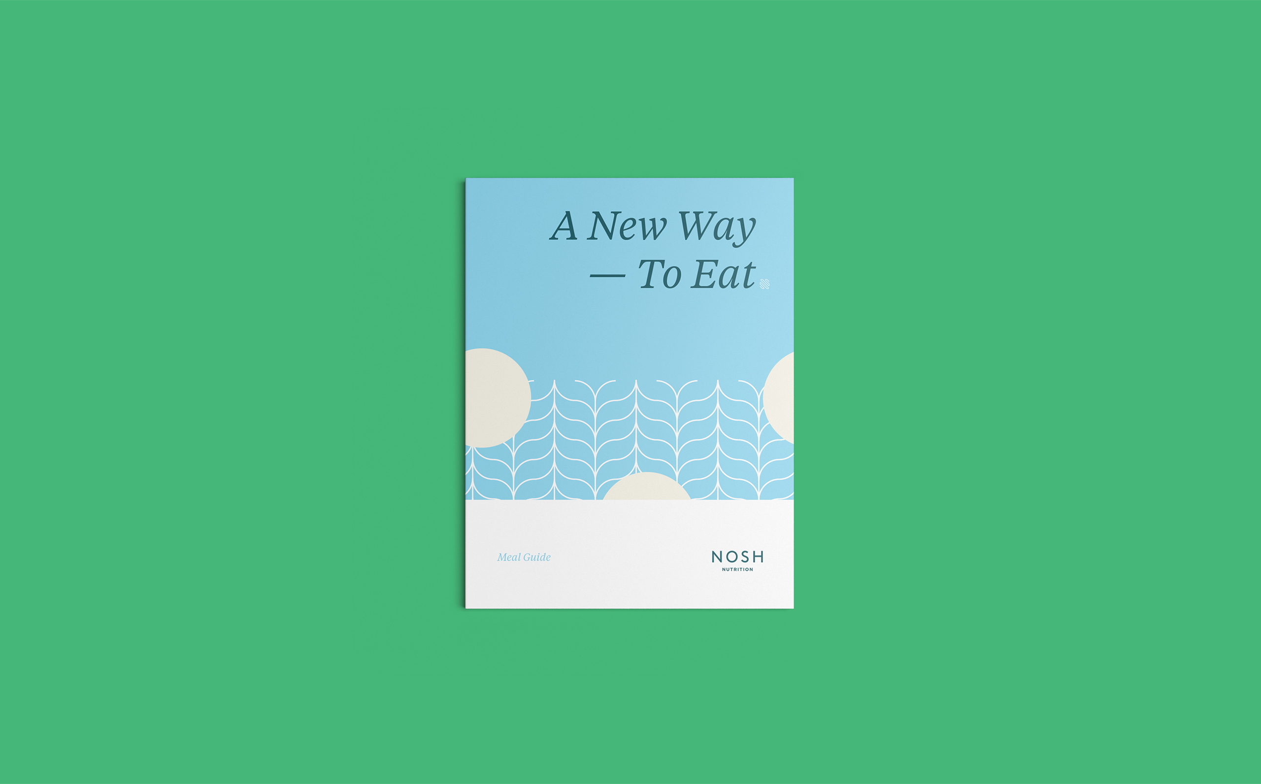
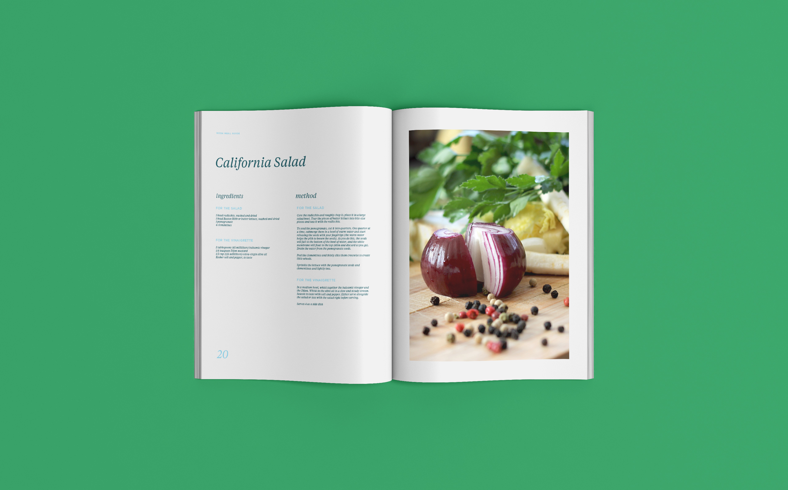
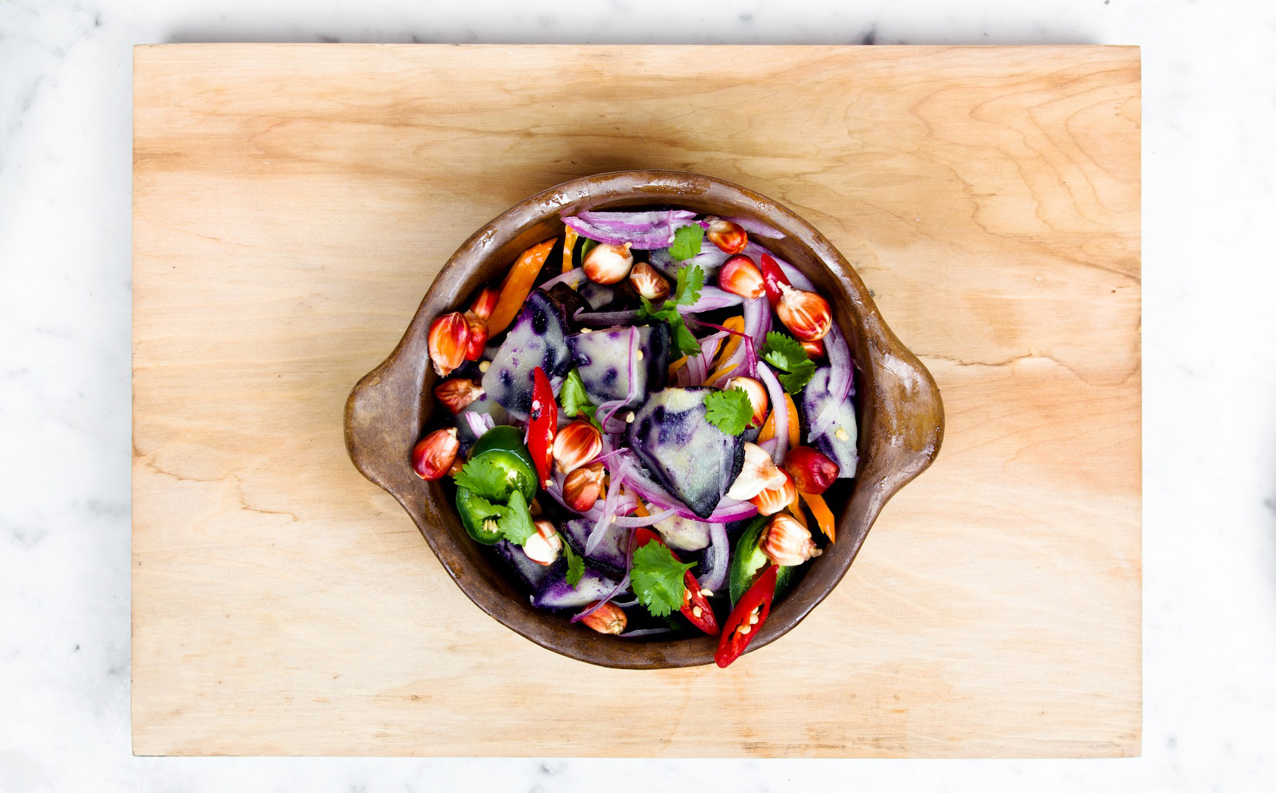
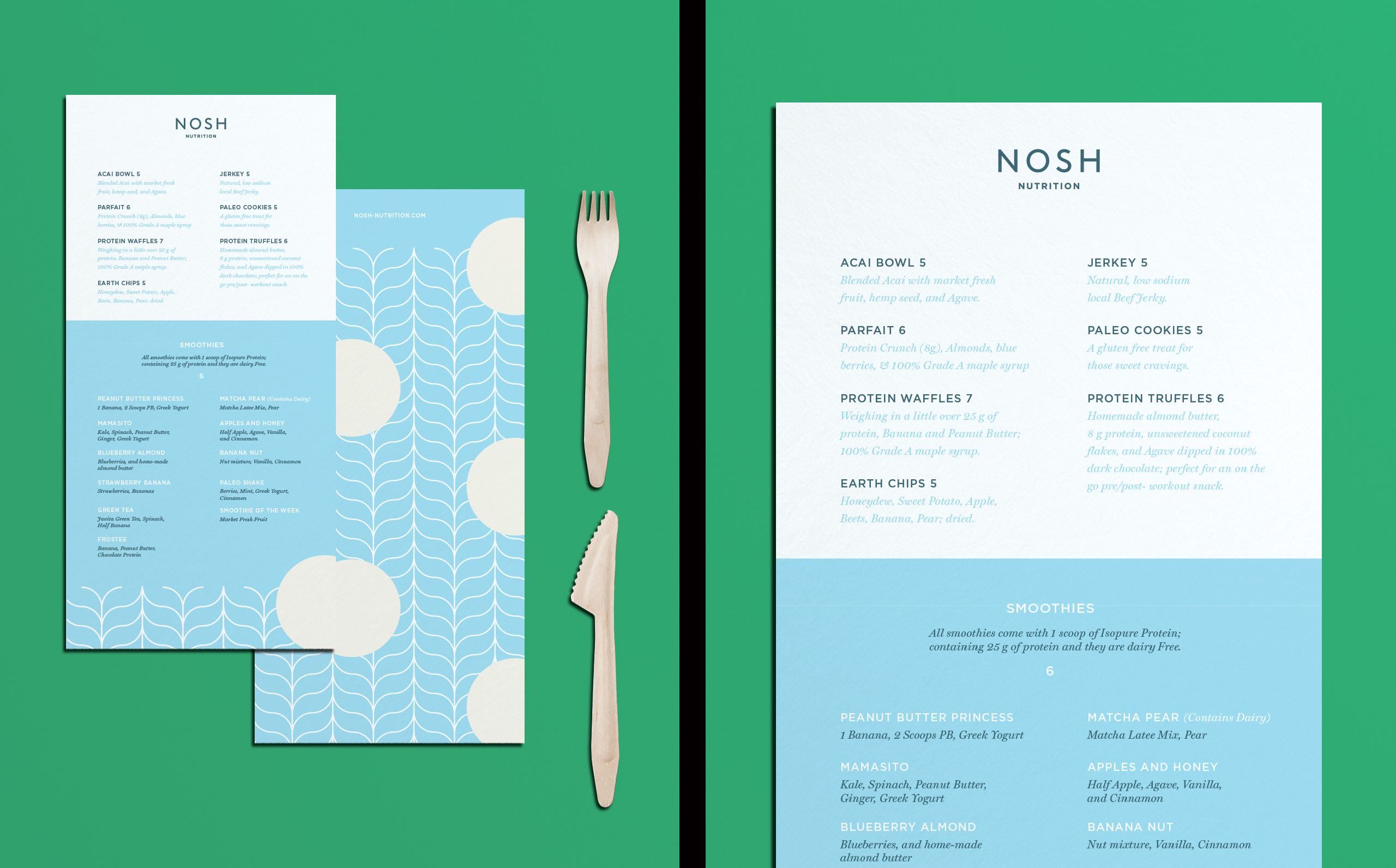
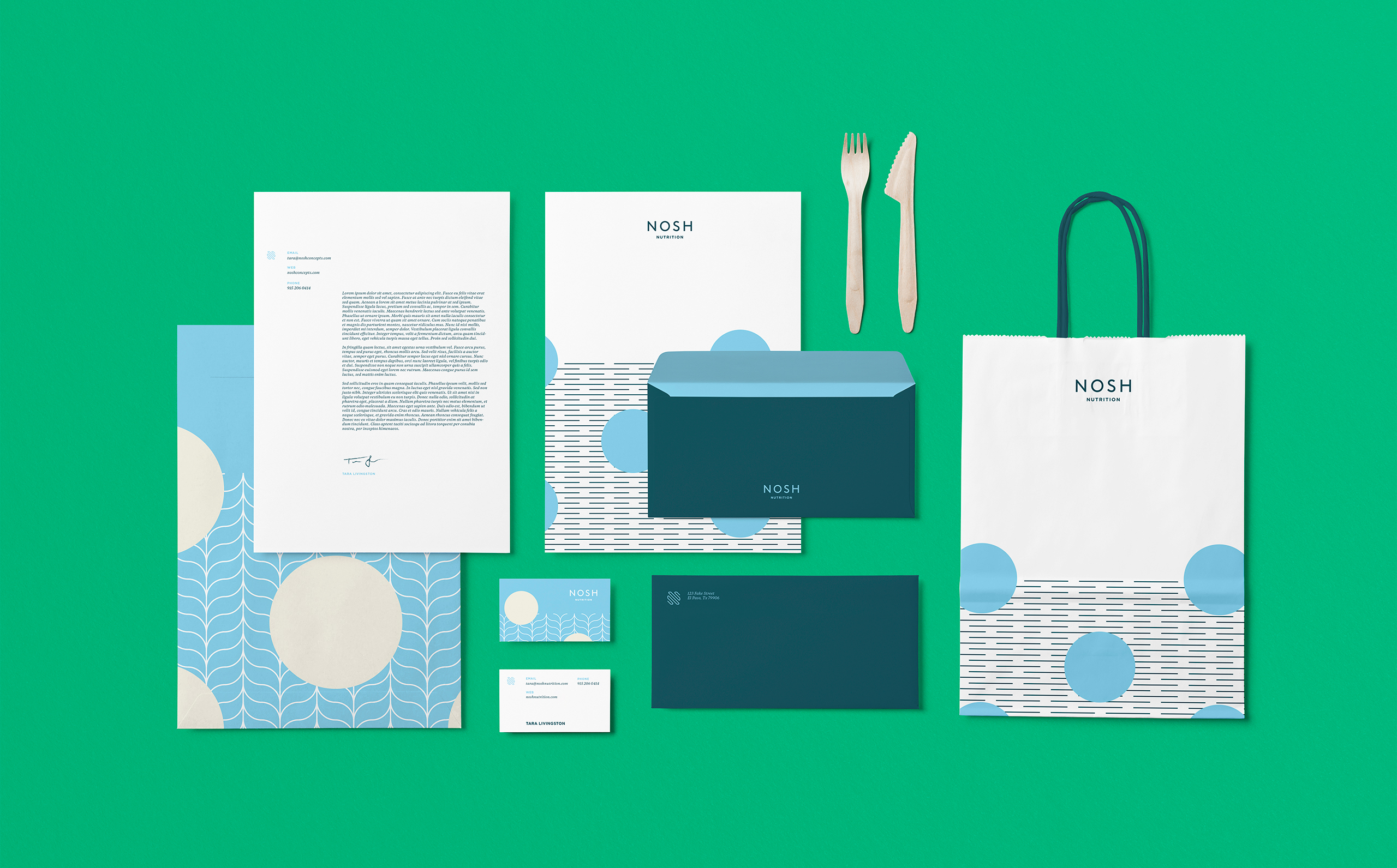
Tara Livingston started Nosh with a simple goal, bringing an alternative to pre-planned meals. She wanted to bring the industry into the present day. Combining the knowledge of trusted friend and Cardiologist, she developed a healthy, appetizing menu for people on the move. This brand finds its strength in the energy and motion it conveys. The wordmark is modern and classic, and the patterns are bright and energetic. Paired together, they create a modern sophisticated brand that represents the offerings presented by Nosh.


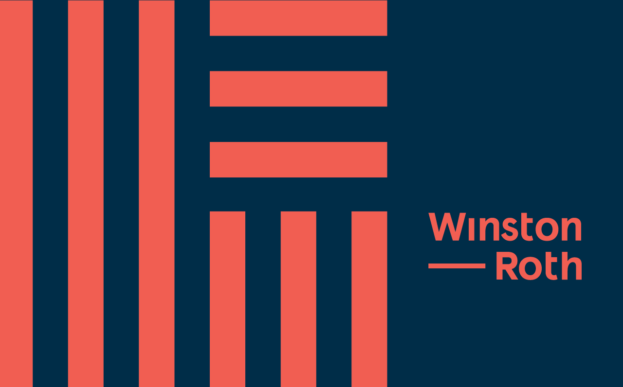
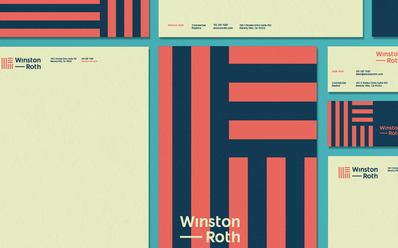
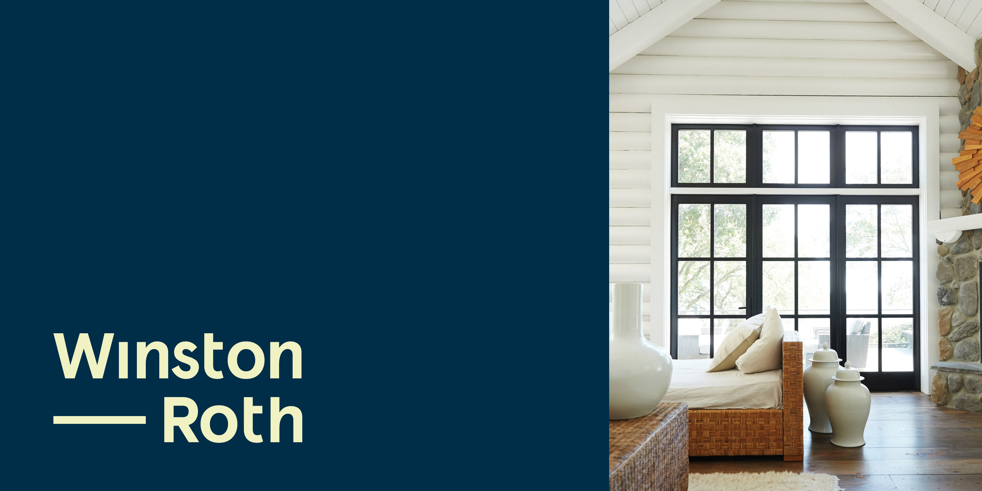
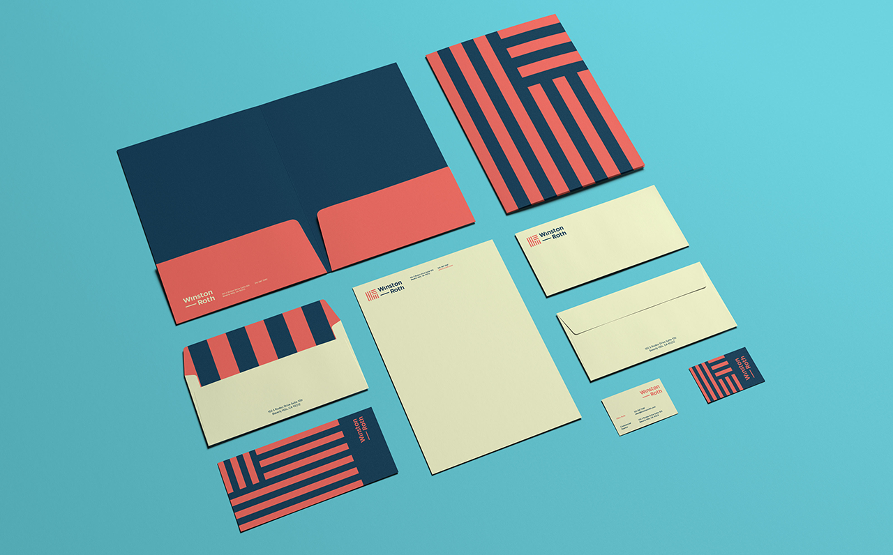
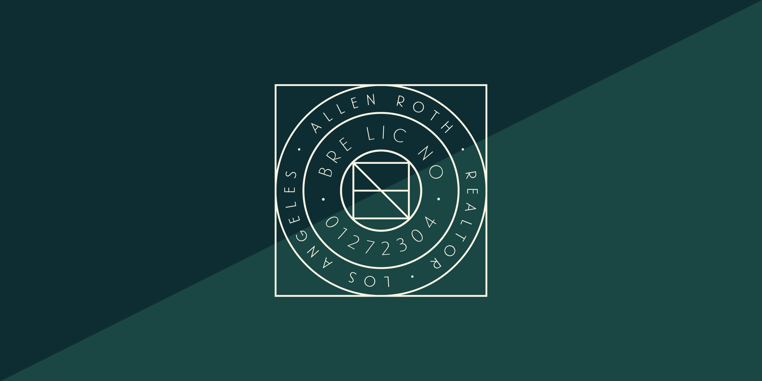
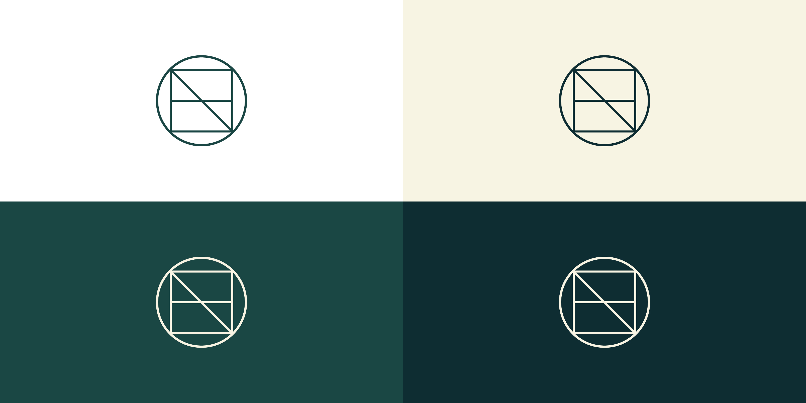
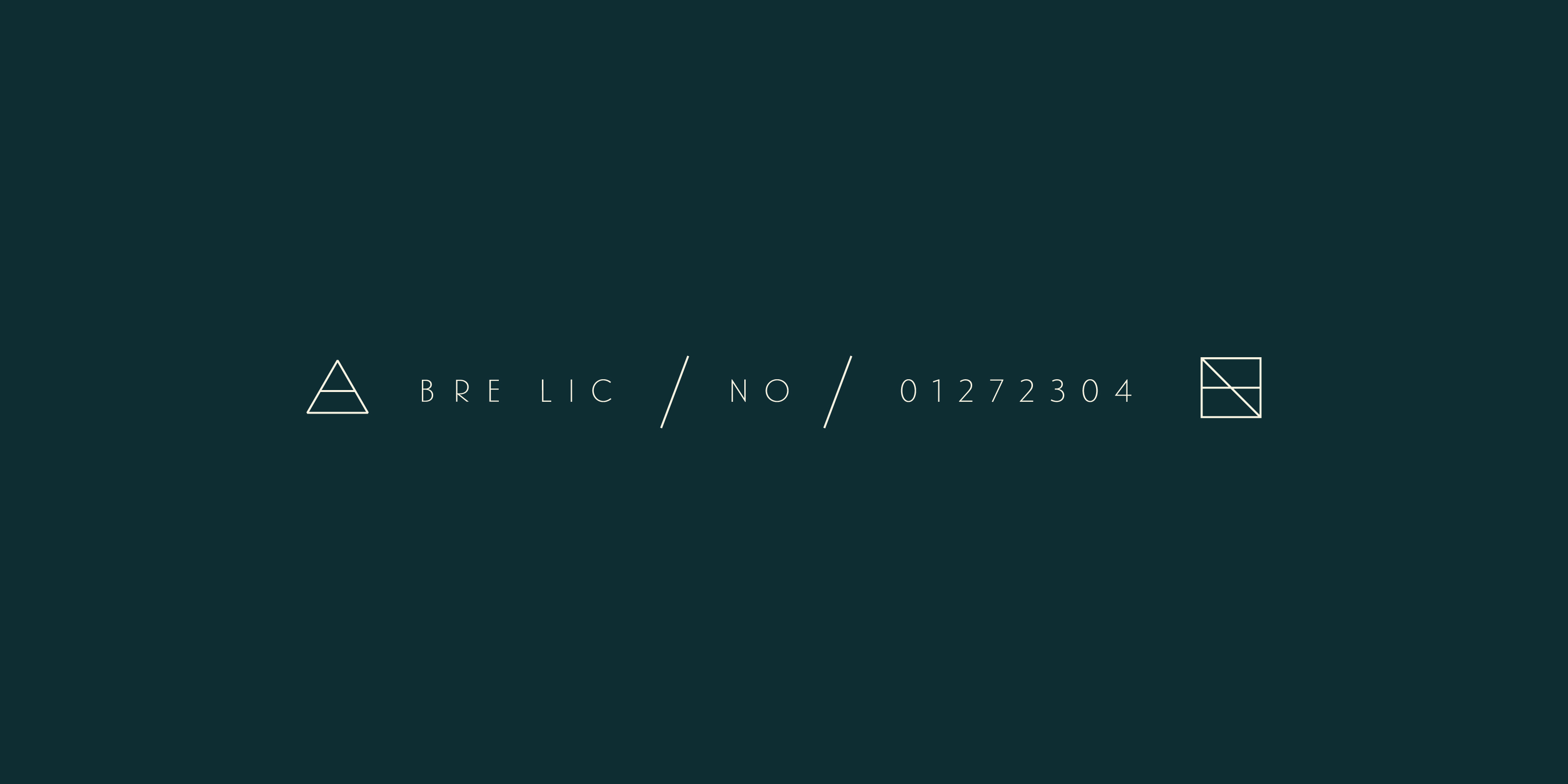
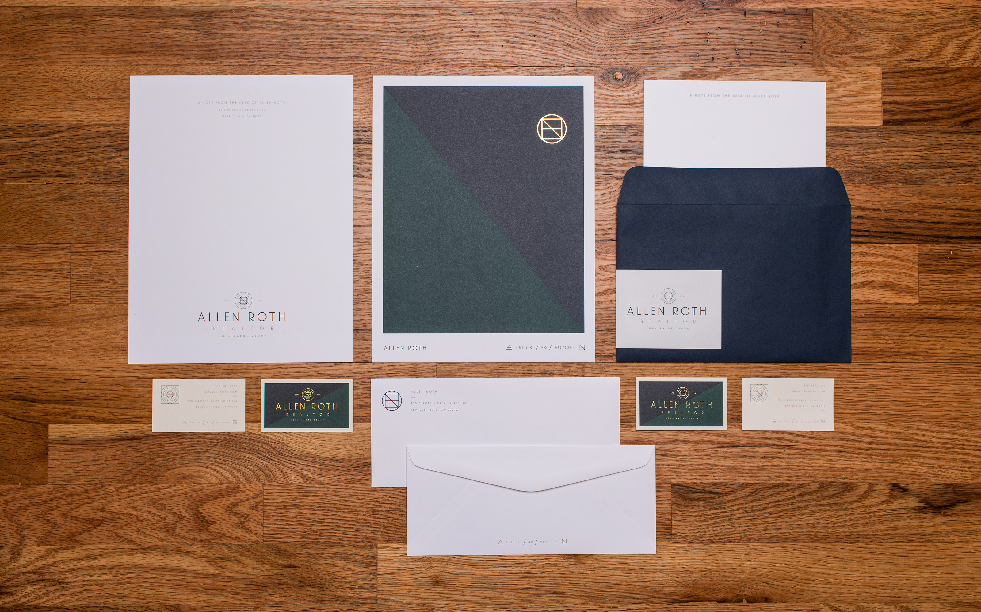
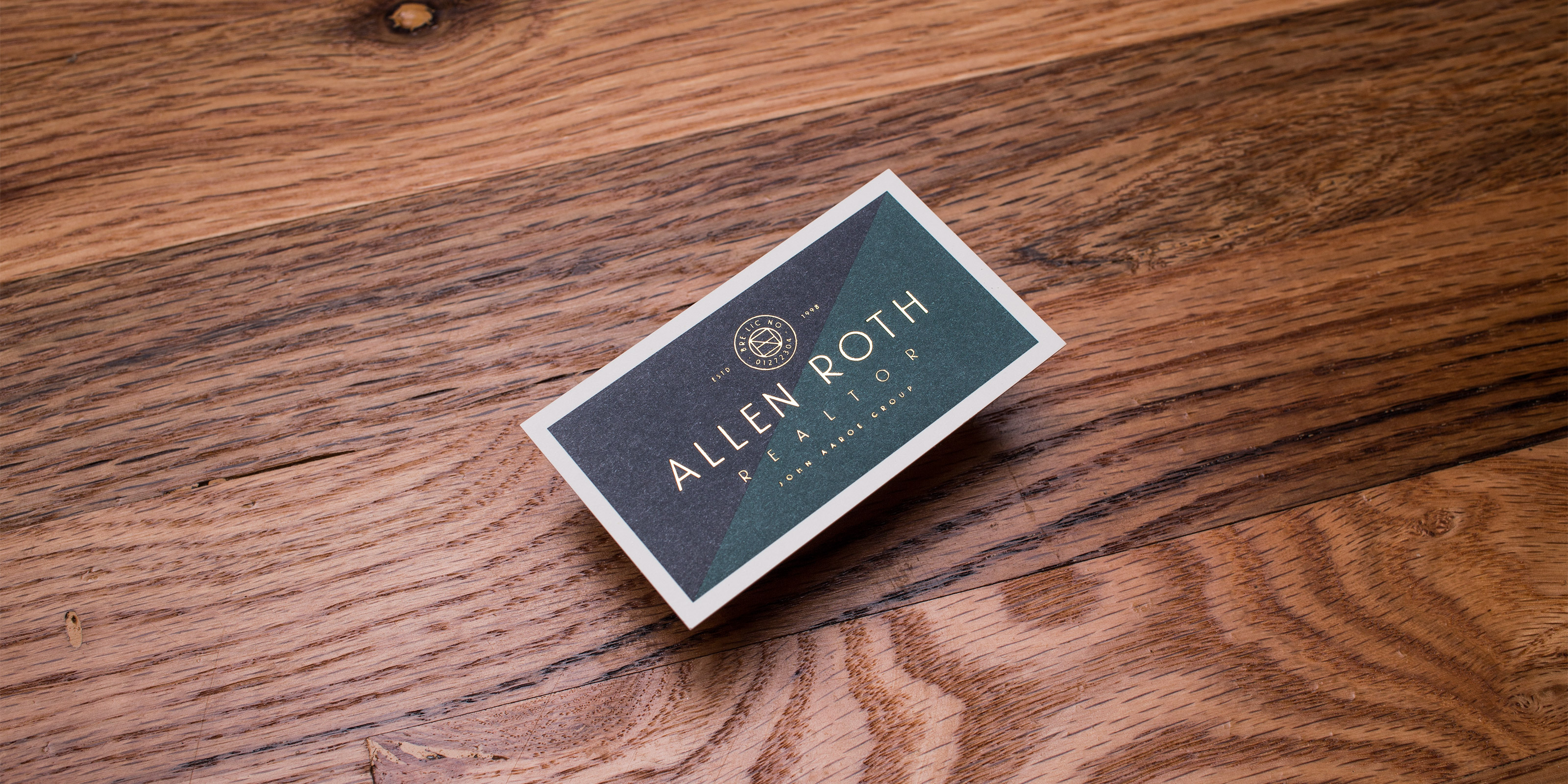
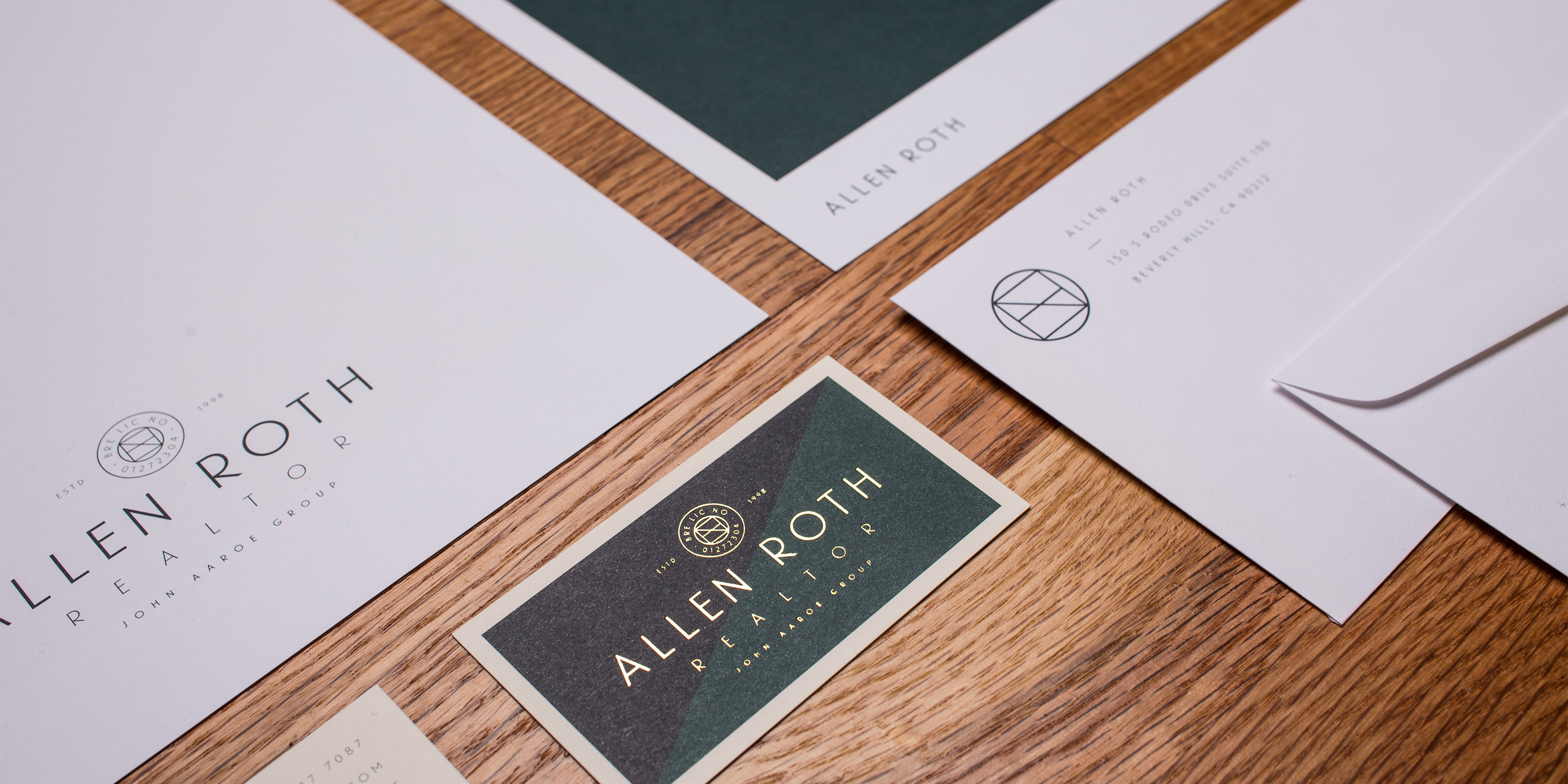
When Allen Roth and Darren Winston partnered to form Winston/Roth, they set out to change how people thought about realty in the Beverly Hills area. We worked with them to develop a modern and fresh perspective in the otherwise stuffy commercial realty market. Drawing inspiration from the modern architecture in the area, we created a strong mark that set them apart from their competition. The Winston/Roth brand pairs a strong mark with warm inviting colors, giving the client someone they are confident and comfortable handling their realty. Completed while at Studio Mast in collaboration with Scott Hill.


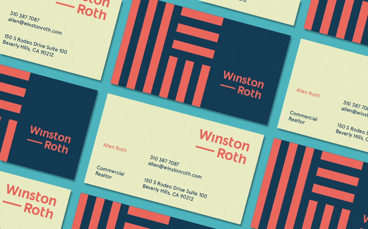

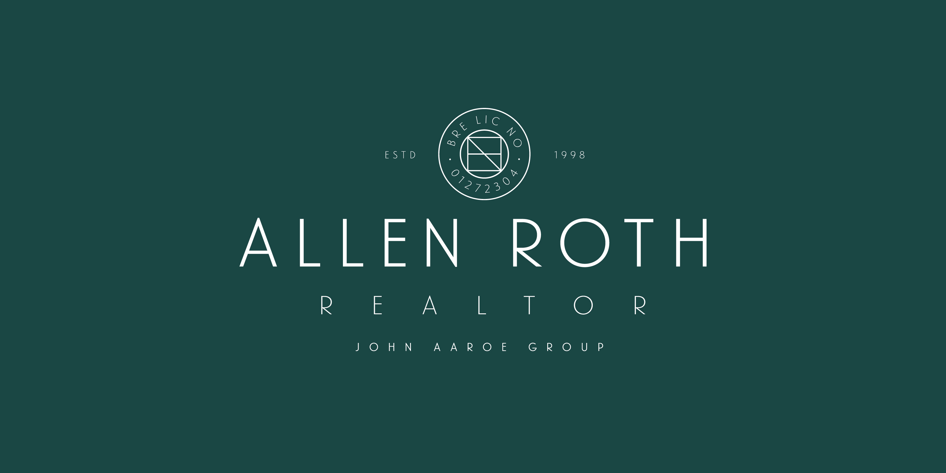
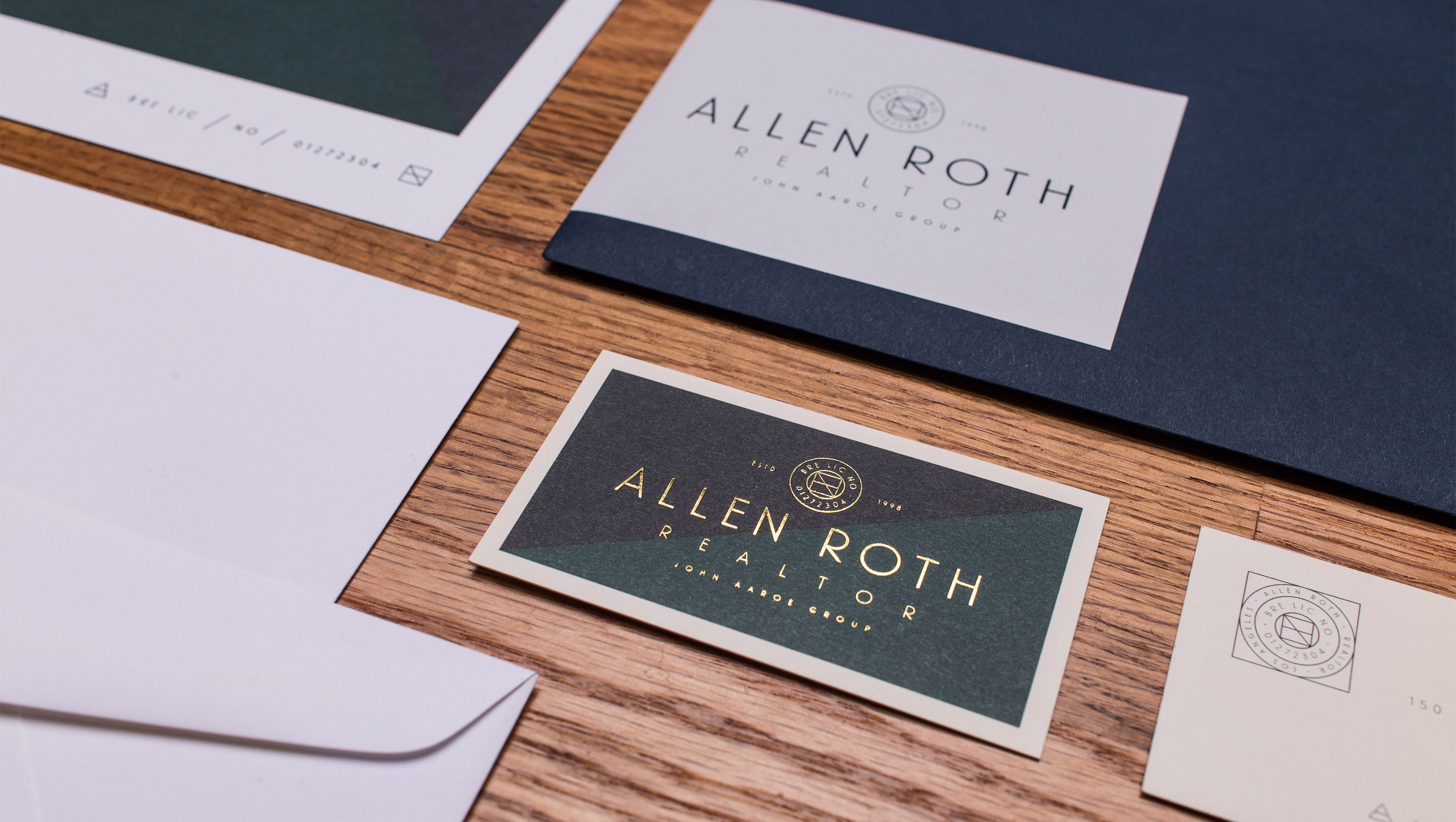
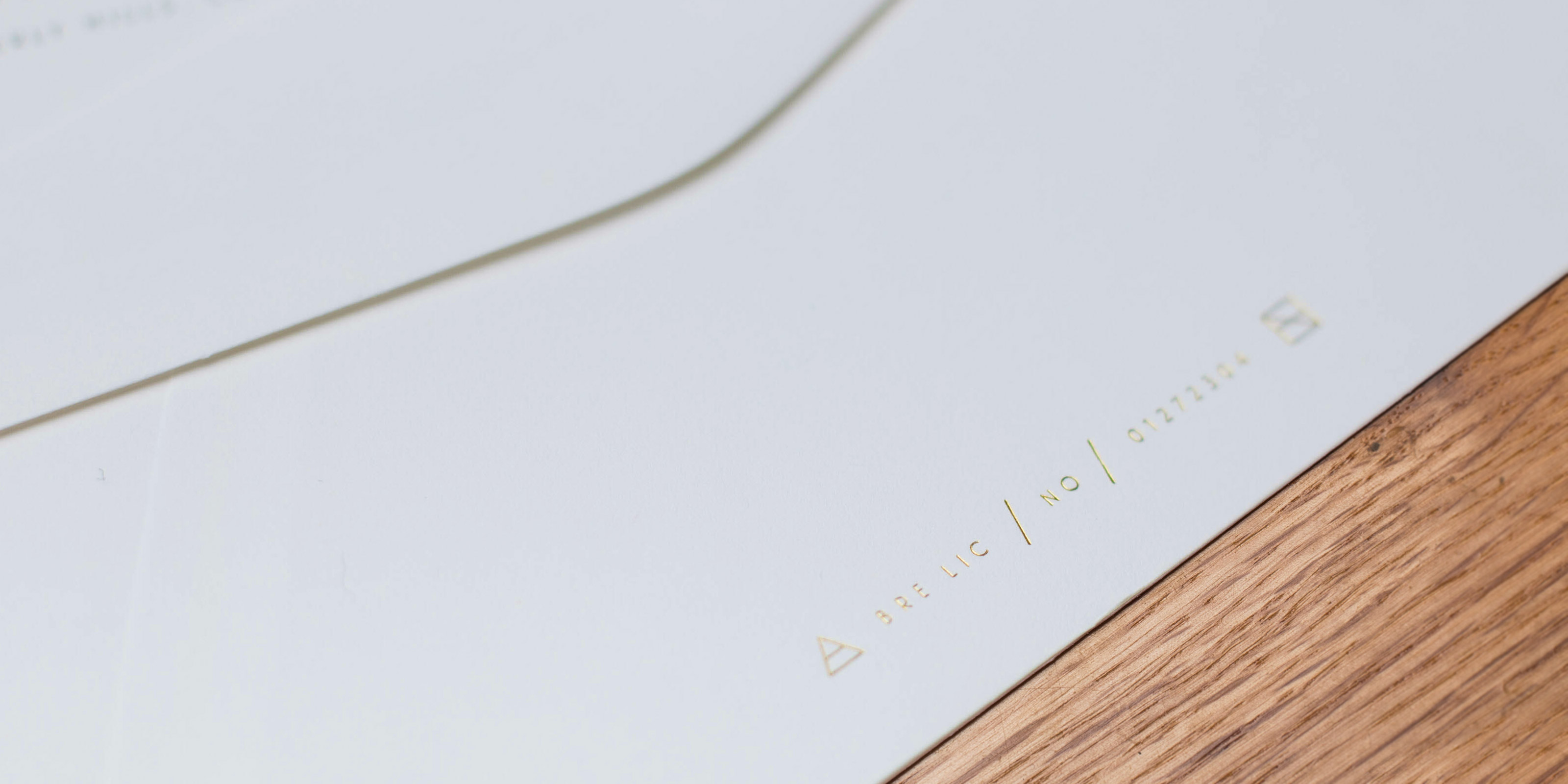
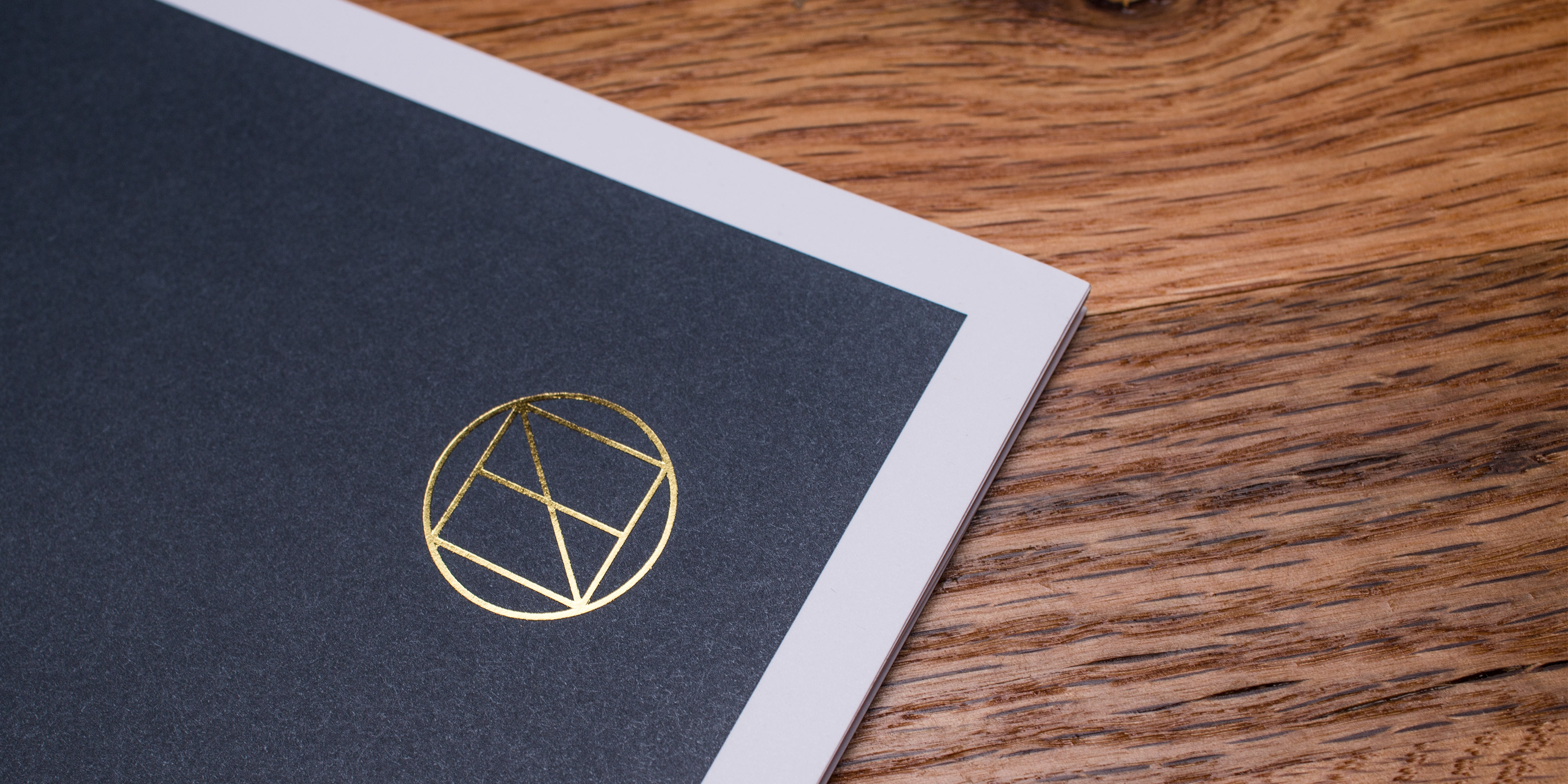
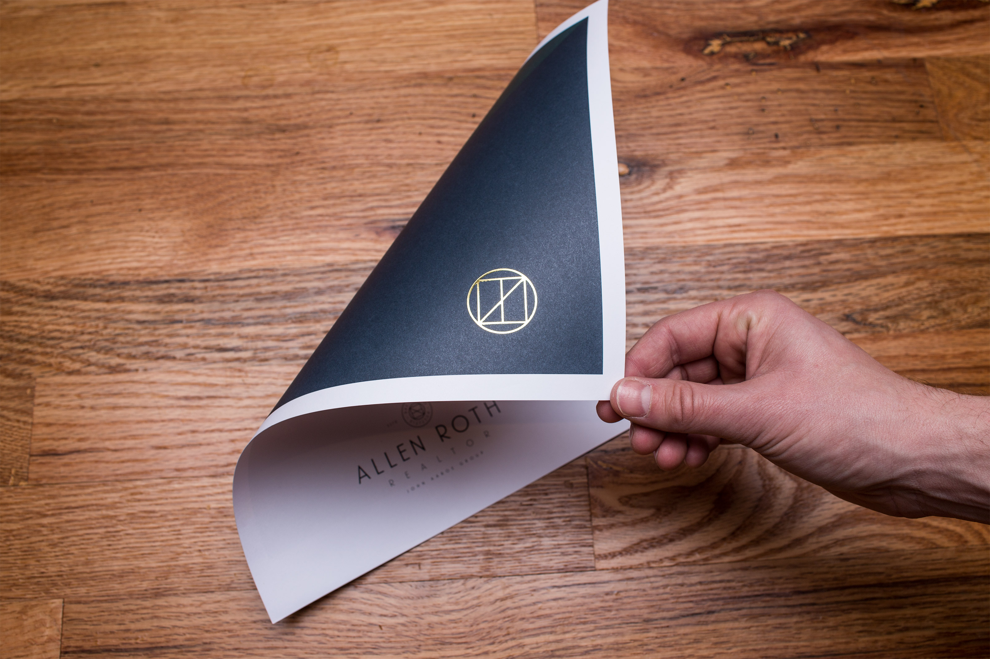
Allen Roth needed a brand that was “premium” to appeal to his Beverly Hills clientele. It was important to offer an attention to detail that garners the kind of premium real estate opportunities he is representing. By mixing together the styles of sailing, rugby, and secret societies, a unique brand was created that stood apart from competitors. Completed while at Studio Mast in collaboration with Scott Hill.

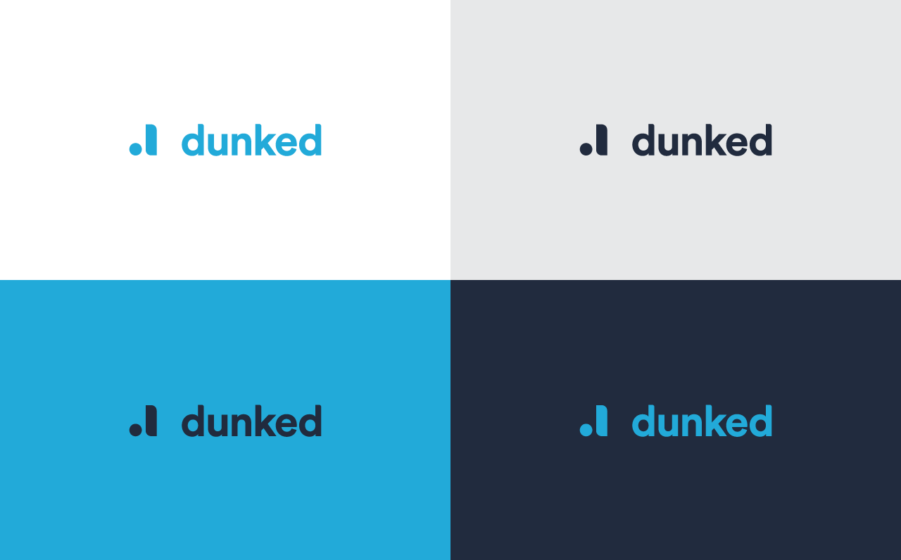
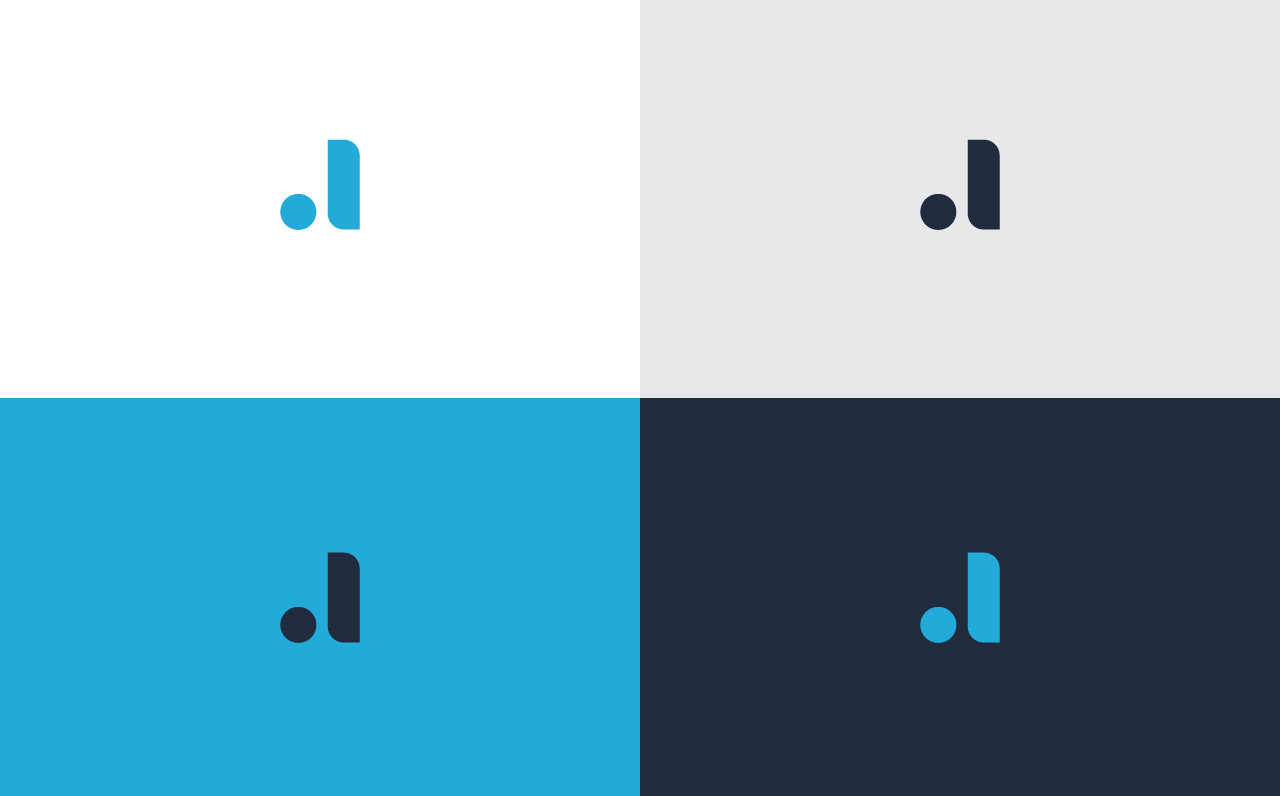
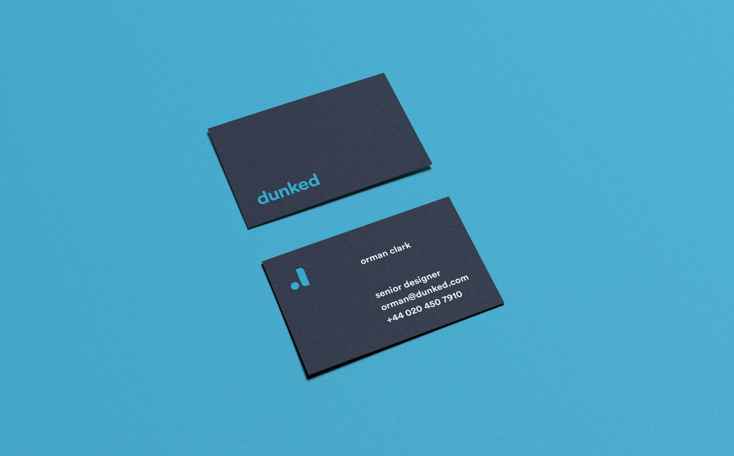
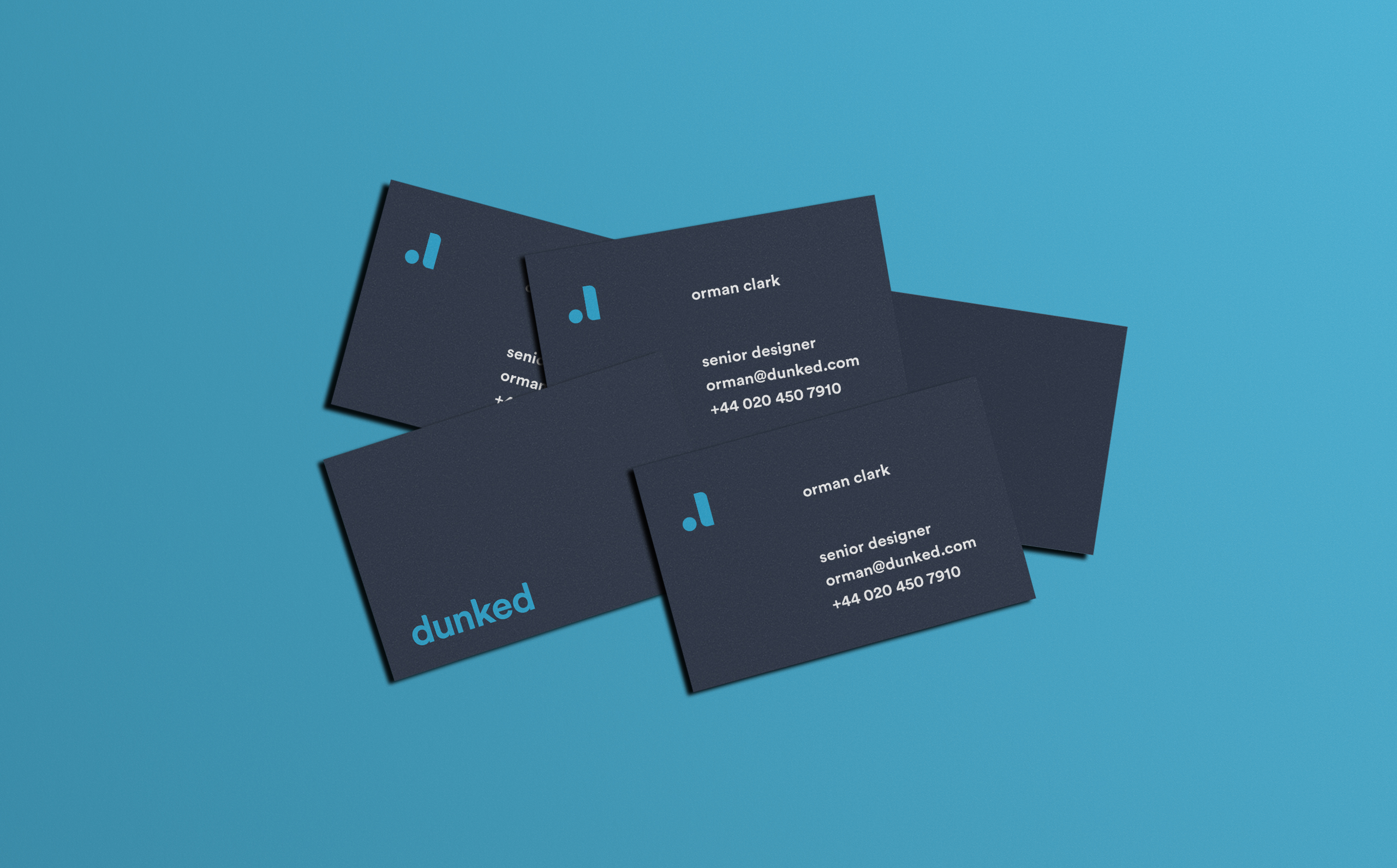
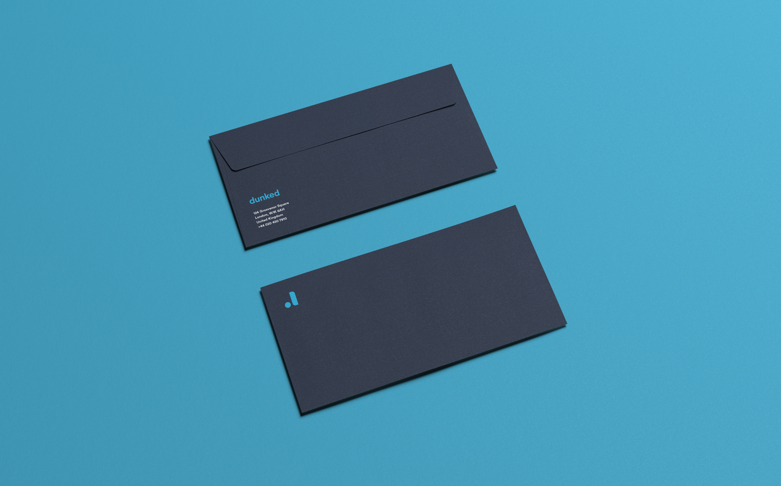
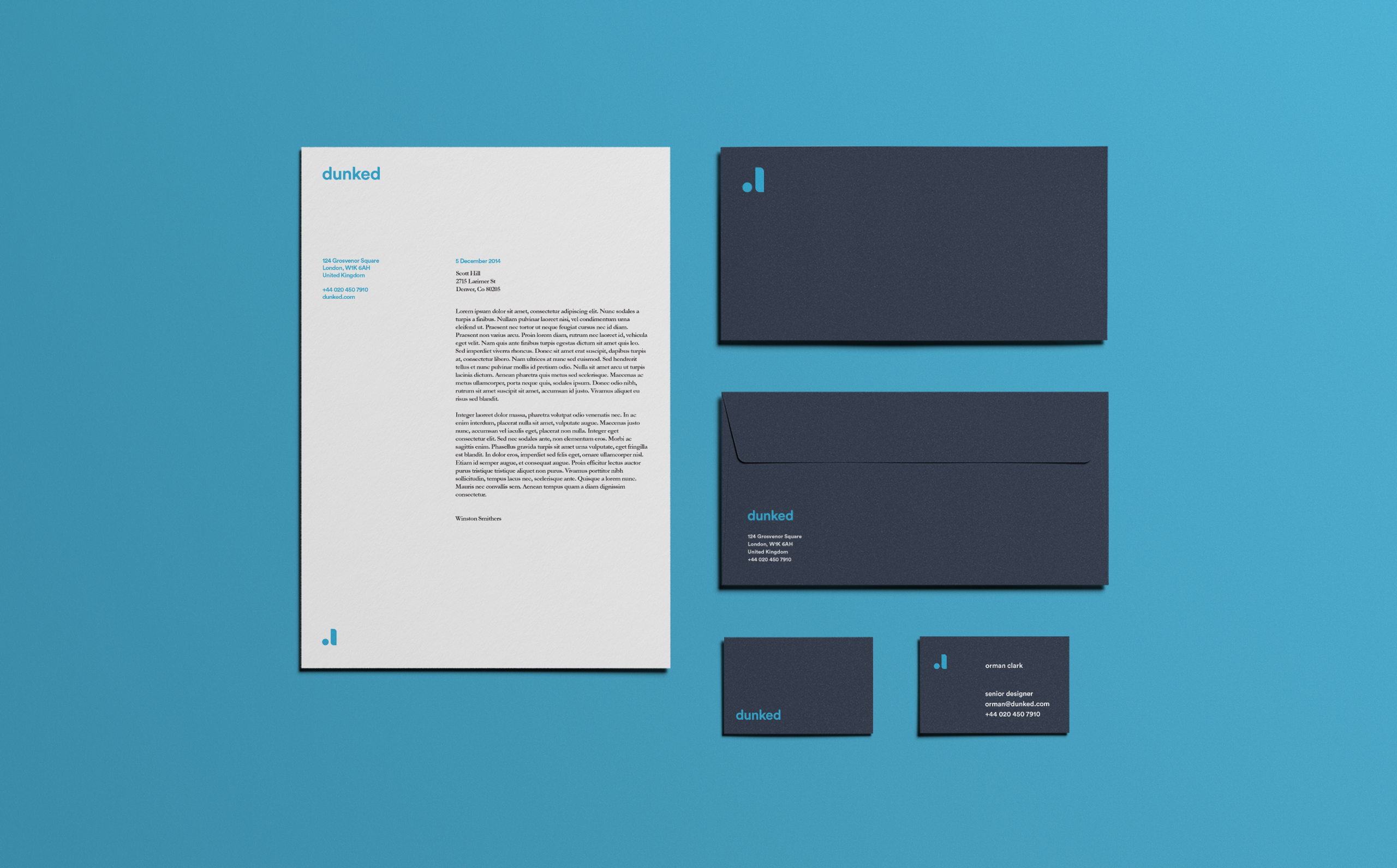
When dunked was seeking a re-brand, it was very important that their brand reflect the simplicity and easy of use of their service. In the past, they had struggled with marks that did not do well in different sizes and mediums. We created a brand that is simple and easily distinguished that can be used in a multitude of sizes and applications.


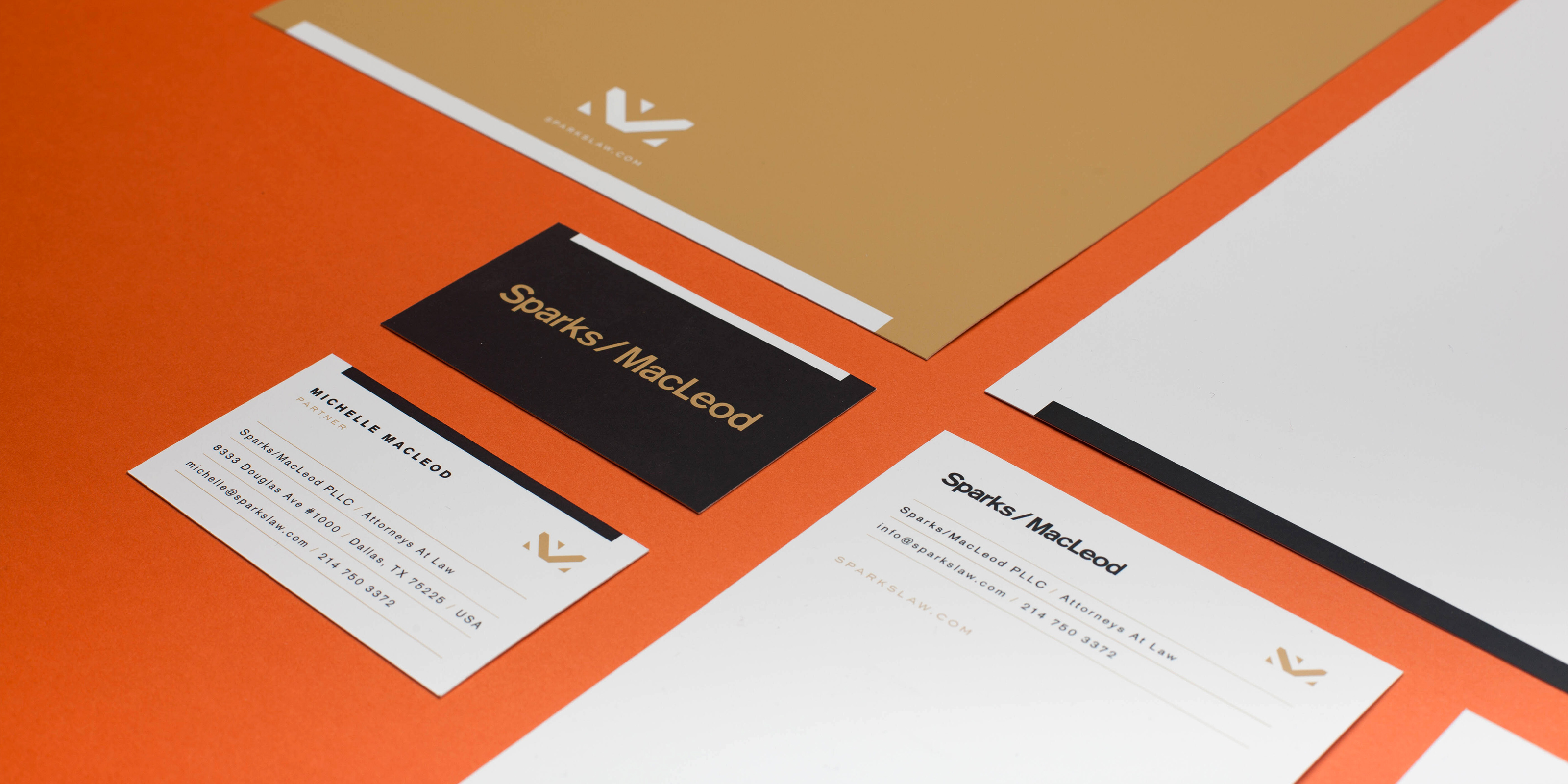
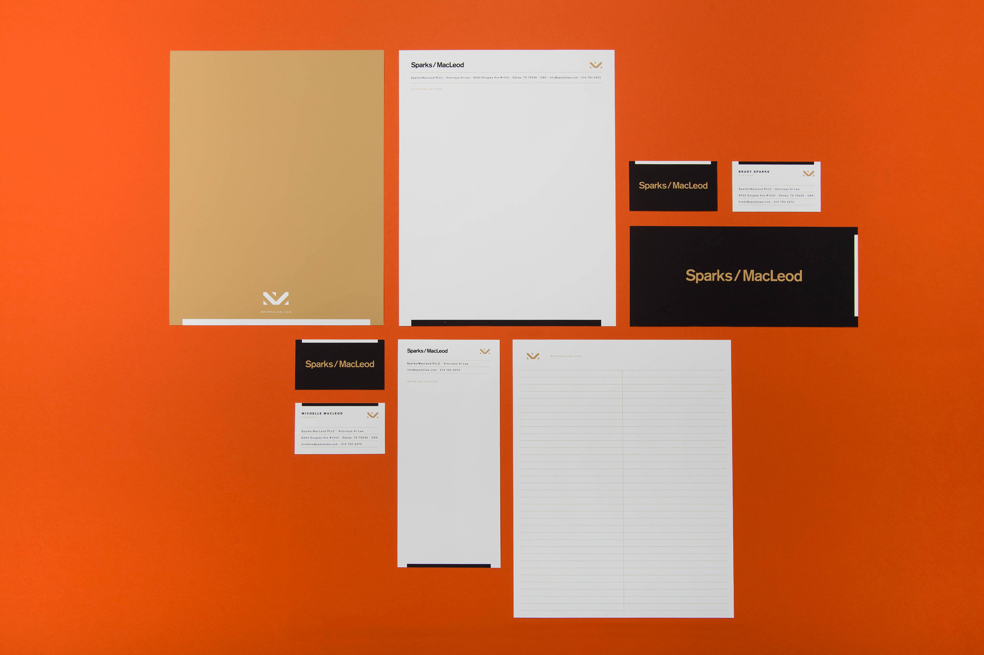
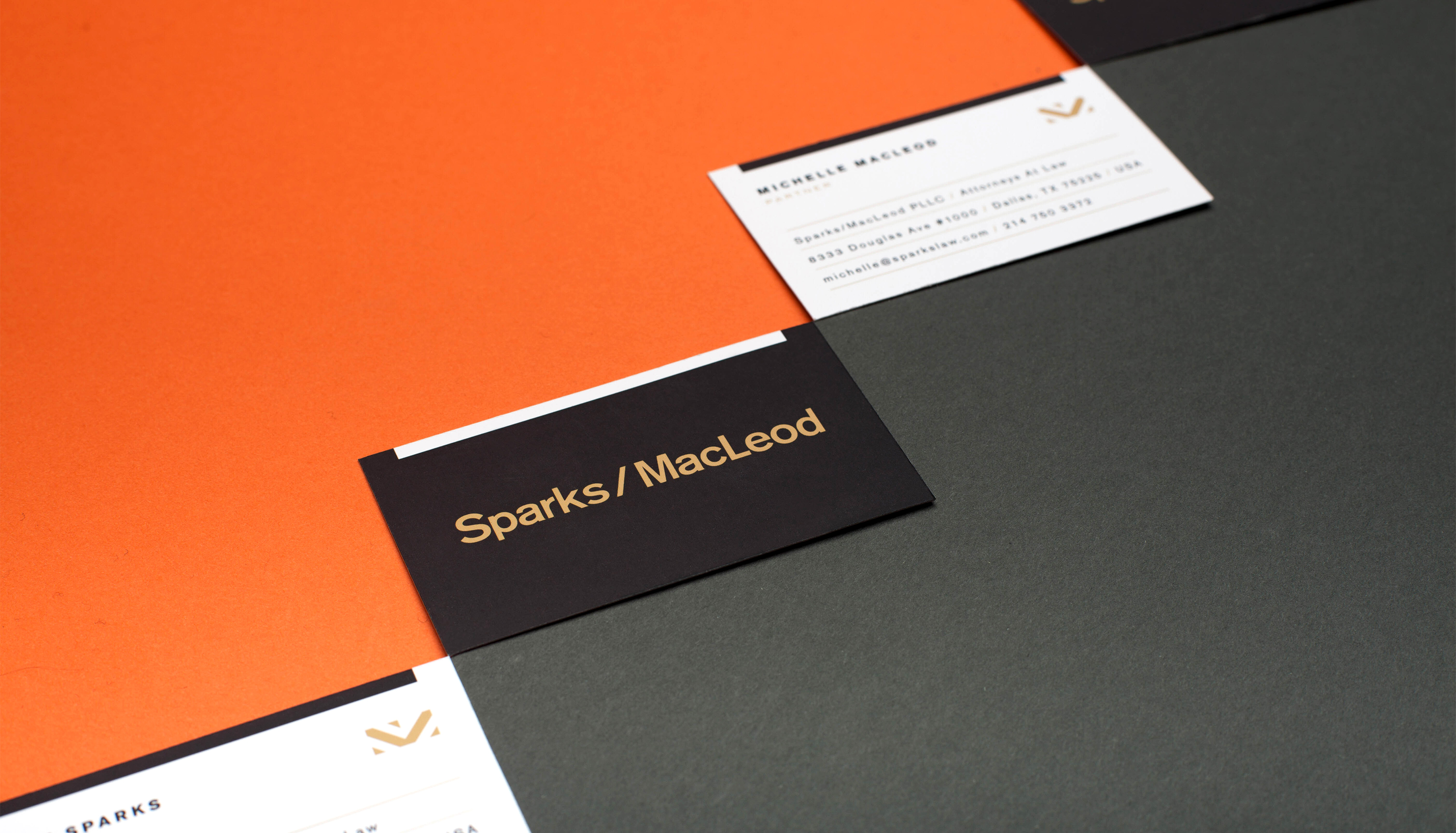
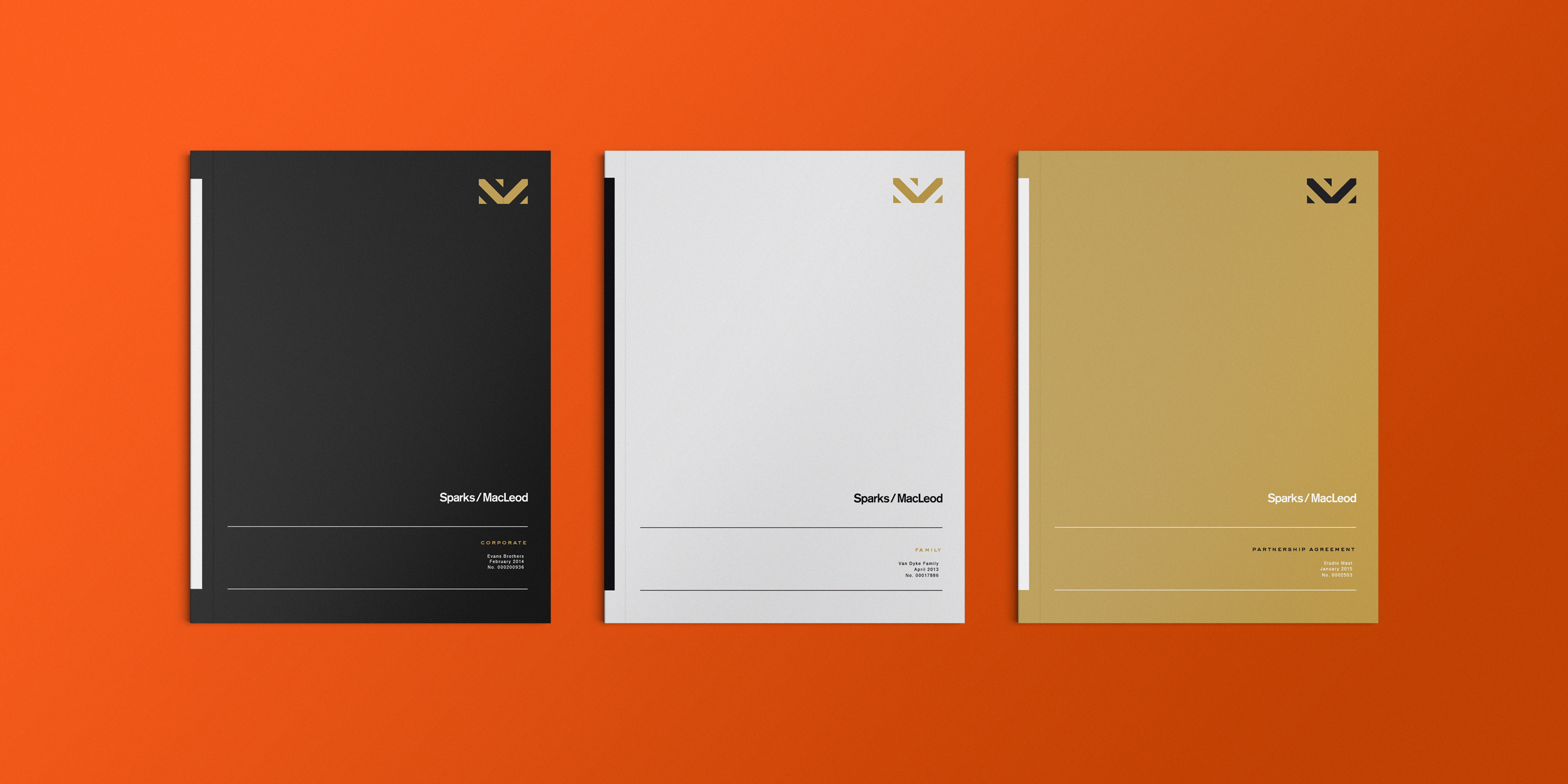
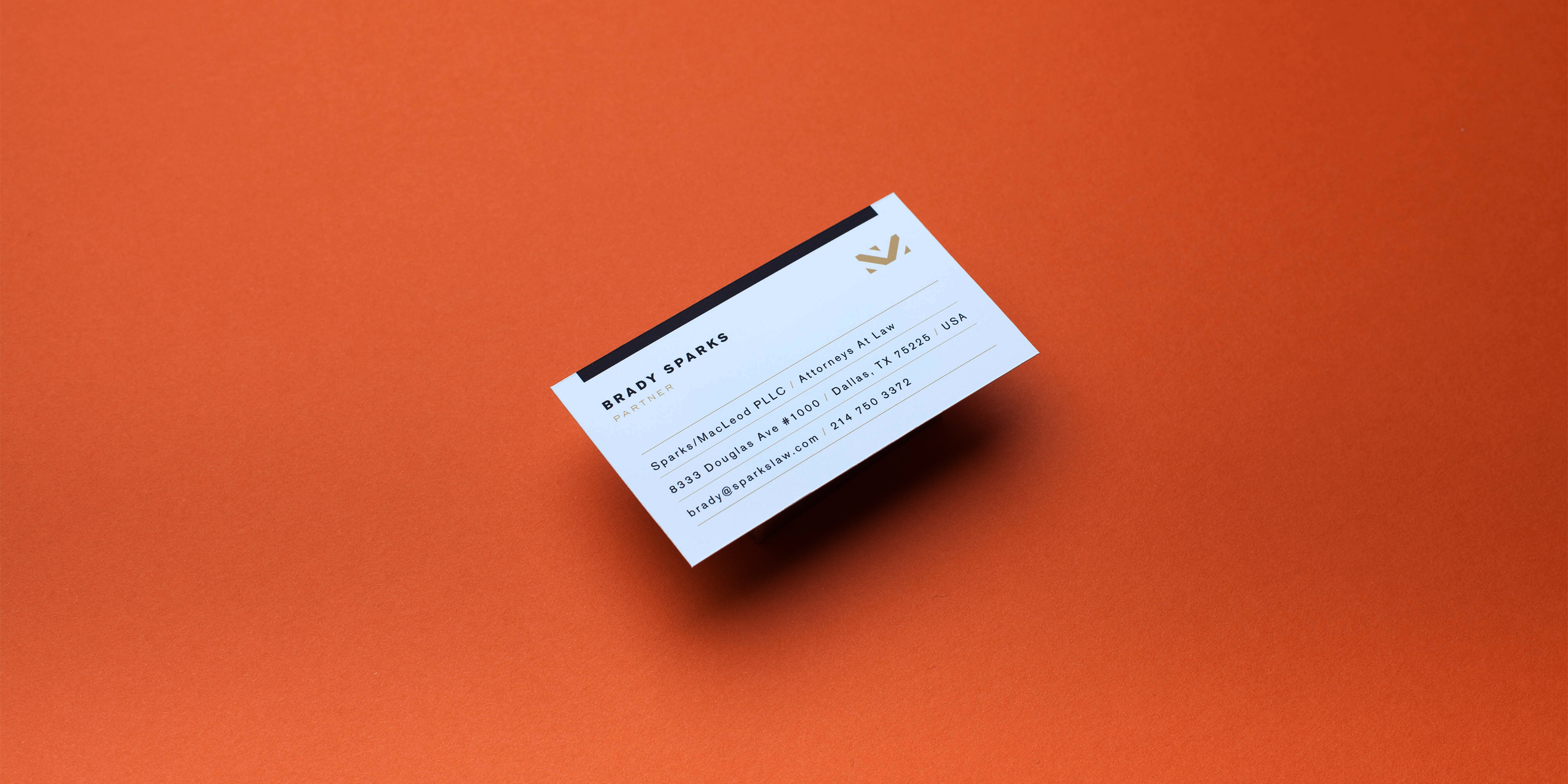
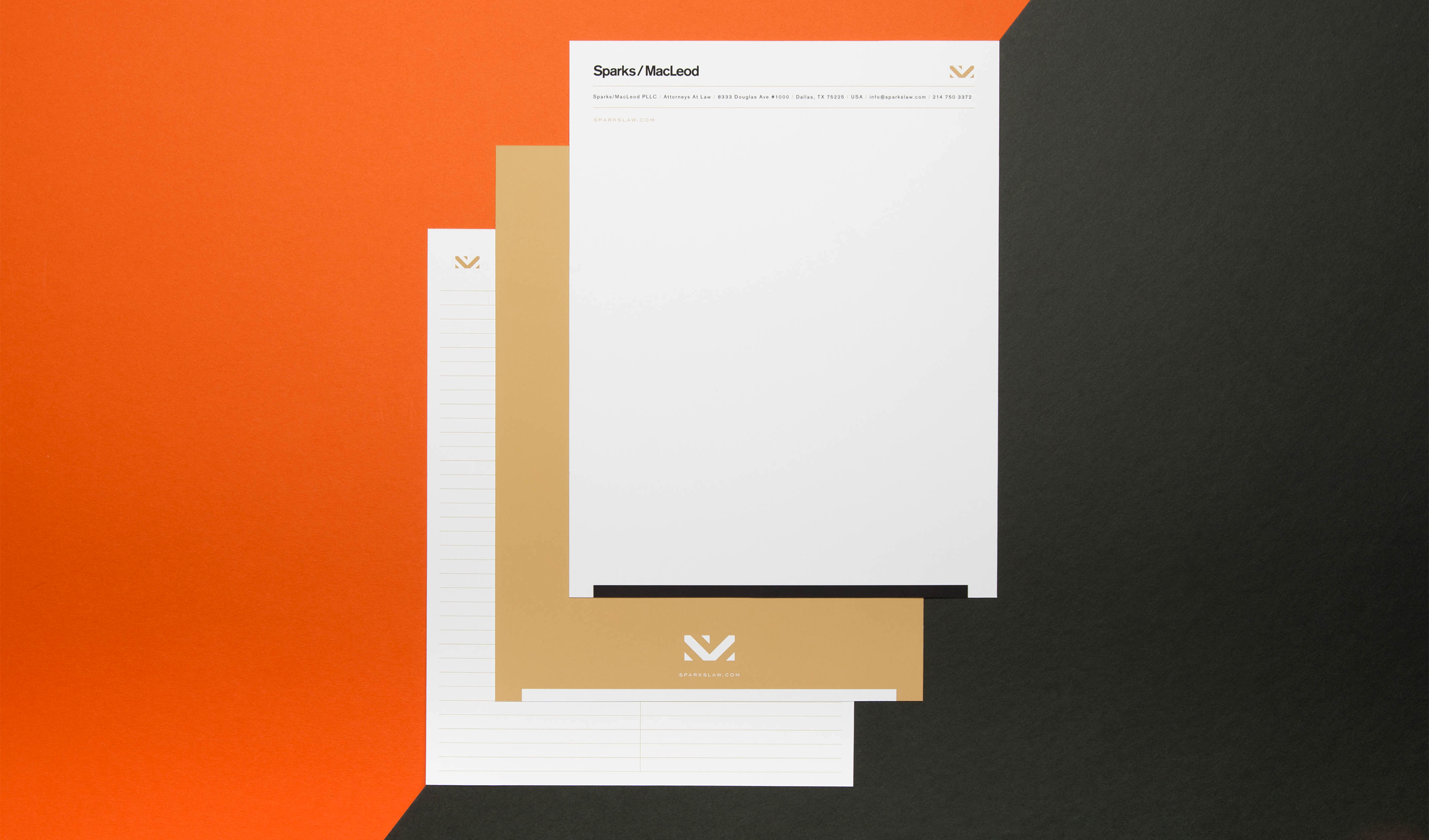
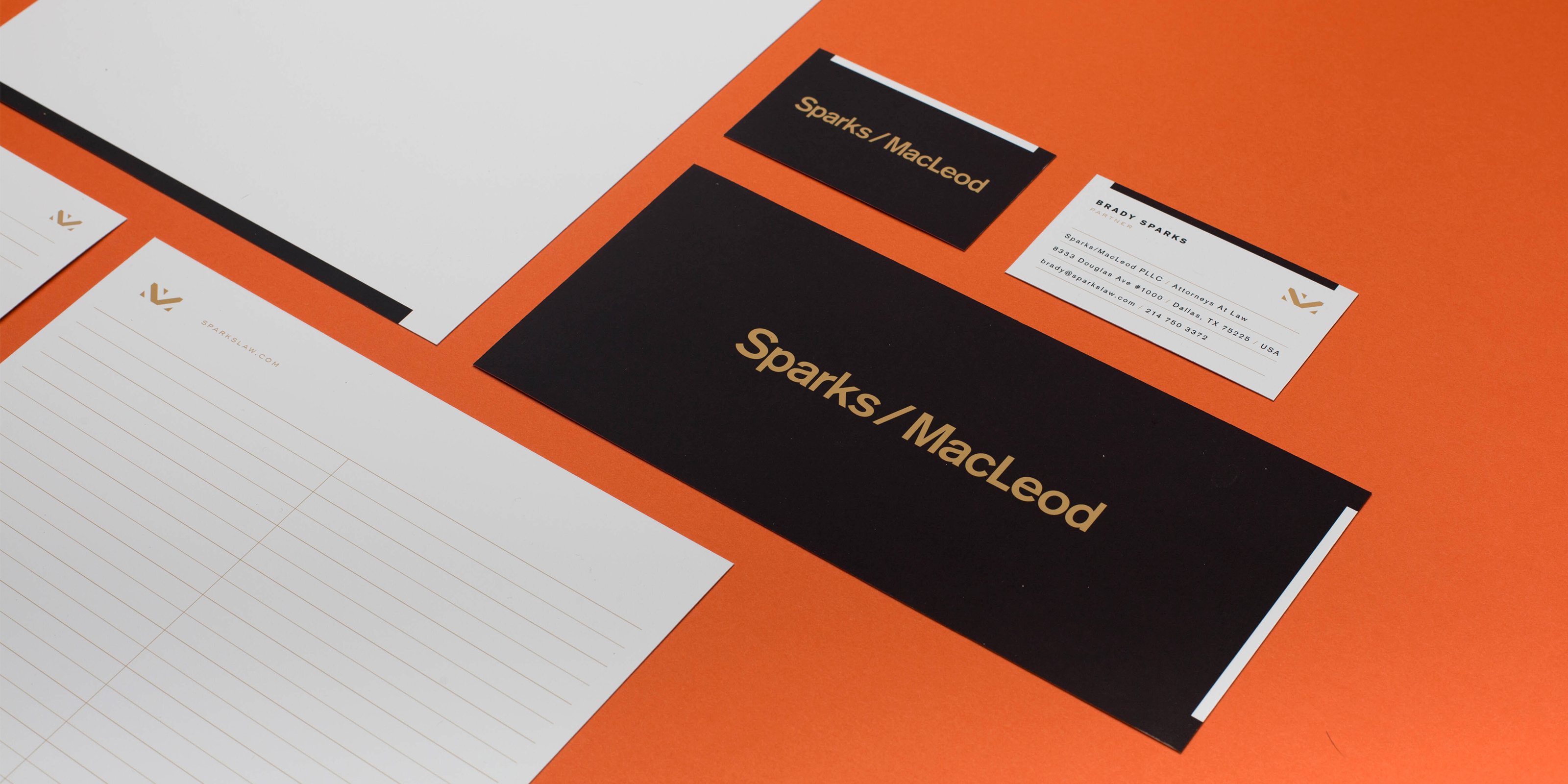
When Brady Sparks and Michelle McCleod partnered together to form Sparks/Macleod, they brought together two different sets of experience. The core of the brand is based on the idea of these contrasting styles. They wanted a brand that would appeal to all perspective clients, pairing a modern aesthetic with black and gold to appeal to a distinguished audience. Completed while at Studio Mast in collaboration with Scott Hill.


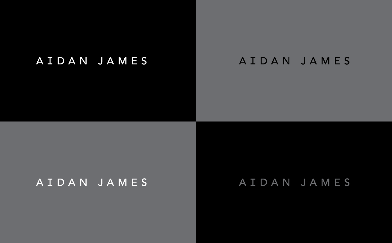
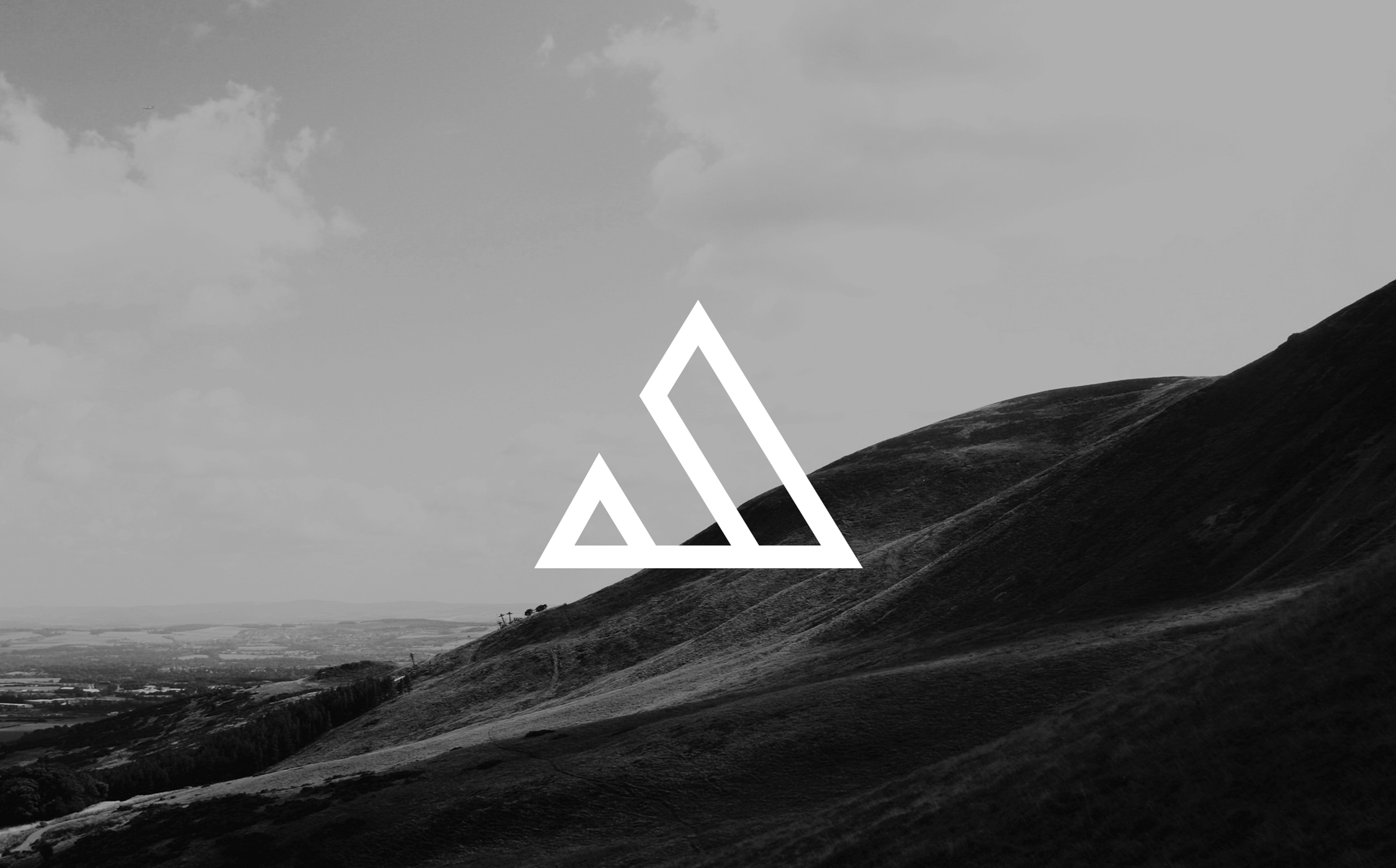
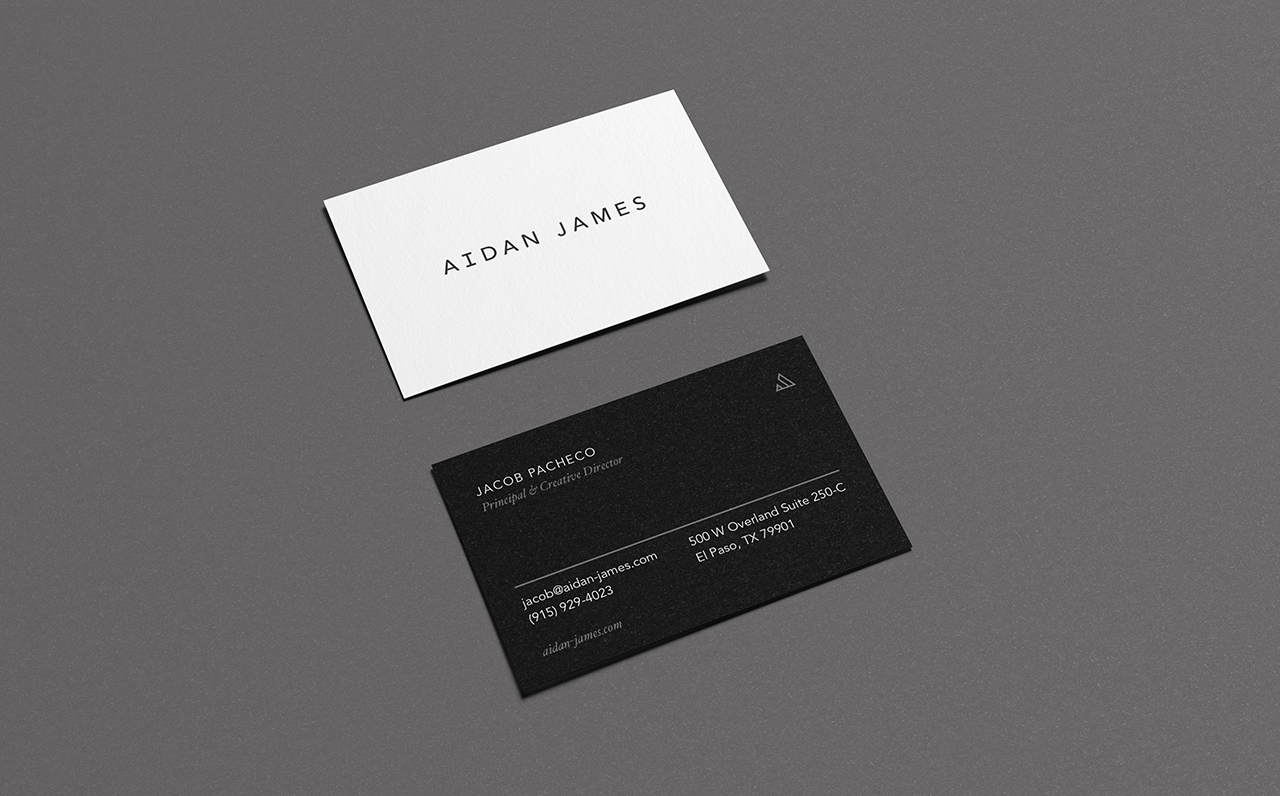
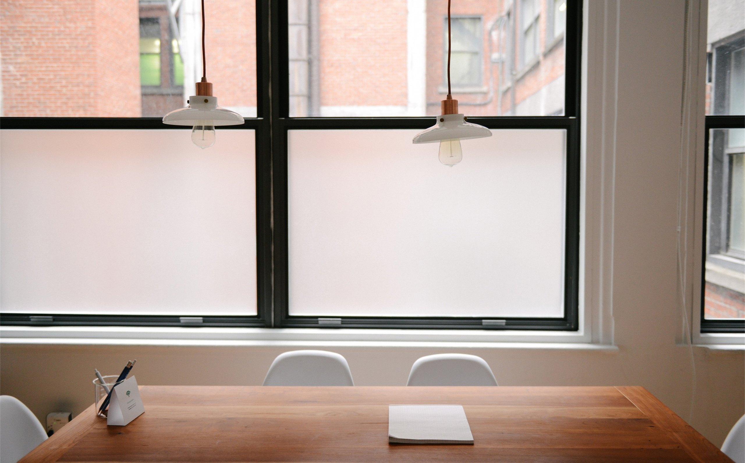
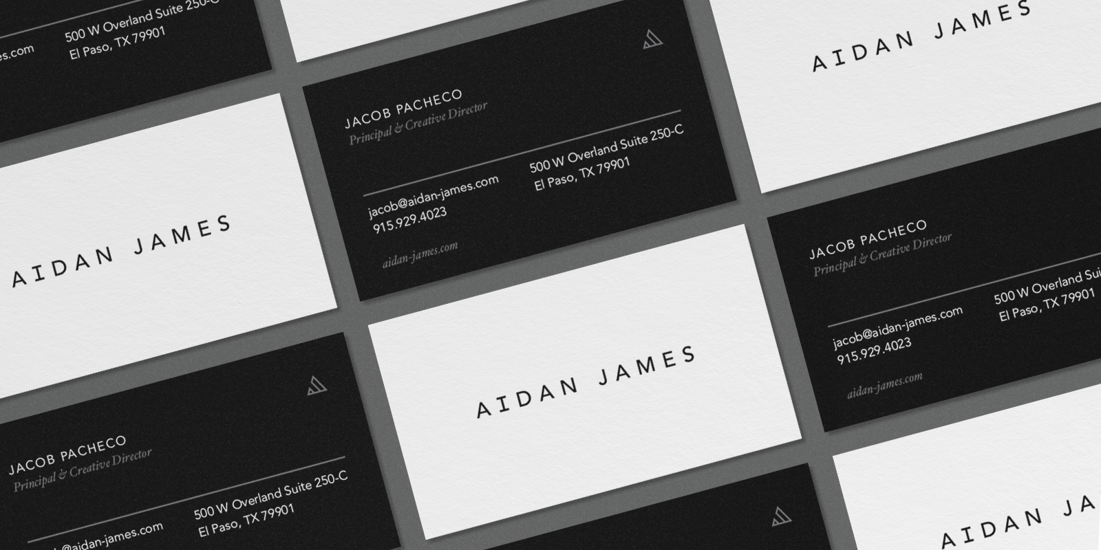
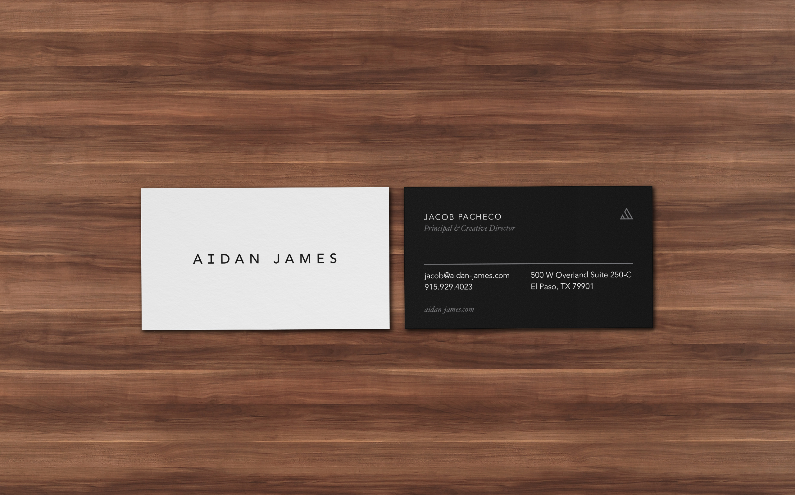
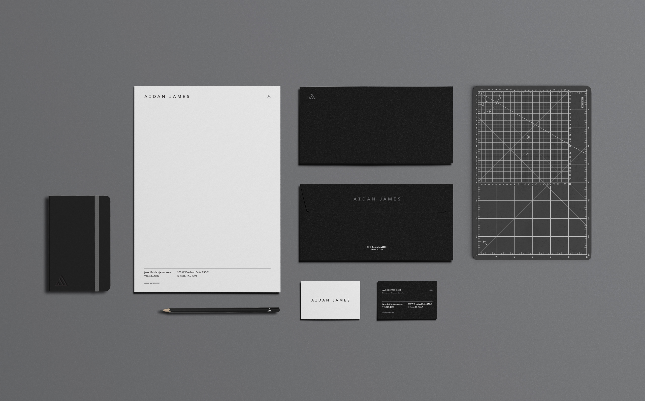
When Aidan James was seeking a re-brand, it was important to them to create a modern brand that would appeal to their perspective clients, modern developers in the El Paso area. They wanted a strong, modern brand that would set them apart from their competitors while bringing a new outlook into a city known for its western heritage.

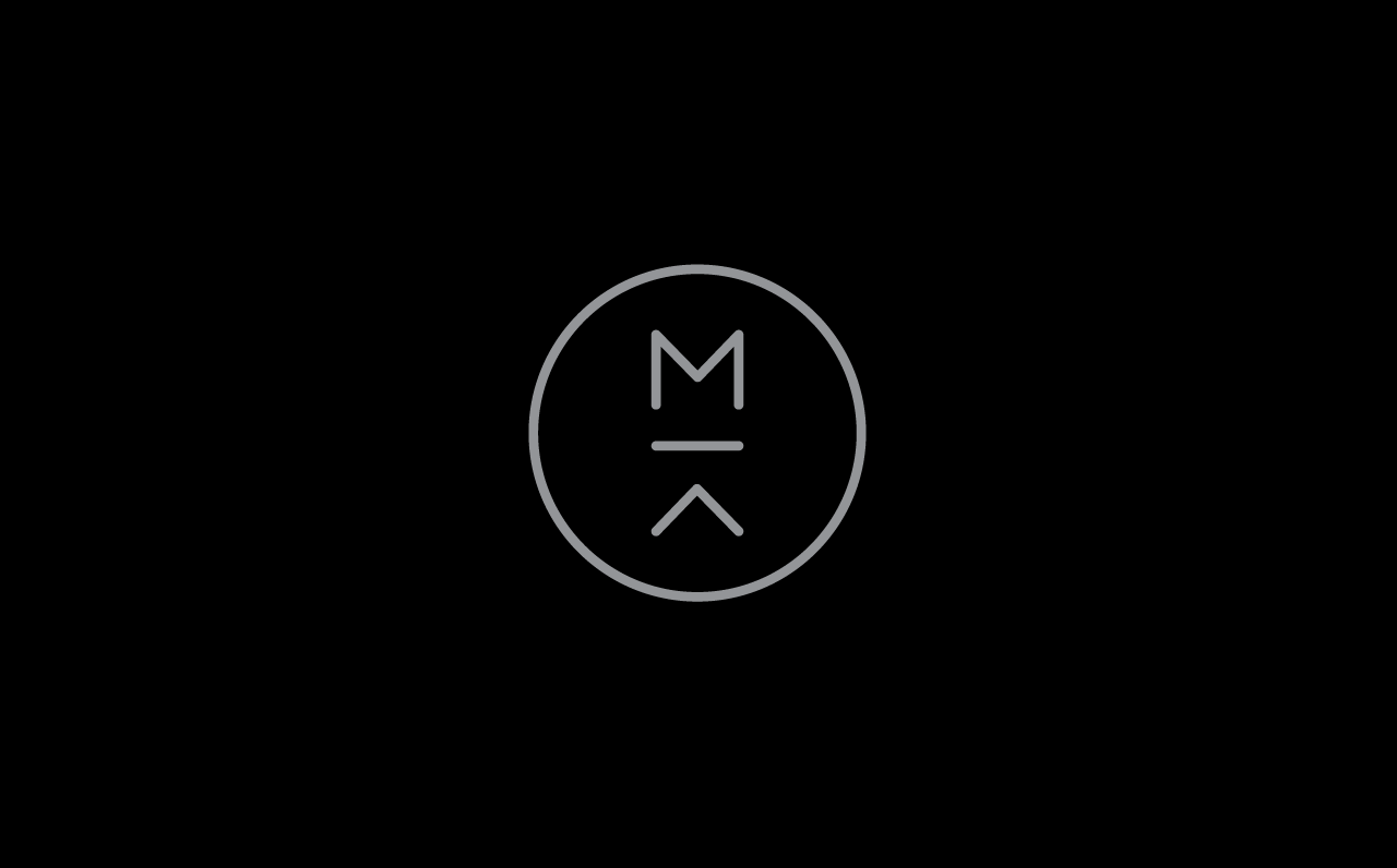
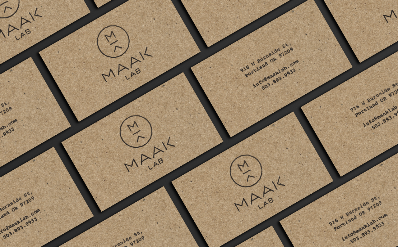
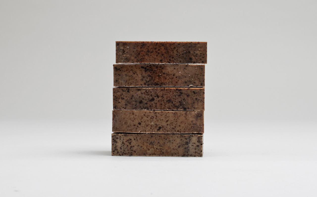
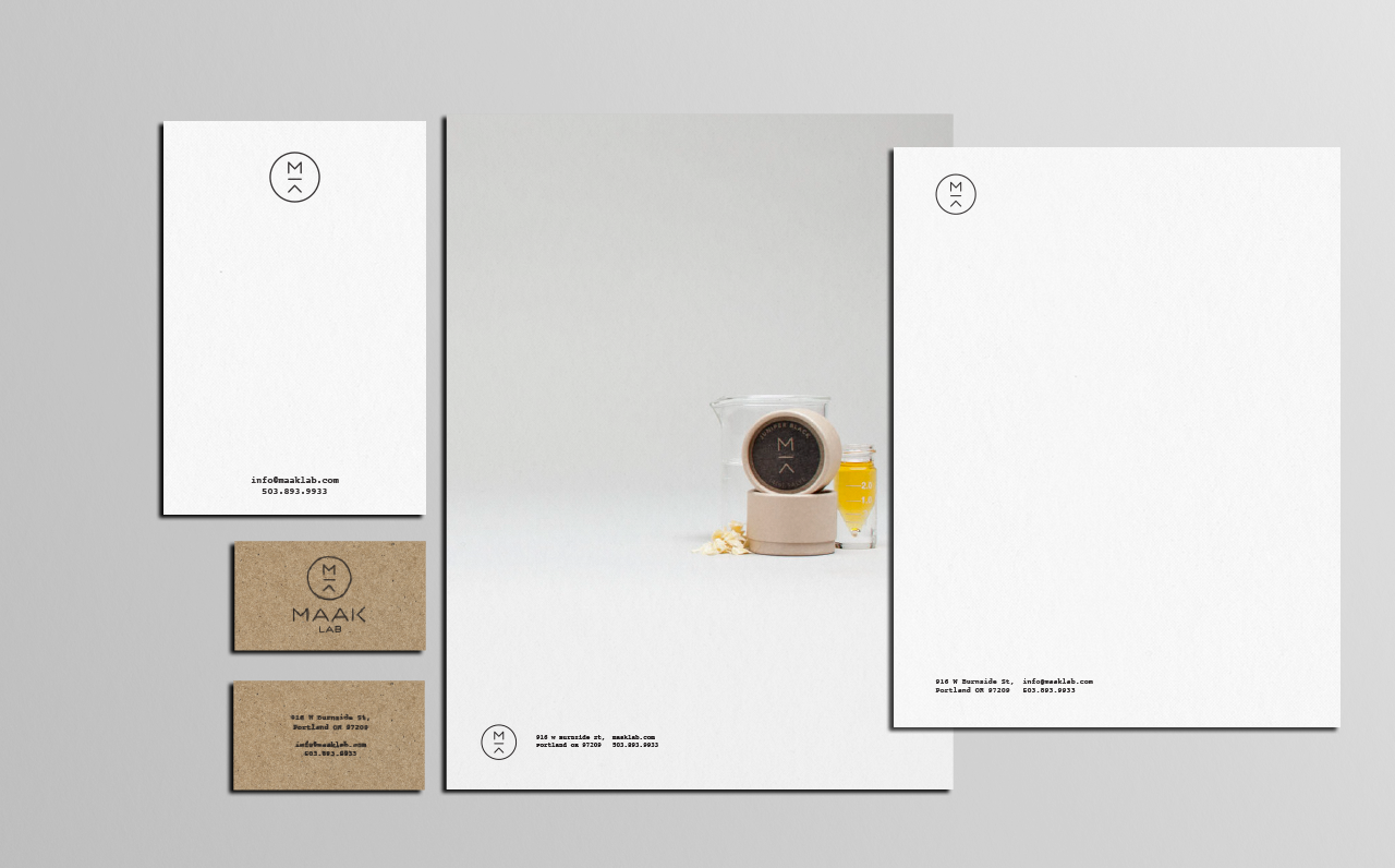
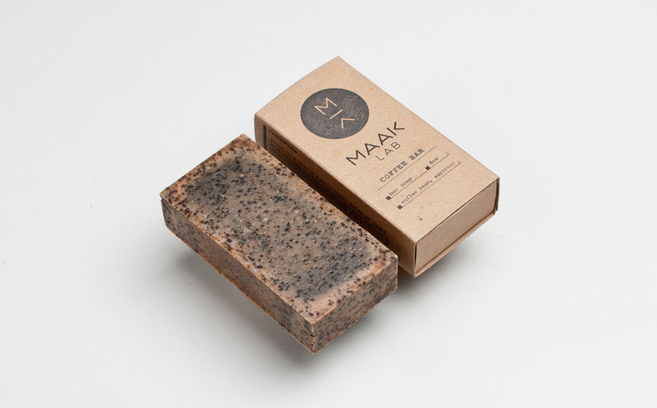
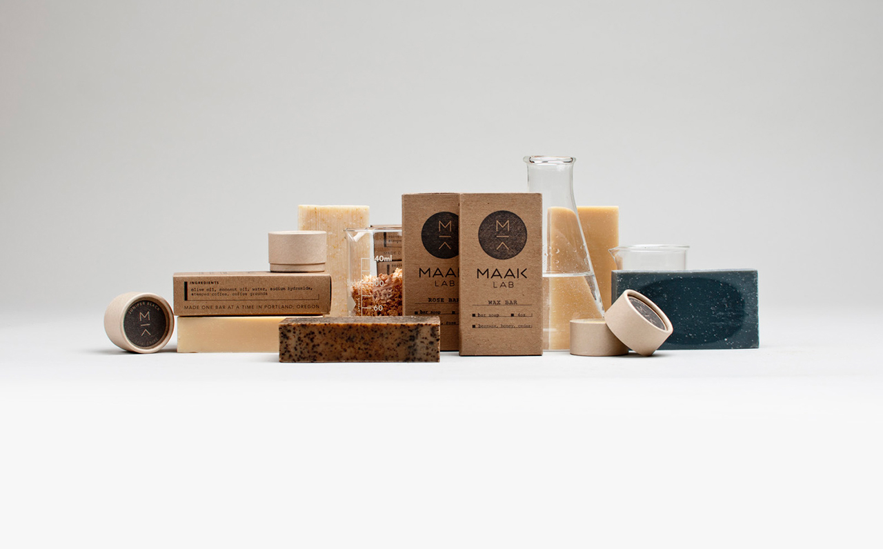
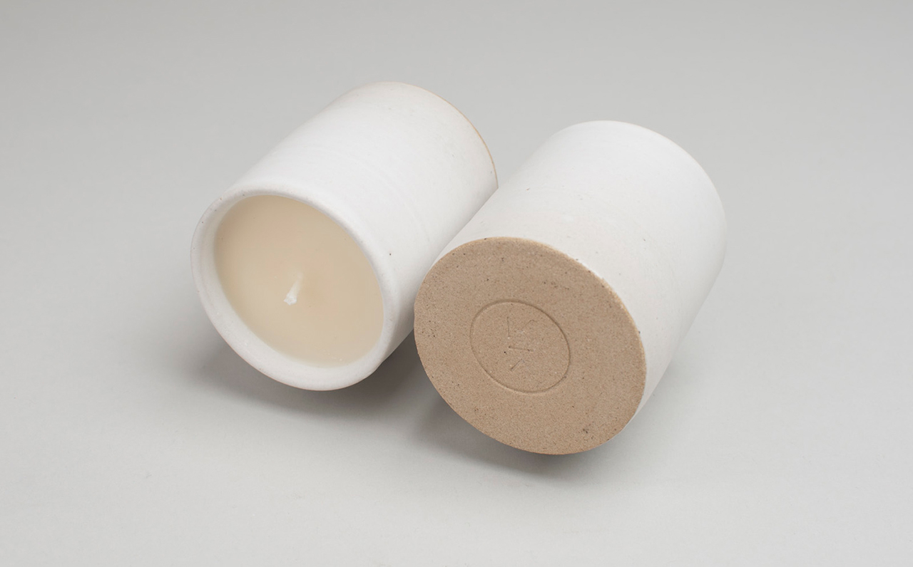
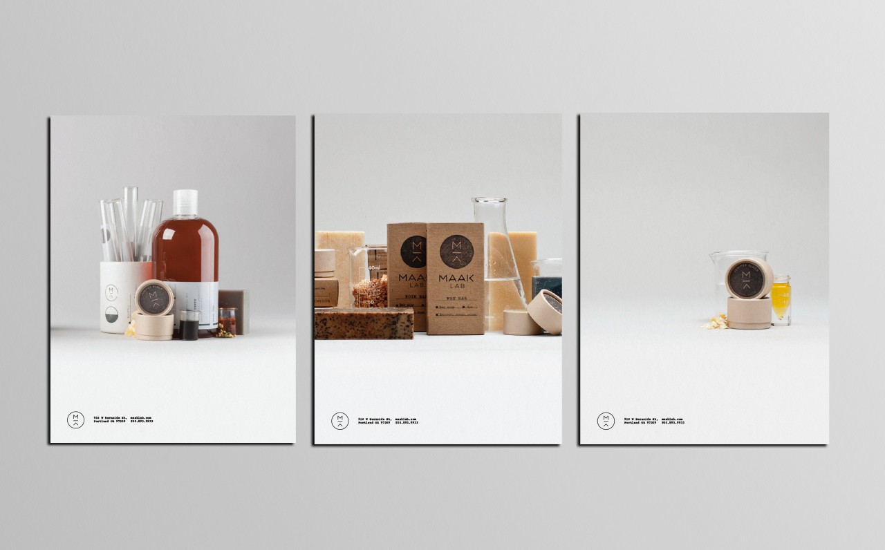
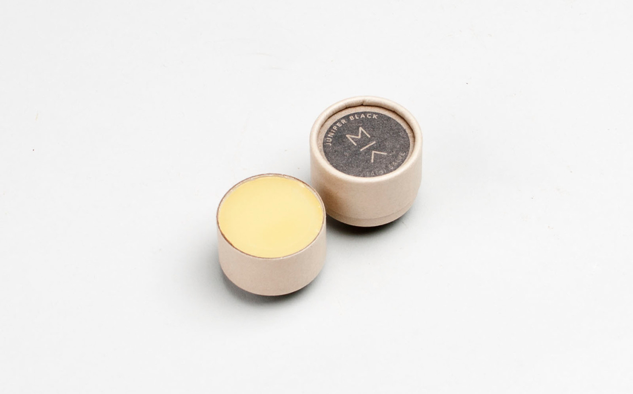
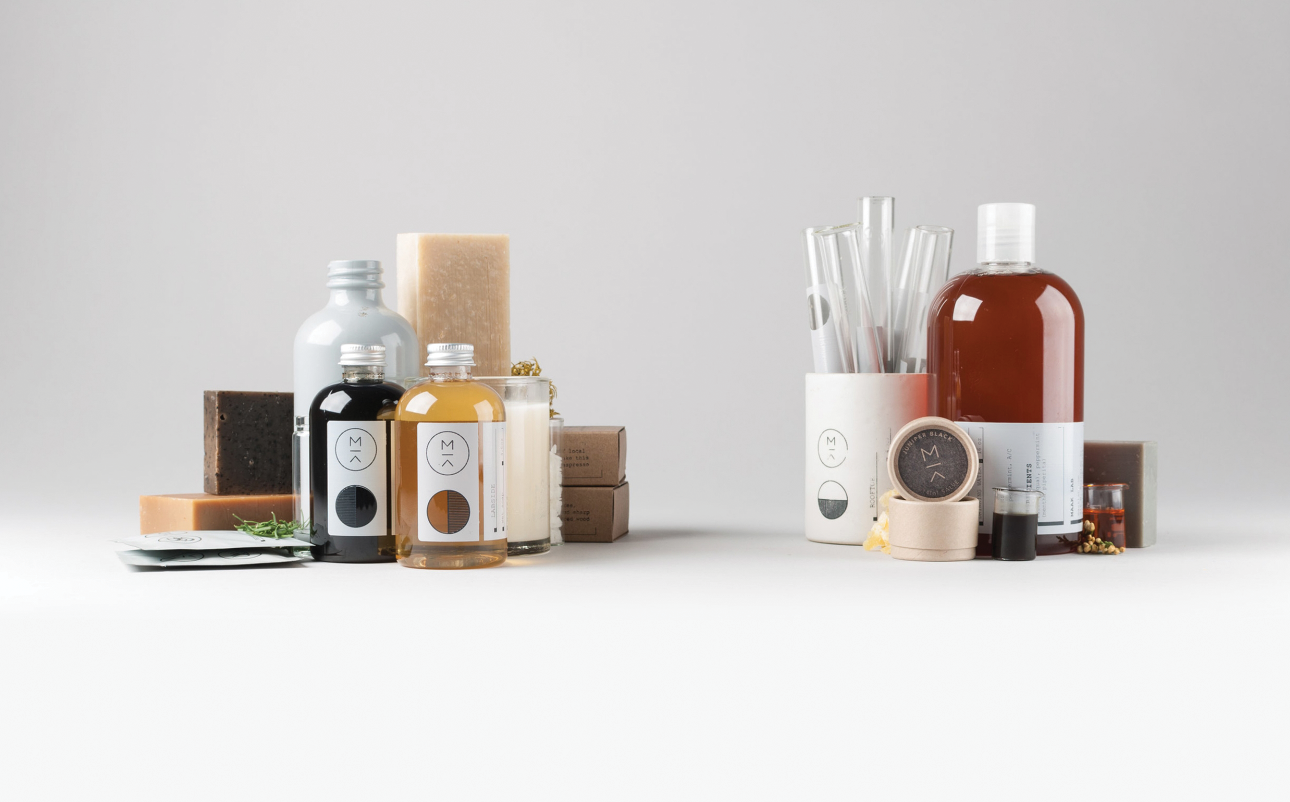
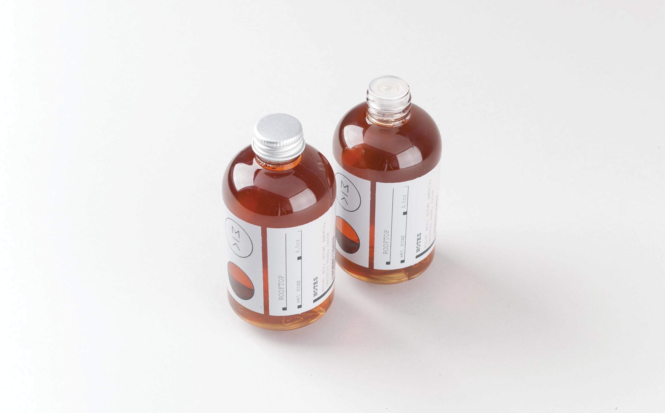
When Maak was formed, they were focused on the art of handmade soaps, hand-poured candles, and salves. They needed a brand that could be flexible and used in multiple applications. They were seeking a modern brand that would contrast their chip-board packaging. Emphasizing their proficiency in their craft and the handmade quality of their work. Packaging photos courtesy of Maak.
Lonely Standard is a Dallas, Texas based production company. Their work ranges from small documentaries to music videos. Their mission is to be the very best in their field, they strive to achieve the highest level of achievement and quality . The brand focuses this intense desire to be at the pinnacle of their industry. Completed while at Foundry Co in collaboration with Scott Hill.

![]()

![]()

![]()

![]()

![]()

![]()

![]()

![]()

![]()

![]()

![]()
Community Pizza is a food truck in Vancouver, British Columbia. They wanted to create a warm and inviting experience for their customers. We worked with them to develop this bright warm and inviting experience. Completed while at Foundry Co in collaboration with Scott Hill. Food truck photos by Grady Mitchell.

![]()

![]()

![]()

![]()

![]()

![]()

![]()

![]()

![]()

![]()

![]()

![]()

![]()

![]()

![]()

![]()

![]()